
Yeah,I have to redo the start menu. It’s top priority. It’s key/mouse anyway
Fifth Layer Studio
63
Posts
5
Followers
21
Following
A member registered Aug 15, 2016 · View creator page →
Creator of
A rage but funny game with a paper figure running to their demise
Action
Play in browser
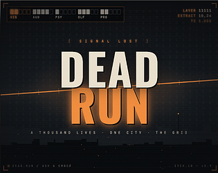
One boss. One ship. Five lives. How many cycles will it take?
Shooter
Play in browser
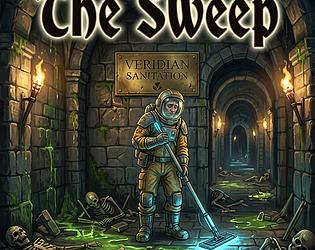
The hero got glory; you get overtime, hazardous sludge, and corporate quotas: clean every floor.
Action
Play in browser
One button. Infinite risk. Tap to dodge, hold to charge, release to destroy in this arcade shooter.
Shooter
Play in browser

Recent community posts
ASGAR - A Stupid Game About Running jam comments · Replied to ceigey in ASGAR - A Stupid Game About Running jam comments
ASGAR - A Stupid Game About Running jam comments · Replied to Xed in ASGAR - A Stupid Game About Running jam comments
EXEC_THETA_KAI (GameJam Prototype) jam comments · Posted in EXEC_THETA_KAI (GameJam Prototype) jam comments
Excellent game mixing exploration and turn based strategy. Graphics, sounds and drone music are very appropriate for the genre. UI is top notch! What’s a bit frustrating is to move the hand from the mouse to press the enter key. I would have used a key reachable with the non mouse handling hand (space bar?).
very atmospheric puzzle game. Interesting idea of using the domino rules. Some of these are a bit obscure though, but I may not remember all the OG game rules… Music is very well chosen. Are there sounds? I think some basic woody/clicky sounds and card flush effects could add a lot to the game feel. Keep at it!
very atmospheric puzzle game. Interesting idea of using the domino rules. Some of these are a bit obscure though, but I may not remember all the OG game rules… Music is very well chosen. Are there sounds? I think some basic woody/clicky sounds and card flush effects could add a lot to the game feel. Keep at it!
I was maybe a bit too vague on the fun aspect, which is, above all the rest, very subjective and it really depends on target audience expectation.
This is something I’m still learning myself, who is the target player for our games? For a pacman clone/reinterpretation I expected a faster and challenging game. But, once again, this comes from an avid arcade/action player.
About the battery, most of the times I stumbled upon a battery with full stamina, so unless you can pick them up and use it when out of stamina, I don’t think they add a lot to the gameplay.
About “just (…) gathering the flowers”, I don’t think it makes a complete game loop by itself, without the added challenge of escaping ghosts (which is what made the OG Pac-Man interesting).
About, “using the mechanics correctly”, if it’s not explained to me as a player (which is always dumber than the game developer) I can’t use it correctly ;)
Anyway, keep at it! A 3d game is not a small achievement! Well done!
Hey! Thanks for your very constructive comment, you pointed all the unfinished and frustrating points of the current version of my entry.
I admit the camera panning doesn’t really add anything to the gameplay, on the contrary it hinders the fun. I was frustrated with the screen aspect and the character size using the grid I chosen but I could have found another option to make the character bigger. I may try to remove the panning (or just zoom out, or reduce maze cell size).
The ghosts telegraphing sucks… a lot! Different sprites is barely recognizable and speed difference between the different ghost states is minimal. Once again, well said! Thanks for confirming all the weak spots of my entry.
And btw! Wonderful entry! I hope I wasn’t too hard and managed to keep it a bit constructive.
This is my review of Dark labyrinth
Overall
This is a great submission with huge potential for improvements. I loved the mood, the graphics and the retro feel. I hated the slow pace… but it can be adjusted easily. Try turn based (you move, they move) or faster real time.
Graphics
Retro hand-made graphics in the introduction with retro transitions! I dig! Contrasted palette. Nice font Old school low colour count with 1 bit character! I dig! Jumpscare death animations! I dig a lot!
Sound
Atmospheric music. Sound effects are too loud. But I still dig!
Gameplay
Very sluggish movement! I no dig! Unfortunately this is a big downside. I’d have turned it into a turn based movement game. It’s almost like a rogue like. Where’s the mini-map? I still dig!
This is my review of Pollen Panic
Overall
Stylish graphics in a very faithful arcade shell. Gameplay is too basic unfortunately and sounds are too loud! Deep lack of game feel/juice, particles, shakes.
Graphics
Excellent and coherent graphics, there’s a huge effort here and it pays a lot. Proper UI with a bit of mixed font styles, I would have use one or max two font styles. I see the same problem I had in my submission: maze is too small in the viewport which made me add camera movement (like it or not). There’s not a definite solution to this, maybe I would have made the viewport more square.
Sound
Music is appropriate even if a bit repetitive. Sound is too loud, I have reduced the volume to 50% and it sounds almost right.
Gameplay
Unfortunately, this is the weakest aspect of this submission. There’s not many challenges, game loop is repetitive, even it looks faithful to the OG.
Buggy character movement, the player doesn’t stay in the grid. The corridor width looks and feels bigger than the player hotbox. Sometimes you cannot turn at crossroads because of this. First level = tutorial, finally some proper arcade onboarding!
This is my review of Gretel crumbs and corridors
Overall
Nice retelling of the classic H&G tale. Great writing, atmospheric music. Great character modelling and movement.
Graphics
Nice UI with a very good choice of fonts., a bit too vanilla but it works well. 3D modelling is rough but well made. Palette choice is very good.
Sound
Atmospheric and mysterious title music. Same in-game as the title unfortunately. Bland and not very engaging sound effects. Sound is clearly the weak point.
Gameplay
Very satisfying character movement. Game loop is simple but very creative, mixing narrative, exploring, a bit of combat. Lore screen is a nice touch! A very nasty bug made testing the game very hard: if you alt+tab out of the game screen the mouse is never captured back which makes turning the camera impossible. I know it’s a common mistake with 3d games, but it should have been caught while testing.
This is my review of Dungeon Walker
Overall
A very solid and almost complete entry with a lot of very good aspects but sadly, IMHO, very classic reinterpretation of the OG.
Graphics
UI is basic but effective with nice contrasted color and a nice font. Very nice 3d authoring for ghosts, coins and dungeon walls. Maze would have gained a lot if corridors were as narrow as the player body width, it would have added a lot to the jumpscare feeling.
Sound
No music in title. Gloomy and very good music in-game. Sound effects are very immersive.
Gameplay
No menu, no pause, no settings. Ghost ai doesn’t look right, they ignore you and suddenly you’re dead. Starting the game facing a wall is not a very good way to present the game to the player. Maybe start in a different and safe room and then enter the proper level. No tutorial, no onboarding. Doesn’t play very well in the browser because the mouse is not captured and it prevents proper turning of the camera.
This is my review for Blipherd’s Garden’s
Overall
A complete game, both similar but also very different from the OG in many interesting ways. (interesting is the word today, sorry!). It’s fun and each level adds interesting challenges. Unfortunately it lacks visual juice (particles, shakes, etc.) but it could be an interesting challenge for a post jam polish.
Graphics
Hand-made graphics are very cute and add an interesting analog touch. I don’t know if the 3d adds a lot to the game feel: dots, being billboard sprites, seem to disappear at certain camera angles. The rural/farmy style is very appropriate for the sheep herder theme.
Sound
Music and sound are very analogic which is nice and interesting and appropriate for the theme, even if a bit too loud. I would have liked a bit of processing, minimum mastering/eq, but I’m a sound maniac, so feel free to ignore…
Gameplay
Very similar to the OG, old tactics still work.
Adding a shop is an interesting choice, but it’s not clear what you’re buying. What’s a blip?
A bit of onboarding/tutorial would have been nice, maybe the first level could be turned into this?
Collision check is a bit buggy,
Attract mode is a very interesting touch, in theme with the arcade vibe
This is my review on Flower Trail.
Overall
A nice 3d reinterpreatation of the OG which is not new per se but not common either. The game is very short and unfortunately not very fun. See below for improvements tips.
Graphics/UI
Sprites are nice and appropriate for the theme, handdrawn ghosts are cute but not so distinguishable one another. Lighting is inexistent which adds gloom but makes it hard to navigate. Maze is too large and corridors are too wide. Improvement tips: use either a bright palette for walls or add environment lights. Scale the level down and make the player be the size of the corridors width.
Sounds
Sound effects are there but a bit too repetitive. Music in game is barely audible. Improvement tips: add random pitch to sounds which repeat often in the game. Add a bit of variation in music tracks.
Gameplay
Pace is too slow and difficulty is very easy. Ghosts are stuck in walls and not very dangerous. I’m not sure I understand the goal of having pick up items? I only saw batteries and they’re not helpful when the sprint bar is full. I had the freezing gun at the start of the game but I couldn’t understand how to use it after a few shots. There’s only one level. Improvement tips: make ghosts roam the level and faster. Increase player speed a LOT! Reduce the features (less pickup items) to have a complete game loop. Add more levels or make the game infinite by repeating the same maze but with increasing difficulty
Hey, this is my review on Trap Ninja.
Overall the game is interesting in the way it turns an arcade game into a puzzle strategy game.
Graphics are somewhat a mixed bag of styles (big, medium, small pixels), it would help a lot to use a consistent pixel size and style.
Sound is there, both with sfx and music and this is a big plus. It’s in the eastern/japanese style, so suited to the game theme but unfortunately it’s a bit harsh for my ears.
Gameplay is fun and challenging but unfortunately some mazes with cells being adjacent to open cells make ghosts stuck and you can’t put arrows on those to unstick the ghosts.
Accessibility: controls should be a little bit more accessible, but the tutorial is a very nice touch. Game over screen isn’t in english (no problem with this but allow changing language then).
Keep at it!
Code: I’m curious about the new Antigravity 2.0 but I think I’ll stick to Claude Cli with a set of skills I’ve been getting familiar with (from AI hero Matt Pockock).
Graphics: a mix of procedural and Pixel lab which has improved a lot.
Sound: procedural for sfx and my battle tested Suno workflow (hand made musical idea fed into Suno with stem separation for tweaks)
Engine: THE littlejs itself! Nothing else!
Hey Master Frank! Thanks for your thorough review! All good points to address, I’ll fix them :) I’m pretty shocked but also proud of the brain dead simple 3d animation: cut the sprite in half, animate the horizontal squish and the darkening and do the opposite on the other side…
Thanks for this wonderful jam!
Simulation banc de poissons - boids jam comments · Replied to misslola57 in Simulation banc de poissons - boids jam comments
🎮 Fun & Gameplay:
The core concept has promise, but the mechanics aren't communicated clearly enough for a game jam context. Offering a race selection with only one viable choice adds friction without meaning — for this scope, it would be better to streamline or remove it entirely. Tile interaction feels unreliable; hitboxes are inconsistent and tiles can be impossible to pick up. Selling a tile permanently without a confirmation popup is a significant UX hazard — a misclick costs you with no recourse. The first auto phase drops the player in without explanation, which is a rough introduction to the game's central system. Matchmaking is the biggest issue: enemy heroes scale too hard too fast, creating a difficulty spiral that feels unfair rather than challenging. Enemy difficulty isn't conveyed clearly either — sometimes a single enemy unit wipes the entire team with no warning. Occasionally there's no valid enemy choice at all. Some units appear invulnerable and some shapes can't be rotated, but neither is explained — it's unclear whether these are intentional features or bugs. Battle speed controls would also be a welcome addition.
🎨 Graphics & Audio:
The tutorial screens are a genuine highlight — clear mouse and keyboard icons that fit the medieval aesthetic well. Battle animations are polished and the sprites are charming. There is no audio whatsoever, which is a real gap; even minimal sound effects would do more for immersion than most other additions. Sound design should be prioritised over systems like daily rewards.
🤖 AI Implementation:
The asset quality is impressive — it's evident that AI-assisted generation was used thoughtfully here, and the visual cohesion across sprites, UI, and tutorial screens is well above average for a jam entry.
💡 Final Thoughts:
Terra Fracta has a solid visual foundation and an ambitious design, but it needs a significant usability pass before the depth can shine through. Players are currently fighting the interface as much as the enemies. The priority fixes would be:
- Add a confirmation dialog before selling tiles
- Fix tile pickup hitboxes
- Explain the auto phase and any intentional mechanics (invulnerability, rotation restrictions)
- Overhaul matchmaking to provide a fairer, more gradual difficulty curve
- Communicate enemy difficulty clearly before engagement
- Add sound effects and music
- Add battle speed controls
- Simplify or remove the single-option race selection
With these addressed, the game's genuine strengths — the art, animations, and strategic tile system — would have room to breathe.
🎮 Fun & Gameplay:
An interesting take on the incremental clicker genre, but the onboarding undermines it. All resources and mechanics are presented at once, which quickly overwhelms the player before they've had a chance to understand the basics. Incremental games thrive on the drip-feed of new systems — revealing complexity gradually is what makes progression feel rewarding. Here, the front-loading of information removes that sense of discovery and makes the early game feel more stressful than satisfying.
🎨 Graphics & Audio:
The wireframe UI aesthetic is functional but has become synonymous with AI-generated games, so it doesn't do much to establish a distinct identity. The visual feedback on clicks is decent and the act of clicking has some weight to it. The click sound, however, is underwhelming and doesn't reinforce that tactile feel. There's no music, which is a missed opportunity — even a simple ambient loop would add atmosphere and help sustain longer play sessions.
🤖 AI Implementation:
The game is clearly AI-generated, but it's one of the more polished examples of it. The systems hang together and the overall structure is coherent. What it lacks is the human editorial touch — the moments of intentional design that make a game feel considered rather than assembled. Still, impressive for a vibe-coded project.
💡 Final Thoughts:
Incremental games are a well-trodden genre, and standing out requires either a fresh theme or exceptionally satisfying mechanics — ideally both. This entry has a solid technical foundation but needs work on pacing and identity. A few targeted improvements would make a real difference:
- Introduce resources and mechanics one at a time to ease the player in
- Add music and improve the click sound to strengthen game feel
- Introduce automation mechanics to reward longer sessions and reduce grind
- Develop a more distinctive visual identity beyond the wireframe default
- Layer in some strategic decision-making to give players meaningful choices
🎮 Fun & Gameplay:
Take this with a grain of salt — I'm not a card game enthusiast — but the gameplay felt a bit shallow on strategy. The biggest friction point is onboarding: the Start button should be disabled until the player has a deck, or better yet, the game should hand you a starter deck automatically and let you build from there. Card types are also unclear in play; I couldn't reliably tell monsters from items at a glance, and the flow of selecting a monster, placing it in the slot, then attacking wasn't intuitive without explanation. A short tutorial or contextual tooltips would help enormously. There may be more depth than I was able to discover, which is itself a design problem — the game should surface its strategy, not hide it.
🎨 Graphics & Audio:
The title menu is impressive — coherent galactic aesthetic, bold chunky text, and satisfying hover effects on the buttons (sound effects there would be a great touch). Card art is nice and the visual style holds together well throughout. The atmospheric music sets the right mood but becomes intrusive during battle; giving it more breathing room or lowering it in combat would let the action feel more intense without the audio competing for attention.
🤖 AI Implementation:
The card interactions and game logic appear to be implemented with care, and the overall scope of building a working card game is no small feat. With more polish on the player-facing rules and feedback, the underlying systems could really shine.
💡 Final Thoughts:
Card games are a notoriously difficult genre to get right, and the effort invested here is evident — the visual identity is strong and the core is functional. The main thing holding it back is clarity: players need to understand the rules and card types without having to guess. A few targeted improvements would make a real difference:
- Add a tutorial or starter deck to guide new players into the mechanics
- Clearly distinguish card types (monster vs. item) with icons or labels
- Surface strategic depth more explicitly — show the player what decisions matter
- Balance the battle music so it enhances rather than overwhelms
- Disable the Start button until a valid deck is assembled
🎮 Fun & Gameplay:
The gameplay is repetitive and lacks meaningful challenge or depth. Enemies feel like bullet sponges — hitting them doesn't produce satisfying feedback, which makes shooting feel unrewarding. A basic score system provides some reason to replay, but it's not enough to sustain interest for long. The single-button control scheme is an interesting constraint, but it wasn't taken far enough here. Allowing the tank to move would have added considerably more depth and tension without much added complexity. As it stands, the game is just a bit too simple to stay engaging.
🎨 Graphics & Audio:
The menu is functional, the UI is clean and readable, and the color palette and background work well together. Sprites are simple but fit the game's aesthetic. The visual effects are very basic and a step up in juice — screen shake, hit flashes, particle bursts on death — would make a real difference to how the game feels. The standout element is the music: the alien theremin lead gives it a distinctive retro sci-fi atmosphere.
🤖 AI Implementation:
The AI is straightforward — enemies follow predictable patterns and don't pose much of a threat — but that's appropriate for this style of game. The ambition here is clearly a casual arcade score-chaser, and the AI fits that goal. It's sufficient, if unremarkable.
💡 Final Thoughts:
A cute arcade game built on a capable engine, but it doesn't quite reach its potential. The core loop needs more feedback and variety to feel satisfying. A few targeted improvements would go a long way:
- Larger, more impactful bullets
- Enemies that die faster but behave more dynamically
- Clear visual and audio feedback on kills
- Tank movement or dodge mechanics
- Power-ups or escalating enemy variety to keep runs fresh
The foundation is there — with some added polish and depth this could be a genuinely enjoyable little score-chaser.
🎮 Fun & Gameplay:
The gameplay is very basic and the difficulty curve is severely unbalanced. Levels 1–4 offer almost no challenge — aliens are passive and trivial to avoid — then level 5 lurches into near-impossible territory with no warning. Items are never explained in the game itself; the instructions cover them, but contextual in-game tooltips or popups would go a long way. Combined with frequent crashes on level 5, the overall experience feels more like a chore than an enjoyable game. It's also quite short with little reason to replay.
🎨 Graphics & Audio:
The retro terminal green-screen aesthetic has some charm, but the execution undermines it. The scanline effect is visibly broken and actively detracts from the look. Text is tiny and hard to read, and the low contrast between text and background compounds the problem. The font feels generic. There is no music or sound effects of any kind, which leaves the game feeling empty.
🤖 AI Implementation:
The game shows signs of having been assembled quickly without a final polish pass. The AI is rudimentary — aliens stand largely inert until the player walks into them — and there is little evidence of deliberate behavioral design.
💡 Final Thoughts:
Acheron Station has a rough-around-the-edges quality that makes it hard to recommend in its current state. The difficulty curve is broken, the UI fails to communicate its own mechanics, and several technical issues — the broken scanline effect and level 5 crashes in particular — suggest the game needed more time before submission. The retro terminal aesthetic has potential, but it needs contrast fixes, readable text, and at least some ambient sound to land properly. With a focused round of polish and bug fixes this could be a decent short experience, but right now it's more frustrating than fun.
Simulation banc de poissons - boids jam comments · Posted in Simulation banc de poissons - boids jam comments
🎮 Fun & Gameplay:
Performance starts sluggish at just 200 fish, but disabling shadows brings it to a perfectly smooth experience — so the culprit is clearly unoptimised shadow rendering rather than the simulation itself. That's an easy fix, but it needs to be more prominent in the UI; a warning or tooltip linking shadows to performance would save players a lot of frustration. With shadows off, the fun factor improves considerably.
There are plenty of knobs and levers to play with, which is exactly what you want from a simulation game. Once performance is addressed (or shadows are disabled), the depth on offer is genuinely enjoyable to explore.
🎨 Graphics & Audio:
graphics are basic but effective
no music or sound effects, which is fine for a simulation but I think some ambient music or sound effects would enhance the experience
🤖 AI Implementation:
very complex behavior for the fish, with different types of fish having different behaviors and interactions. it's impressive to see such a detailed simulation in a browser game, but again the performance issues really take away from the experience.
💡 Final Thoughts:
interesting swarm simulator and impressive for a vibe coded application
🎮 Fun & Gameplay:
The mini-games I tried felt underdeveloped. "Curling" plays more like a golf game than anything resembling actual curling. "Find the Bomb" relies entirely on luck — the hint system is unreliable and ambiguous (e.g. "row 2" with no indication of whether rows are counted from the top or bottom; in one run the hint said row 4 but the bomb was in row 2 or 3). With no real skill expression and random outcomes, there's little incentive to replay.
🎨 Graphics & Audio:
The visuals are extremely minimal and the text is so small it's nearly unreadable. There is no audio whatsoever — no music, no sound effects — which leaves the experience feeling hollow.
🤖 AI Implementation:
The game gives the impression of having been put together quickly, with little time left for polish or refinement. The rough edges are noticeable throughout.
💡 Final Thoughts:
The game fails to load on itch.io and instead redirects to a different platform prompts users to create an account — a significant barrier for a game jam entry where first impressions matter. In its current state it's hard to recommend, but there's potential here if the hint system is fixed, audio is added, and the mini-games are given more mechanical depth.
🎮 Fun & Gameplay:
The settings menu is thoughtfully designed with solid accessibility options. Gameplay is engaging and the AI puts up a real challenge. The pacing can feel overwhelming at times — a turn-based mode with strategic depth (think Risk-style moves) would be a fantastic addition for players who prefer a more deliberate playstyle.
🎨 Graphics & Audio:
The main menu is clean and easy to navigate, though the visuals feel a little bare. A bit more visual flair on the title screen would go a long way. Audio is a clear highlight: the title music sets the mood perfectly, and the in-game music and sound effects are polished and well-suited to the action.
🤖 AI Implementation:
The AI is impressive — it plays with genuine skill and keeps the pressure on throughout. The overall game feels well-crafted and cohesive, which speaks to the quality of the implementation.
💡 Final Thoughts:
A polished and well-executed strategy game with strong gameplay fundamentals and standout audio. With a bit more visual ambition on the front end and an optional slower-paced mode, this could be an exceptional experience. Great work!
🎮 Gameplay & Mechanics
The core Match-3 loop is currently buried under a layer of unnecessary complexity:
- User Interface: The "click-to-swap" mechanic feels clunky compared to the industry-standard drag-and-drop. It adds an extra step to every move, slowing down the pace of the game.
- Over-Engineering: There are many stats and mechanics that feel poorly explained. In a Match-3, players usually look for "flow"; here, the extra systems act more as a barrier than a depth-builder.
- Recommendation: Simplify the stat system or introduce it gradually. Focusing on making the "swap and match" feel responsive should be the priority.
🎨 Graphics & Audio
- Responsiveness: The lack of window scaling is a significant hurdle. Since the game crops rather than adapts, it makes the play area difficult to navigate, even with scroll bars.
- Visual Cohesion: There is a stylistic clash between the minimalistic, wireframe-style gameplay and the pixel art used for the Title and Game Over screens. A unified art direction would make the experience feel more intentional.
- Feedback & Feel: The match animations are currently too fast to be satisfying. Slowing them down slightly or adding more "juice" (particles or sound cues) would make the matches feel more rewarding.
- Audio: The music is a highlight! The Game Over theme, in particular, captures the tone effectively.
🤖 AI Implementation
While the "vibe-coding" approach successfully packed in a lot of features, this is a clear case where "less is more." The AI-generated complexity lacks a human designer’s touch to balance the mechanics. A more focused, polished Match-3 would have been more effective than a feature-heavy but disjointed experience.
💡 Final Thoughts
There is a lot of potential here, but the game is currently "over-designed." By stripping back the excessive stats and focusing on UI responsiveness and input feel, the core fun of the game would be much easier to find. Great foundation, but it needs a heavy dose of simplification.
🎮 Gameplay & Mechanics
The core concept is intriguing, but the execution currently suffers from significant mechanical friction:
- Clarity & UI: Navigation is difficult as entities are visible through walls and the Map (Tab) appears non-functional. Essential information—like how to use power-ups or what the "Random Events" signify—is missing.
- Controls: The Q/E strafing feels unintuitive without a tutorial prompt. Modernizing the control scheme or providing an on-screen layout would help.
- Combat: The "center-screen" projectile logic feels disconnected from the weapon's visual position, making aiming feel glitchy rather than intentional.
- Progression: There is a lack of a "Win State." Since civilians respawn indefinitely, the player lacks a sense of completion. Vending machines also appear to be non-functional decorations rather than interactable elements.
🎨 Graphics & Audio
- Visual Polish: The emoticons add a cute touch, but the overall art style lacks cohesion. The UI is particularly rough; many screens (Intelligence Briefing, Field Manual) are overcrowded, with text being cut off or rendered in a font size that is too small to read.
- Audio: Having music is a plus, though a shorter loop can become repetitive during longer sessions.
- Legibility: The leaderboard scroll speed and pixelated enemy chat make it difficult to engage with the game's social/competitive features.
🤖 AI Implementation
The "vibe-coded" nature of the game is an impressive feat for a jam! While the raw output is fascinating, it currently lacks the human-led polish needed to turn these generated ideas into a balanced, playable experience.
💡 Final Thoughts
The "Bureaucracy-themed Doom" aesthetic is a fantastic niche. While the current state is quite rough, the foundation for a fun retro-shooter is there. With a focus on input reliability, UI legibility, and a concrete victory condition, this could evolve into a very polished project.