Well done ZSlash, I'm happy to read you have been able to add to your project. I hope to play it again when it's all done.
James Sonneveld
Creator of
Recent community posts
As has already been said, the visuals are great, it has a very creepy look to it. The environment, I feel, sets itself up really well for an escape room type game with puzzles and passwords. Is that what you were trying to create? If not, that's okay, it might just mean you need to tweak some aspects of the game (mechanics or environment) to push it towards your intended game style.
Personally, I think the timer could be extended just a little bit. Reading the riddle and then relating it to the numbers found around the place did eat up a lot of time. I did have to do multiple runs to think about the riddle and try out combinations until I eventually got it, which probably could have been a part of the timer instead. Even the animation to get out of the bed at the start was eating into the timer, which would either need to be paused until the animation finishes or added as extra time.
Another idea that could be cool to experiment with is to remove the timer on the player's screen and replace it with a physical timer that sits in the game world. It could be digital (like a large LED wall timer), or analog (classic alarm clock or egg timer). This way, the player is forced to search for the time they have left, pulling them away from a puzzle for just a short amount of time.
Would be great to hear what you think. Even if the ideas I gave don't go with your idea for this game, I would still like to know.
Well done again, game looks great so far.
Very impressive game with quite a few game elements implemented in only two weeks. Congratulations!
In terms of game play, the only thing that could be a little frustrating was the fishing mini-game. There were moments where the moment to stop was impossible to land, mainly because the reaction time needed was beyond human capabilities. I'm only guessing on how your code works but I imagine you just take a random angle around a circle and use that to place the stopping area. If you just ignore around the first 90 degrees, it should give player's just enough time to quickly take a look at what they have and then respond.
Besides that little thing, everything else about the fishing mechanic was easy to understand and control. The rest of the game was also really well done, the sounds especially were well thought up and worked nicely with the environment.
Well done!
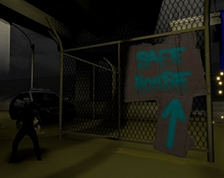
It has a very good foundation for a horror game. Movement is solid and responsive and the environment is amazing. The environment has quite a few creepy elements to it, like the hanging vent cover near the computer station. It makes me wonder what could come out of it.
One minor thing you could implement is possibly a way to recharge the flashlight and/or an easier way of navigating when the lights go out, even if it's a small, exaggerated glow at the player's feet so they have to crouch down to the floor to take advantage of it. That way, the player isn't mindlessly stuck scrambling in the dark.
Otherwise a very solid start.
Thanks for the explanation Caduckic, I think you explained it quite well. My UI was very similar to yours but rather than a text box I kept adding Label elements in a vertical container (VBoxContainer in Godot I think). The text was just an array where each element was a new line of text. In code it looked like this:
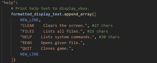
It's funny but I think the only thing we did differently was how we handled displaying the text haha. It's reassuring to know that someone else has the same ideas and not everything feels like a hack.
Nice little game you have made. I like your use of the command window, I would really like to know how you implemented it, because I made a similar one in my game, "Digital Haunting" but it was getting very bloated and hard to maintain and I had far less commands.
Also, this is probably not too much of a bug and more of a conflict with WebGL and browser behaviour but I noticed that when playing on your web build, that when I went to crouch and move forward into the vent, the shortcut for closing tabs would activate (CRTL + W). The only quick fix I can think of is making the crouch button toggle-able. That way, player's aren't holding two buttons down at once.
Hi all. Just wanted to say that my first ever asset pack in now available to purchase over at,
Graffitified Words by James Sonneveld (itch.io)
The asset pack consists of a collection of words and letters made in a graffiti style. All words and letters are done in a greyscale colour scheme to allow people to re-map the colours to their own preferred colours using gradient remapping.
Use the small demo to play around with some of the images available for purchase by changing the colours on the gradient and placement.

Totally agree. Platform spawning may have been too random. When making a platformer, I probably should have focused more on a players skill level (which can be improved) rather than RNG. That way, highscores are always made by the player's skill and not how lucky they were.
Thanks for the comment, it's given me something to think about if when making platforming games in the future.
Thanks for playing and thanks for the feedback. Yes, stopping the player from getting the same score from the same photo every time would be something that needs fixing. Pokémon Snap fixes that issue with the player being on a track, they can't repeat photos because they go past them after some time. I might test out a level on a track for fun and see if it adds to the game. I will also implement a limit to the same photos being taken, which will probably require a level reload if the player wants to take good photos again.
If I expand on the movement, do you think 3D movement would work better?
I thought this game was really fun, I certainly was challenged enough to want to make it to the end. Well done on getting this done in only a week.
The falling mechanic is a good choice. It allows the player the chance to speed run (which is usually the goal for some players) but with the added challenge of risking a death because of it. The only difference with your game compared to something like Going Up is what happens after falling. Going Up keeps the player alive the whole time, while yours essentially kills them then restarts the level.
This might be ridiculously complicated to implement for such a simple game but maybe falling to a certain speed causes a portal to open up beneath the player and teleports them back to the beginning. This way, the player doesn't get a jarring experience that involves menu screens to restart.
Simpler mechanics to implement might be the ability to do a mid-air jump if the player hasn't already jumped. I just found that a couple of times I would try to jump but would fail even though it seemed like I was still touching the ground.
Also, locking the mouse position and hiding the mouse would improve gameplay. It is a little distracting seeing the mouse go all over the screen and it actually prevents the player from looking around if it goes onto another monitor (that's what I found anyway).
None of these issues were game breaking in any way just a little inconvenient. Overall, still really fun to play.
I really liked the two-phase approach to the game. Most games would generate a level for the player and if something went wrong, then the game would be at fault but this way, only the player can be at fault because they didn't make a good path. (Though you could say, the game didn't give me the right cards, etc).
I would like to put this out for anyone who has played but would the game still work with a portrait-shaped screen instead of a landscape screen? While I played, I found I wanted to keep using cards even though I had reached the furthest point I could before I had to move into the movement phase.
To the developers, was a vertical screen something you had considered at all? I'm curious if that would have made the game too easy or not.
Loved playing the game regardless, just something I thought of while playing.
That makes a lot of sense. I did watch a video about flocking algorithms, and it looked kind of tricky to set up but maybe that was because they were trying to be super performant with it. Though one weeks worth of time is still quite impressive to get that set up, plus everything else you had to do.
OnBacameVisible and OnBecameInvisible was a good choice, even if it isn't performant. I had completely forgot that was a method on Monobehaviours and it does account for the whole frustrum of the camera whereas a cube trigger collider misses the gaps as the far plane expands out.
I'll have to look into implementing those ideas.
Thank you for the reply.
Yes, that's a great idea. I know that Eliane1998 who posted the game, "Flash the Fish" had the same concept in their game. Here's a link to it if haven't seen it already. https://itch.io/jam/brackeys-10/rate/2230411
Being able to see what pictures you take could help slow down the game a bit because I know it is kind of quick at the moment. Also, the way they score a photo is interesting. I would like to know how they did it because it could be interesting to implement.
Thanks for the feedback by the way.
Thanks for the feedback. I did have a counter for the number of shots that you could take before needing to head back to the ship. It probably got cut off when I was adjusting the UI for the web build. I will consider having more than just UI elements to give the player feedback, possibly a shot sound that plays.
This was so much fun to play, the mechanics were simple but provided such a wonderful way of interacting with the world. The art style was definitely what stood out the most to me. It was very professionally made and complimented the gameplay very well. Even though the levels weren't complicated to navigate, it was nice to see light sources being used to guide the player, especially towards the ends, which signified the end of a section. Well done.
The bug I found (and it a very minor visual bug) was when I ran into a boulder. Just as I activated the anti-gravity ability after being hit, I found the walking animation was playing while I was floating. Fixed by switching anti-gravity on and off. I just thought I should let you know.
Overall, great game.
This was a really fun game. When I played, I almost thought the scoring system glitched out when I was getting such high scores but looking at the stats and how it calculated my score seemed to explain it. I did a very similar game about taking photos of fish to get a score.
I would love to know how your photo system worked. Mine was a simple collider in front of the player that kept track of all the fish in the volume, then returned a score based on how many were there when the player pressed the take photo key.
I would also love to know how the fish movement worked. It was fluid and dynamic and was able to have multiple fish swimming together at once. It was really well done.
That was a great little game. A great story with some great acting.
I think the only critique I could make is that during the running section, because of the need to focus on the gameplay mechanic, you miss out on the action that is unfolding on screen. A great game regardless.
Note for other people trying to play. I found that Google Chrome seemed to make gameplay really slow for me but trying with another browser seemed to fix that issue.
Hey Nutty Studios. I loved working on your project for day 2.
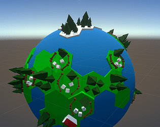
I loved the look of the tiny planet and the UFO and how they both move.
I was wondering how you made the nodes for the placement of the buildings and trees. Were they all empty objects dotted onto a sphere in your modelling program of choice? It definitely is reminiscent of the top-down Civilization games with a hexagon board.
I would also love to know what you think of the additions I made to the project.
https://jimjambimbam.itch.io/uddergeddon-a-cow-abduction-game
You're right my bad. So many projects I forgot that multiple people could be working on the same one.
I had a look at what you managed to get done. I liked your tractor beam effect, there was a lot more movement and life to the effect than mine.
Your UI was also a nice touch. I had thoughts of doing some sort of UI, but I thought that it may have taken up too much of the screen but when I saw what you had, it didn't look like it would have taken up as much of the screen space as I thought it would. It also had a nice sci-fi feel to it, which was good.
Well done! Looking at your changes and the game itself, I can see that you have already put so much into it.
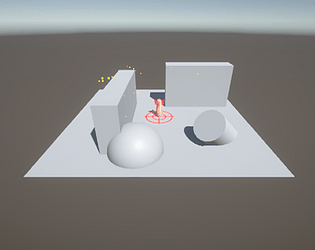
I couldn't see it in the Web build (possibly because of the graphics settings) but I noticed that you implemented the animating reticle for the decal. I love it. It's exactly what I imagined it would look like.
I hope someone is able to pick it up for day 3.


