So good. I ended up playing for like 2 hours straight.
jakerr
Creator of
Recent community posts
I loved it.
Only issue I had was, as euclidean-whale also mentioned, that I felt like the punishment for making a mistake on the later levels of having to start completely over was to severe. I was about three moves from completion when I made a mistake and I didn't want to continue. I think a three strikes you're out kind of mehanic would have been great here. Or even collectable "lives" pickups throughout the levels might have been cool.
Overall I really liked the graphics and application of the theme! It's a fun little game!
My only criticisms are that:
The jump sound effect was a bit too high pitched and loud. I ended up muting the game to finish playing because it was just too annoying for me after a couple minutes.
While the trippy effects were really cool, I'd have liked them to be bit less intense and put more focus on effecting the controls rather than making the player dizzy with upside-down graphics. I understand you were going for something disorienting but I think a bit more moderation in that dimension would lead to more fun gameplay.
I loved the art style and animations they really kept me engaged so that I had to play to the end even though I was a bit frustrated by having to start the entire game over instead of just starting each event.
I wouldn't want to play this for very long because of the controls being so tiring on the hands but I could see this being a fun theme for a game with some nicer controls!
I love the aesthetic. The concept and gameplay are also great. I did find the death from picking up another coin of the same color confusing at first. I also found overall difficulty to be a bit high on some stages but I did enjoy the puzzles.
One thing I'd recommend is to not show the menu after death, but just immediately respawn since so much of the game is trial and error - it would be less frustrating to die if you could just try again immediately :)
This was a lot of fun! The controls were pretty satisfying and easy to understand. My only criticisms are that I found the music to be a bit repetitive, I was pretty tired of hearing the song by the end of my first run. One other small thing Is that I found the putter placement to be pretty tricky sometimes, some shots that I thought were lined up pretty well would just barely move the ball at full power presumably because I was too far forward - this may not be a bad thing from the skill based game perspective but I feel like some visual indication of what good alignment is, or maybe some indication of what went wrong with a weak shot, might be nice!
The presentation artwork, music, sounds were all quite satisfying. The concept for the game is also very cool.
As other commenters have mentioned, I found the controls quite tricky to get the hang of. I found pressing Q to get a new knife just felt like busy work that made my hand tired (of course I want another knife after I've thrown one!) I found coordinating the E press with mouse movement to be exceedingly difficult, even after 6 or 7 rooms I didn't feel like I was getting much better at it and it stopped feeling like my skill was helping me. At some point I gave up on playing skillfully and started randomly flinging. Some visual incentive not to waste knives, such as a score with penalty for misses might help with that urge to just fling randomly.
Thanks so much for the detailed and constructive criticisms!
I completely agree with everything you pointed out, especially the camera and difficulty criticisms. I have to admit when I ran out of time I used the difficulty of the level design as well as the artificial difficulty imposed by the fixed camera to get closer to my goal of a single hole of mini-golf with a very high par.
I also appreciate the feedback on presentation such as font and cover design. Definitely things I will try to put more energy into in future Jams. :)
Thanks so much!
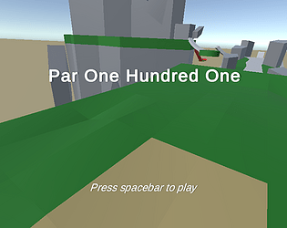
So I went at this project from the start a bit overly ambitiously thinking of making a huge map that takes 101 strokes to complete. Initially I'd envisioned more nicely balanced areas with more walls as you mentioned, but because of lack of time I kind of used difficulty as a crutch to help me get something hard enough to take 101 strokes on the first play through. I think the game would be much more fun with better level design that has easier and harder areas, and nicer camera controls for sure.


