
On Sale: GamesAssetsToolsTabletopComics
Indie game storeFree gamesFun gamesHorror games
Game developmentAssetsComics
SalesBundles
Jobs
TagsGame Engines

hilloftheking

20
Posts
2
Followers
A member registered Aug 24, 2023 · View creator page →

Creator of

Recent community posts

You are right about color coding. It is probably confusing that for "wires" yellow means on. Thanks for the feedback.

Fun but I was having performance issues with the minigun after getting to a score of like 300,000. Enemies started causing massive stutters when they explode into blood. But it starts off fine which is weird. (i7 10700 and rtx 3060 ti). Maybe just an issue when playing on linux through wine?

Sort of sucks that falling is a death sentence. Maybe going out of bounds should do -50hp and teleport you back, or dash could work upwards so we can save ourselves.

Definitely an interesting game to say the least. I just can't grasp the controls. Do I have to constantly move my mouse to walk forward? Also it's very weird that moving works differently during combat.

Got a sword by pressing G I think and flying upwards. That is probably a debug feature but it was pretty funny.

Very fun game already. I made sort of a broken build with an upgraded maelstrom that goes in a circle with a magnet and a medkit attached. Plus a bloodblade (77 damage) going extremely fast (also with the same medkit) for good measure. Maybe the game could make the waves harder depending on how good you are doing. Or there could be an auto button if you make a really good build. Even on wave 50 I am ending with full health

Some issues:

* I don't know what the "lock" button in the shop does

* Interest is confusing. I didn't realize at first that it just means later waves give more money. I think it would be more intuitive if the amount listed as "reward" just went up.

* Zap seems a bit overpowered, I could go forever with just maelstrom+, booster+, and circle+

The game is really fun to play, but my biggest gripe is the visuals. For example, in the first screenshot of the game the walls are very bright and the floor is dark. Plus the wall textures have a lot of contrast which is kind of annoying to look at. The levels should be either entirely dark or bright, and the enemies should be the opposite. That would instantly make everything look much nicer, at least in my opinion.

Now, onto the gameplay. Some of the power up things might need to be rethought. Why would anyone want multiple Anti Gravity power ups when it would just put you at a further disadvantage? Maybe it should just make the enemies slower? And the ring of flames looked like I was on fire.

Particle effects for the portal should be bigger. It is nearly impossible to see from far away. I do like the indicator that shows you when you are getting close to the portal, but I didn't realize what it was for a while.

Not sure what's up with the areas where you get shot by nothing and your view turns constantly. And the lost king filtered me. Couldn't avoid his laser.

I encountered a couple bugs:

  • One of the twin pillars that I fought was named "@Twin Pillar@43874."
  • One of the powerups that reduces ammo for each weapon causes each new weapon to start off with more loaded ammo than there should be.

It feels really good to play already, but the lighting should be adjusted to make it more clear where to go. For example, there were stairs tucked in a corner somewhere that were pitch black when looking at them from certain angles.

I came back and beat it on Cultish difficulty. The only way I was able to get past the room with the yellow key was by abusing the diagonal movement and ignoring the enemies. Then I used all the rockets in the next room. Found a weird invisible enemy at the very end https://boards.4channel.org/vg/thread/453065286#p453095797

It was fun but holy shit 12 and 15 were hard. So was the level that was split in half, gave me a headache in fullscreen from moving my eyes so much after dying 100 times. I suck at these platformers kek. Beat it for the ending screen because I was hoping it would change based on the outfit.


I was able to just run to the exits without actually fighting anything. A few of the weapons felt very weak. The gunplay did feel satisfying, but I did not realize I had 2 weapon slots for a while. Explosions should deal less self damage.

  • Player moves at 60hz without interpolation. Pls fix
  • Diagonal movement is too fast. Movement vector should be normalized
  • Agree with zerochance, the flying lavaball dudes do way too much damage. Maybe there should be a falloff from the center of the explosion if there isn't already
  • I like the theme of burgers and fries
  • I was fine with hard difficulty up until the part where you get the rocket launcher. That part was just ridiculous. Then on medium difficulty it was too easy.
  • The level design was pretty good but this is a crazy first level. And you can just completely break the order by wading through the lava.
  • The flying lavaball dude also needs a sprite for when he is not facing you

Overall it was enjoyable, but it was too easy on medium, and too hard on hard. Some of the screenshots are not in the demo, right? The demo ended for me at the door after the bridges are made in the lava.

The framerate should be fine as long as you don't press Q, which spawns a very unoptimized spider. What are your specs? And yeah the terrain is definitely going to change at some point. Thanks for the feedback

The white cubes are intentional. I just left them in because I thought they looked cool. The explosion shader is a little bit hefty, but I tested it on my NVIDIA GPU and Intel iGPU and it seemed to work fine (no black box). Can I have hardware info please?

Yeah the shader stutter is pretty bad. I'm really looking forward to adding dungeon-type structures. Wish I had done that before this demo day

I went into the options menu from the continue screen, and I could not press return. So I pressed save and the window became very small. Deleting AppData/LocalLow/Fxy did not fix the window size, so I had to look through the registry for your save data (which had resolution width and height set to 1). Please don't use the registry.

With that out of the way, here is my feedback:

  • I like how flashy the combat is
  • The font is a little bit ugly
  • I could not figure out a proper way to defeat the first boss aside from just standing inside of him and spamming attack. There seems to be some deflect thing, but I could not figure out how it works. Also, it was hard to tell how he was going to attack.
  • Second boss was more fun.
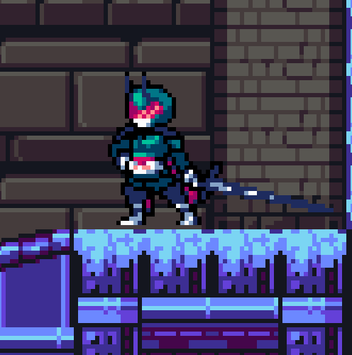
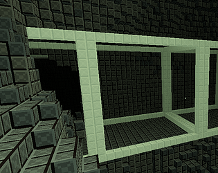
  • Some of the level assets keep losing their top pixel. In the picture, the ground seems to have been shifted by one row of pixels.

Sensitivity now has an actual slider in the pause menu. Movement is definitely going to be changed at some point. Thanks for the feedback

Chunks are 32x32x32 and are unloaded once you are more than 2 chunks away from it. There is a separate type of 512x512x512 chunk for structures that does not get unloaded right now, but it would take forever for this to fill up your memory (they don't even take up a megabyte) so I left it as it for the demo. Chunk unloading was rushed for the demo and causes rare crashes, but the entire browser crashing is a little weird. You can tell that chunks get unloaded by destroying stuff, moving past a few chunks, then turning back. The blocks will all be replaced because nothing is saved to disk currently.

The tunnels intersecting looks weird, but it is intended as of now.

You should be able to press left click and right click at the same time, can I have some info on that? Operating system, browser, and mouse? Having to left click to turn is temporary, though.