I got it submitted! Really wanted to meet the self-imposed deadline. I should probably come up with a cover image though!
dranorter
Creator of
Recent community posts
Might I just start out by saying, I love hoverflies. I didn't know they existed until a sunset walk in late August when it seemed there was a large black fly hovering perfectly still in each sunbeam in the woods. Not sure of the species, but it's great when nature decides to be that surreal.
Anyway, I've got my game scraped together over the last couple weeks (it's a pen and paper game) but now the writing and layout part is going slower than I would've hoped. Just wanted to say I love the theme and sorry if I don't make the deadline!
The fight with the Horror isn't marked with a check box or the FIGHT keyword. This makes sense, because, if it were a real FIGHT, it would fill a slice of the Vessel clock, which it shouldn't do. Is it mandatory given arrival in that map point? Or is it optional like a typical point action? Or, should I have read the title of the point and known not to go there unless I intended to finish the job? (I'm taking this last interpretation for now.)
How does difficult terrain work? It states that all actions are at -1 Harm. Am I dealt Harm or am I just worse at dealing Harm?
The rules tell me to resolve all the actions from a given card. Do those need to happen in order? In RUNE, movement is always before damage. In REAP, I see that movement is listed before damage; but does that mean it has to happen first? Because, well, I can do cooler move sequences if I can use my weapon's harm, then my weapon's movement, then a spell's harm.
I think this opens up an interesting option: Some weapons could require the movement to happen first, while others could be more flexible. It's an interesting way to make a weapon subtly better.
I have a few questions now that I'm in my first combat.
Is it fine to reap all the fallen enemies at the end of combat automatically? Or does combat end immediately with the last death/round?
The Scythe states "... Those components may be used with a spell you are currently casting." This looks like a holdover from the RUNE rules. You're not simultaneously casting a spell when using a weapon in REAP, right? Since things are resolved one at a time, the Scythe has to be used first, then components gained, then spell cast. (This has already given me fewer options at one point.)
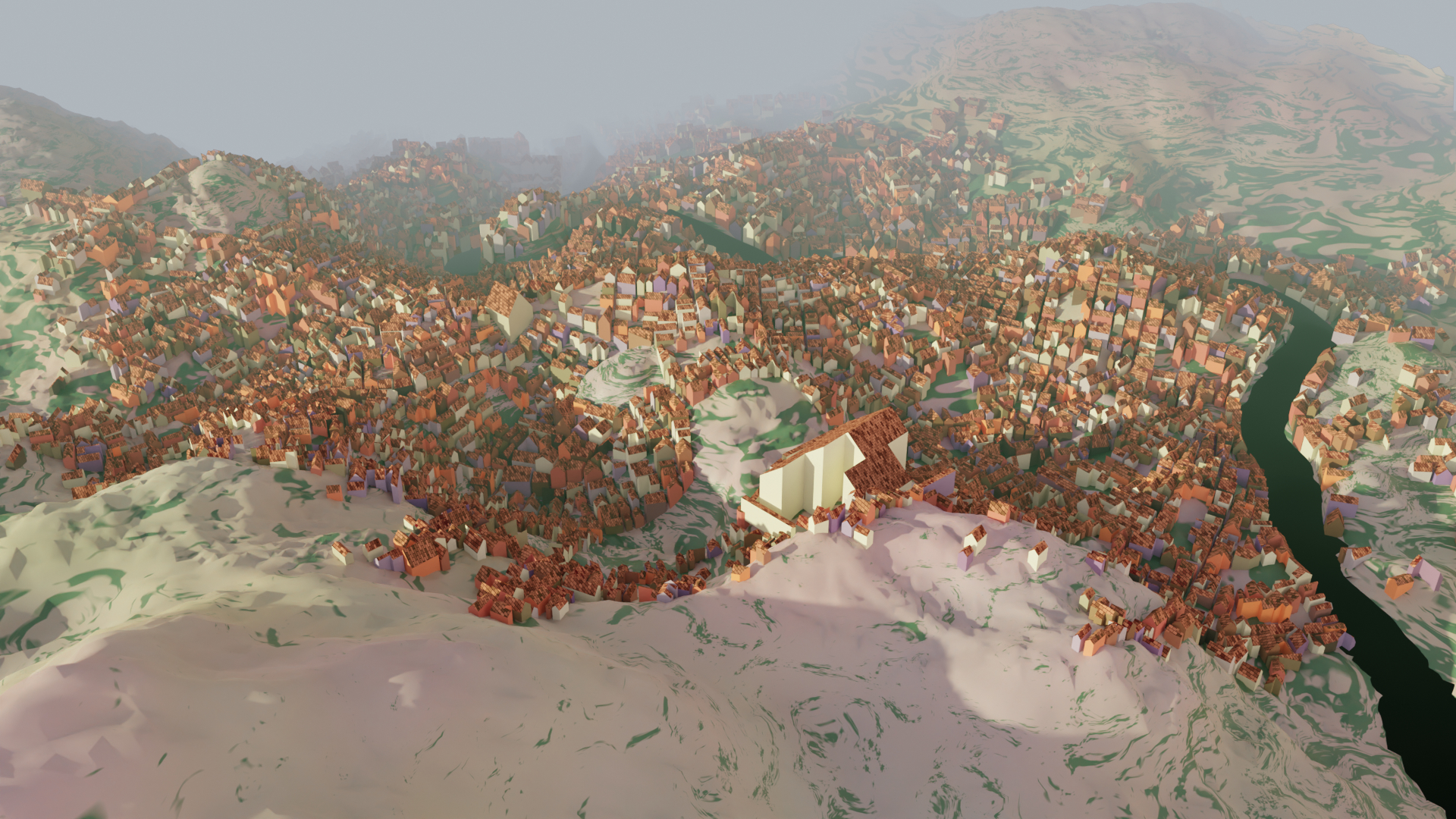
A rewrite from scratch sounds good. The main thing I've been anticipating is better looking shorelines, which you mentioned awhile ago; I take it that's been too hard with the present codebase. I don't know how a rewrite would/should affect Azgaar integration; for myself, if I'm concerned about saving exactly how a city looks in an Azgaar map, I generally save it as an image. But if people have concerns about stability (like the comment here about districts), I could see benefits to keeping the original city generator available while posting the newly rewritten one.
I continue to be oddly fascinated by this tool, it's so satisfying. Also I'm sure countless RPG groups have explored your cities without necessarily leaving any comments. Here's to many more years of random cities!
I'm curious if anyone has played the game Feather, Beak and Bone using the city generator. It seems like it'd be a great match, since that game requires a blank city map, and that's precisely what MFCG provides. I'm always looking for things to actually *do* with MFCG since I end up with more evocative cities than I have any reasonable need for.
I'm going to try it with my story game group once our current campaign is over.
The Cybermancy rules don't note that Knights should initially be removed. (The campaign does say it though.) In fact, in the bas1c game m0de section it mentions removing just 2t thru 21t, saying "this should leave you with a 54 card deck" which it of course doesn't. (It leaves me with 58.)
Just thought I'd mention it in case you do a revision.
Hey, I also wanted to say, One Trillion Years is quite the thing. I encountered it through the thousand year game competition (I played as many of the entries as I could, though Nomad was the only one which stuck with me). Cool to randomly encounter you via a different route.
Someone pointed out to me a couple cities which don't generate properly, producing errors in the Javascript console, so I linked them on a Github issue. There's some commonality with my earlier github issue about a particular seed/size combination which doesn't seem to function.
I just thought I'd mention them here since it doesn't seem the Github has much interaction.
If anyone else has encountered parameters which don't generate a city at all, or generate everything squashed into one corner, please reply with your examples!
Here's how to do it:
1. First of all get a good image to work with. Go into the menu inside the fantasy city generator and disable "raised buildings". Mess with any other settings as you prefer, possibly getting rid of triangular buildings or putting more gaps between buildings. I like setting the buildings to "complex", also.
2. Export the image as an SVG. You can do this in the menu under "Settlement". The reason to do this is because you can open the SVG in Inkscape and remove all the text. Text covering up buildings will be a huge problem.
3. Additionally, export a PNG version of the image with colored districts, in case you want a map while you are building. The version you embed in the terrain will get hard to read, as you can see from my screenshot.
4. Once you've removed text and other unwanted elements from the SVG, save it as a PNG. Using MS Paint or Photoshop or Gimp etc., convert the image to black and white (no grey - just black and white) and scale it to an appropriate size. You probably need to make it much smaller!
5. Next, you need to decide what materials you want to use to create the building outlines or "foundations". Get a matching number here: https://www.worldpainter.net/trac/wiki/Scripting/TerrainTypeValues For example I used yellow terracotta, which is 15. (Using yellow terracotta was a bad decision! Use something which will be higher-contrast on your maps!) For the background, around the buildings, I used 0, which is grass. (Sadly this means any non-grass blocks on the surface were changed to grass.)
6. In the black and white image, change the black lines to the appropriate color for your material. In my case, the RGB color (15, 15, 15), a very dark grey, represented Yellow Terracotta. Then, change the background to pure black, (0,0,0) (or whichever material you want for the non-building background). The end result will be a very dark image, which is your terrain map. Now save this as a grayscale BMP. In Gimp, this is done by selecting Image -> Mode -> Grayscale, then File -> Export as... (and name it something ending in .bmp). It seems to work without messing with the export settings.
7. In WorldPainter, use Edit -> Import -> Mask as terrain or layer. Select the grayscale image you've created. If you've coded the colors correctly, you will now be able to select "terrain" and "one to one". Type in an offset to get the image to the right location in your world, and then hit "OK".
You can do this to an existing Minecraft world, but exercise some caution - use the 'read only' layer to prevent WorldEdit from making strange little changes.
If you want to get fancy, instead of importing the image as a terrain map you can make a custom layer, holding a custom ground cover, and then import the image as that custom layer. For example, you could bury the ruins under a single layer of dirt. so that you have to actually excavate them. I think I may have used a custom layer for my world, to make the terracotta markings 3 blocks deep.
I haven't tested these precise instructions, and I did this awhile ago! So I hope it's all correct but obviously exercise some caution if you're altering an existing Minecraft world.
I'm wondering about what the intended or best way to use the alternate prompts might be. They're numbered, so it's very tempting to just give them a go , but then I'm not sure how to treat the alternate first prompt or the alternate endings. The instructions say "save your original prompt page and use one of these in place of that number". I'm not sure exactly how that's intended. Maybe we get to prompt 32, and it feels like too much of a curveball (32 is always like that for me) or we've had it a couple games in a row, and we just decide we want something else? So then we flip to the Alternate Prompts and just peruse them until we find something we like? And of course when we roll the dice we jump from our saved position at 32. Is that about right? Seems pretty indulgent!
I'm tempted to do some reordering and see if I can't make the alternate prompts feel time-appropriate like the main list.
Ah, Substrate is a screensaver: https://www.youtube.com/watch?v=dCCVgBOVD0E It avoids the loose ends by starting seeds directly on existing lines. I was acting like you'd heard of it because I've seen it mentioned a couple times in the context of history of procedurally generated art. https://procedural-generation.tumblr.com/post/124657726768/substrate-2003-shortly-after-the-turn-of-the
Having played with the code more, now I understand that the objects are rendered in one at a time to give some appearance of depth. It does look like there's a setting for number of starting seeds which gets used on a few objects.
It might be interesting to produce some symmetry by having some objects which place two seeds at a time, symmetrically. Maybe that would be a solution for getting more face-like things to appear.
Anyway, I'm enjoying poking around in your old project. :)
Been poking around all day, and now I have some coherent thoughts on improving the image generation.
The pips have some good variety, but at the moment aren’t different enough that, e.g., diamonds and chimes can be told apart by shape in a given deck.
An easy way to vary them more would be to alter their “density” or starting number of seeds. I’ve cranked up the seeds and gotten an interesting look.
Very occasionally, I get a suit whose pips favor some zigzag lines. I got a “rocks” suit on one deck which was a grey color and did this! It looked like jagged boulders. Possibly this outcome should be slightly more common to increase variety.
I suppose mask shapes could also be varied more. Thin, randomly tilted rectangles, crescent shapes, or annuli (circles with a hole) might look noticeably different, but I haven’t tried any of that.
A more out-there idea would be to add a “foreshortening” effect to either the line quality or the flow fields. Right now, flow fields have “right” and “left” which are at right angles from their forward direction. But these “right” and “left” vectors could be placed at shallower angles to the forward vector, with “right” still being the negative of “left”. Applying foreshortening could potentially make some objects seem more 3D. And, flow fields could potentially have different amounts of foreshortening in different regions. (At this point it’s almost like having two different flow fields, one conceptualized as at a right angle to the other.) This means they could represent the geometry of foreshortened curved surfaces.
Besides the pips, the other major thing to my mind is the figures. Sometimes they turn out very interesting, but they have some quirks which can feel repetitive; such as not having a clear head or being roughly diamond-shaped. What I’ve done for myself is add some extra mask shapes, such as just the top half of an ellipse, and a plain rectangle. The plain rectangle doesn’t look too great, but maybe more random quadrilaterals would have some character. I was also thinking maybe a more hand-shaped human silhouette could be good, or a selection of appropriate Julia sets.
I’d also like to try and see what happens when all the density is placed near the edges of the mask shape, leaving the middle basically empty. But another option would be to try distributing the density by Perlin noise.
When it comes to having a head, probably the only solution is to put some sort of deliberately generating head near the top of figures some of the time. Wouldn’t want to do that too much. The strength of this comes when it enables seeing things in the scribbles, not when it forces one interpretation.
OK, I've fixed the bug 3 different ways and I think what's happening is that occasionally one region entirely contains another. The function register(shape) only checks whether an existing region has points outside the shape, not whether the new shape has points outside an existing region. Comparing the sizes of the two regions can show them to be not duplicates (and skips a lot of comparisons), or the comparison can be done symmetrically to notice that shape contains points outside the existing region.
I was able to download the Javascript source and get it working, and added more text to my own liking. :) I see what you mean with the gradients; it's just enough to be a bit annoying to add texture. It looks like you've got a framework in place for alternate lettering, but the "modern" style is the only one implemented.
If you don't mind, here's my current understanding of how your image generation works - how close am I to correct?
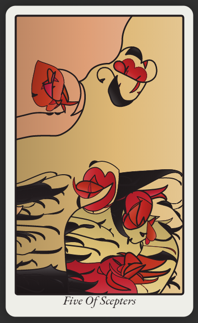
So each card has a number of objects associated with it, such as "sea", "sun", "star", "figure", "mountains", "city" etc. These objects work in different ways but generally have an actual position on the card, and often an associated "mask" that determines the shape of their "density". Objects also have a flow field, which I take it is like a vector field, which influences the direction lines will take, if the line is associated with the object. Each object also has a set of parameters which determine how lines will be drawn; this can make lines strictly follow the flow field, or wobble around, or travel at right angles to the flow field, or zigzag, etc. etc. It can also make lines thicker or thinner, and can apply certain colors to the cells which are produced by the lines.
Drawing takes place via a number of growth points traveling around on the card. Each of these growth points belongs to one of the "objects" (as I've been calling them), but they're all on the same card so they can collide with lines being drawn by other "objects". One thing I'm not clear on, is how many growth points initially are placed onto the card. Do separate objects maintain separate pools of points, or are they all thrown in together? But anyway, just like with the famous "Substrate", when a growth point collides with an existing line, it gets moved someplace else on the card.
As I understand it, growth points actually spread outward in two directions (unlike Substrate). So I think maybe both sides of the line need to "land" on an existing line before the line "dies" and a new growth point gets placed. When both sides of a line have "landed", typically it would form a closed shape which I think gets called a "cell". I'm guessing that the growth point which completes a "cell" influences what color it eventually gets colored, via the parent object that owns the growth point.
New growth points get placed randomly on the card, according to the "density" field. Looks like when a new growth point is placed, it drains away some of the density nearby, so that growth points are unlikely to begin too close to where one has already been. There's also a limited number of total growth points, so that eventually they run out and the card is finished.
I think that covers most of what I understood. Is that about right?
I don't know if you'll ever come back to this, either to do a writeup or add to it, but it is quite wonderful! Sometimes I can just sort of sink into the image and see figures and detail. Here are the improvements that came to mind while I was playing with it.
It could use some more suit names. They're probably easy to come up with, but here are some I've seen on real decks: discs, mirrors, spirals, doors, chalices. And some from the short story "Dowager of Bees": chains, bees, ivy, scissors, chimneys, teeth.
I'd like it if some decks used "princess, prince" in place of "page, knight". Other face cards in actual decks include "brother, sister, mother, father". Again referencing Dowager of Bees, we have titles like "Dowager, Detective." It would be nicely surreal to have a wide variety of titles like that.
All that's just word-stuff, but with the images it feels sillier to suggest anything. One nice touch would be using textures other than gradients on some decks, as if the printing techniques vary. And the lines could be slightly offset from the colors, as is often seen on older or cheaper printings of RWS decks. Also, the style of the numbering and lettering could change from one deck to another; some decks could have a "borderless" style.
My personal temptation would be to add a few exceptions to many of the predictable rules, for example sometimes "six of swords" could be generated via the face card / major arcana generation algorithm.


