
That approach makes a lot of sense. Ill see what i can do.
Also the gas mask means sentience ahaha. Its supposed to be just some anime head from the side.
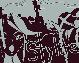
Craspedia
14
Posts
1
Followers
4
Following
A member registered Oct 06, 2024 · View creator page →
Creator of
Recent community posts
>"Unironically - I wish I had your cards as physical cards. Maybe on a Bicycle deck or something. But your art is SO GOOD. Peak sovl."
Thank you very much :> I will sadly have to add some colour to the game, because readability seems to suffer for many others, so hopefully youll still like it with that change.
>"UI is a bit odd. I got kinda used to it since I'm familiar with Cultist Simulator, but I think it'll be confused to anyone else"
I decided to separate the cards and events because i wanted to have visualizations of the background available. When you streamed the game and instantly repositioned the events to be all next to each other i had to laugh so hard but knew you played cultist yourself ahaha. Was a fun stream, sadly wasnt able to watch the other days.
>"Also - you should probably add more identifiers to the cards and slots - like types (person/location/etc)."
Gameplay wise i already have a lot of hidden modifiers, stuff like "fogbeing", "slave", "human", "location" and so on. But i dont visualize them right now. I will have to visualize those and also a tooltip that lets you hover over attributes i think, as some of the symbols arent super readable right now. Im also thinking about reworking combat to be a little bit more in depth maybe, as id like to seperate myself a bit more from cultist simulator. But that may be overkill ahaha.
>"The idea of tabs is actually pretty cool, but it's not very noticeable.
Thank you :> I have some ideas id like to try out with them, i wanted expeditions to feel more special than just sending people away. Hopefully ill have something until next DD.
>"Really looking forward to the next demo, keep it up, I love cultist simulator, and I loved your demo!"
Happy you enjoyed the demo, even if its very early into development.
Thank you for the feedback. :>
I will try to implement more colour and a slower introduction to the game and narrative. The win condition is still a bit hazy, but hopefully itll work out ahaha.
Regarding moving across the map i will have to add more ways to make it more easy for the player. But with all the feedback given so far i have a vague idea how to accomplish that.
I really need to fix the ui in different resolutions, that header displacement is atrocious.
>"After cooling down a bit I wanted to say that even though I complained a good amount, I can see what you're going for with a pure discovery game."
Dont worry, it was fair feedback and as i stated im unsure if i even want to continue. Ill give it a bit more of a try but if i consider the total feedback from everybody i will most likely project hop to something simpler once more.
I didnt do it because of it being too wide.. But nobody understood what i was going for, so i either have to explain it or just make it wider. Showing the rolled result at the end was on the list.
The book and arrows are a bit hard to use, as in the case of the noble challenger the fifth emotion slot can actually affect the 3rd and 4th slot. I would most likely just use a line and maybe a colour indentation to visualize groups within an event. But thank you for the idea and feedback, its very helpful.
Thank you for the in depth feedback, in general you mention a lot of problems i hear from many as well as good advice
>"UI looks partially broken in 16:10"
-I didnt check for other resolution types, i will try to fix that, thank you for pointing it out :>
>"Being monochrome is visually 'cool' but sucks for grabbing attention and pattern matching."
-Understandable, I will most likely end up clumping certain stats together in colour palettes to makes it more readable, stuff like cards focused on strength having also some red colour for easier visual recognition.
>"If I am holding a character card, it'd be nice if hovering over a unexpanded event card would expand for me."
-Never considered that but it makes sense.
>"I assumed it would be a scroll since it's a tower"
-Never thought of that, actually a really good idea. Ill also implement that if you click and nothing is being dragged you can move the screens around
>"Card events are unexpanded on turn end"
-It used to remember what was open and what not, but i broke it soemhow and now they dont reopen again after the outcome phase. Id also -like to add a symbol in the case an event changed during the outcome phase.
>"I do... things then the noble shows up, and at this point I get the idea that we are probably bad in a bad world or something with all the descriptions."
-Yeah its a bit too on the nose right now, i need to fix that. Id like to make it so that the noble only shows up if you have infamy cards. Maybe when i implement the tutorial ill also give a choice to either get 1 or 2 followers or 3 to 4 slaves instead. So that the player can decide who they are.
>"I get bodied a couple times by the guy, it's at this point I am more confused by stats, why are there two numbers above and below each stat? Also the buff/debuff cards also have two mults, which I assume is debuff against enemy, and buff to me? But which is which? And do these only last for one encounter, or stack over turns?"
-Most people understandably got confused by that. The two stats mean its a range that the character can roll during the outcome phase, while the buffs/debuffs also roll in that range. The most confusing part is that the buffs only apply to cards that are left of them, and if there are two buff slots in one event, it means that one is for the enemies and the other for your allies. its very hard to understand and i need to fix that, thanks for clarifying your confusion and stating your experience.
>"All my guys are dead now, and I only just realize that I can place location cards into some of the event card slots to do more actions."
I think youre one of the few who found that out. Your commitment to trying the game out is impressive and im thankful for that. I will add to their descriptions that you can do that and highlight events if any of their sibling events is able to slot them.
>"When I do the LURE THEM quest to purchase followers, for some reason the event card is staying up despite not having a location card or otherwise on it."
-I didnt know that would happen. i either forgot to link something or the game crashed maybe. Ill have to look into that. Thank you :>
>"I feel exhausted trying to understand wtf is happening."
-I apologize for the experience you had. Thank you for playing it though and writing down your feedback, ill use it feedback to try and make the game more understandable and easier to navigate. Have a nice day.
>it's very confusing right now
everybody said that even those who havnt played cultist simulator.
>Gorgeous style!
I will change it ahaha, the project is from 2 years ago but now with your game i feel like i have to change it.
>you might as well let players use the mouse clicks to drag the camera around
I guess that makes sense as long as nothing is clicked, shouldve considered that sooner. Thank you.
>I suggest giving each description (not just in the event outcomes) a brief "gamey" text
Ill do that, ive been thinking to just but the gamey text first and when somebody shift clicks i can have some larp text behind it. With both i think the screen would be too cluttered.
>Flowery writing to me is a struggle to read
Most people i gave it too say the same. i think its just badly written ahaha. If i continue with the project ill cut that down.
Thank you for the feedback, sorry for the inconvenience the game ended up being ahaha.
Enjoyable demo and nice progress :> Got to the finish and luckily wasnt ambushed by any of the last 3 enemies by saving up my dice.
The game was a bit hard at first but when you learn the weaknesses of the enemies it becomes easier. I played a thief, warrior and knight. In combat i usually just pass around my turns, using up the half dice with the knight or thief for support skills and damage the enemy with the warrior. I didnt really need to use any skills besides the normal attacks for the three, for the warrior the shield bash and flame strike, thief the attack that reduces def and bind, and for the knight i mostly just taunted when necessary. Dont know if that is the optimal gameplay. (forgot the skill names, im sorry)
The combat feels solid but can feel a bit repetitive over time, ultimately its a good foundation. Im wondering if you want to keep it, that one can adjust passives and skills during a dungeon? Will you balance the game around players needing to switch loadouts during an expedition? One thing i liked about darkest dungeon I is that you needed to prepare a finished loadout to embark onto a mission. taking more food if you dont have a healer as an example.
The leveling up mechanic that makes you walk around feels slightly out of place. Maybe it just needs some warming up, but it makes a playstyle more optimal in which you walk around, try to avoid enemy encounters and collect as many tiles as you can. Im not sure if defeating enemies rewards you with anything, but i ended up defeating every enemy on the map anyways.
I like the shift strategem, i think it was intended, but being able to skip certain combats, traps or even the elite on level 2 feels good.
The new character design is very cute, wish they were a twink, albeit they are flat enough to just imagine it.
Everything in the game was very easily understandable and concise. Although im not sure if you can look up the tempo of the fighter anywhere.
All in all a very enjoyable experience. Hopefully youll be able to submit again next demo day, id be looking forward to anything youre able to produce. :>
Thank you for giving it a try and for the feedback :>. It being confusing was also a feedback from the stream ahaha. Not sure yet if i want to continue it, but if i do id have to ease the player more into whats going on and structure the game better. There are several features i havnt implemented yet. Which includes the lose and win condition.
The readability is quiet bad tbh, especially after i changed the placeholder events, they sort of just merge into the background.
This project barely has any content so far (5-10 minutes max). I mostly submitted for a few reasons and questions id like to get resolved before continuing with the project. In most events that dont have an outcome yet i wrote the lack of outcomes in the event description beneath the sockets.
-Do you see any potential if id clean up the art and maybe worked a bit on the artstyle?
-How does the general UI feel, any issues or annoyances you experienced?
-How clear are the event outcomes and your control over the results?
-What do you think about the writing?
A few things that might be confusing: If cards are locked in sockets and you havnt placed them there, it means that their values fight against yours.
Emotion cards manipulate values through multiplication so far, the range is stated in the tooltip. They effect the group to their left.
During the outcome phase when you press next turn you have to left click when you want to progress.
When you press the button left to the next turn button it speeds up the game and doesnt ask for your feedback.
Please be honest, if you think this is a dead end and im being told so by enough people i dont mind project hopping to something else. If you dont want to publicly write your feedback, heres a form for your convenience :> https://tally.so/r/0Q5QDy I will also look up Stylite in the Archives, bant and vg thread the coming days if you dont feel like posting your feedback in the forms.
If you do end up playing it id appreciate any feedback. Thanks for reading :>
Great start, most things have already been mentioned, so ill try to keep it short. The menus are well made, the levels feel plain, but that should be fine for a starter area. Imo the bloom is a little bit too strong everywhere, but maybe thats a stylistic choice. The shipbuilder seems cool, but im concerned how youll create synargies, especially multi layered ones. Imo thats the most interesting part about twin stick shooters. And why i think gungeon is a bit worse than isaac as an example. The swaying of the ship needs getting used to, it feels very floaty, but i dont know what else one could do. After some time it was fine. The ai behaviour right now is bare bones, their controls feel a bit clunky. I hope you intend to add ships that can shoot sideways or differently in general on top of what you currently have. The destructible environment is great, just feels a bit awkward when you shoot out the entire middle part and the thing just floats there. I guess its connected to an imaginary ceiling, but it still feels a bit weird. Having you inherently float might restrict you in some aspects, im curious on how youll add variety to the rooms.
Looking forward to the content youll introduce over time. Especially the map generation overhaul you told me about. :>
Havnt played many games from demo days yet, but you definitely made me regret my previous life choices. Absolute cinema. At first i doubted the gameplay a little bit. The characters in the story are so far a little bit plain, but the animations and sounds make them charming, and being thrown into the first level is scary, especially because i had no experience with the game. I still managed to get it done on my first try. I then tried the challenger mode 3 times which lasted for around 10-15 minutes each match. My highscore so far is only a measly 29700. But i felt like i was mostly just circling the board until i saw something line up well, instead of actually thinking which way i need to go for a good setup. So i decided to watch the tutorials and play the puzzles afterwards. Got stuck on 1-10 as i didnt want to do too many turns, and got 2 star everywhere except on 1.6 and 1.9. I like puzzle games, but this one makes me feel retarded. I cant even fathom how much youd have to practice to intuitively see and setup combos. The puzzles are setup well, they teach you harder and harder patterns after another. The dice setup is also simple enough to memorize patterns, but complex enough to not become as monotonous as something like minesweeper. I think the premise is interesting, and i wonder if there is even anything to push it further. Ill def play more of this, especially when i want to relax, as it doesnt feel like brainrot at least and makes you think spatially.
Character wise Mimi and Pero are my favourites. The game feels wholesome and im happy that it is that way. The landscapes and backgrounds are nice, but tend to feel a little bit too nonsensical at times. I went through the art folder and looked at them in more detail. The town with the fountain image as an example has 2 random houses in the distance that almost look mirrored. There is also barely anything close to them, Which makes it a little bit off putting. The houses have some variance, but the silhouette of the houses are all of the same floor height when cutting into the clouds and the distances between the houses also feel too similar. The simple style definitely works wonders, but instead of placing random triangles all over the floor, it would be nice if the shapes would have an more overarching shape to it to read better. The inside view of the room and the path to the academy have nice floor shapes in contrast imo. Im not sure if the marketplace is a newer image, but there as an example you put more of the triangles in the foreground which helps the scene a lot. The houses in the background also have a more unique silhouette. The blue tint is also a big improvement. If that artwork was made later you improved a lot and i might not even have needed to state the things prior. The small witch house with the trees and especially the academy are really good pieces. Your trees have lovely shapes. I think the bricks in the walls could be clumped slightly more as they create right now a little bit too much noise, which clashes with the building being in the distance imo. But you left enough space empty for it to not be too noticeable.
Im looking forward to seeing more, only reason i stopped for now was to test out more demo days, ill def look more into the build later on. Tbh i think the biggest problem right now might be catching people at the beginning, but once you start to pay a little bit more attention you see the fun in it. The challenger mode in particular is def going to replace my sudoku and minesweeper time ahaha.
Game is a lot of fun, especially the blood splattering around ahaha. I dont have too much experience with the genre, but here are some thoughts of mine nonetheless. The shotgun feels nice, although imo the reload time is either too fast or the magazine size too big. Enemy sizes werent big enough to ever feel overwhelming, as the shotgun has plenty of ammo and basically oneshots anything. The enemy interacting with the environment also makes it more plausible. The fans in the ceiling add a lot to the atmosphere, in general i think the athmosphere makes sense and adds positively to the gameplay, the rusty bridge was surprising and intrigued me but sadly i couldnt see what lies behind. The only thing i could maybe say is that i feel like the sounds are a bit too flat for the environment, most spaces are rather vast and i feel like the sound should have more echo maybe. Being able to drag in the Inventory would also be nice, if you go farther with the game.
The game sadly crashed a lot for me, one time when i threw a grenade at the doorway of the shop room, multiple times when walking around, especially after that first big area, a few times within the shop bootup when i click randomly, and the last time in the middle of the bridge after i went back to collect some ammunition.
But given its a proof of concept its really good and im looking forward to your next demos.
Really good game, the art is of course phenomenal. Took me three attempts to clear out every enemy.
My first run was without the fighter, which ended in me instantly dying to the golem ahaha. Understandable that the weapons wouldnt really have much of a chance, but i wanted to ask if you were planning to implement different physical attack types? Like pierce, slash and blunt. That would at least make the physical weapon (mace) of the priest useful in certain situations. It could also open up a little bit more variety.
Usually with these types of games (my only experience aside from turn based rpg being ff tactics, darkest dungeon and metaphor) i have a rotation that i find out and spam. In this case it was for the skeletons passing until i can do the priest aoe, and when i have to use my turns with the other two it was taunting with the knight and just the burning slash with the fighter.
Second attempt failed btw because the enemy crit me 4 times back to back in 2 turns ahaha. Which was funny. Do you intend to add a mechanic similar to deaths door? Will the characters be down and you can restore them in camp, only losing them if the mission completely fails? If not thats fine,.
Aside from that random feedback, here is some other ideas that came through my head while playing:
-No idea what the coloured tiles do, i could identify the start and end (i think), but i dont know why the enemy tiles are coloured. its a bit confusing because i can already see that the enemy is there. The yellow colour made it seem like a item room, but that only my thought because of Darkest Dungeon i think.
-Some more UX around targeting and selecting abilities would be nice. There is already plenty, and you did a great job with what is there, but to reference darkest dungeon again as an example: Multi attacks connect the affected tiles and make them all glow at the same time. In dd youd also see what positions you must be in, and what positions you can affect. I honestly dont know if all the abilities in the bottom only show you the positions you can cast from, or which you can attack. I think the abilities that affect your own team like healing or taunting, showed the fields youd be able to cast from? The style of the game is really cool, and i understand if you wouldnt want to introduce colour because of that, but a quick green/red colouring of the abilty circles could fix easy identification of such abilities. But its also not super needed once you know what each ability does imo.
-Would be nice if you could make the battle music loop. You shared it in the discord, so i assume it was custom made. Even if not, the track is really good. :>
-The action animations are a really nice idea and help a lot in making the combat feel more alive.
-Damage ranges would be beneficial for planning out combat actions, especially if youre planning on including permadeath in my opinion. But it would reduce the surprise and intrigue of finding out what is good against each enemy. Metaphor showed what is weak against an enemy as an example if i remember correctly, while Darkest Dungeon just flat out showed you everything, from hit, crit to damage range, even how likely you are to apply any status effect.
Anyways, a lot of rambling from a nodev. And to summarize it all, you have a great game with a lot of potential, im looking forward to your updates and wish you the best of luck.