Is there any condition you saw this bug happen in? Restarting maybe?
No idea, sorry. I am almost sure I did fail the mission several times before getting to the point I saw it.
Really impressive that you have this all functional. I had fun playing a bit.
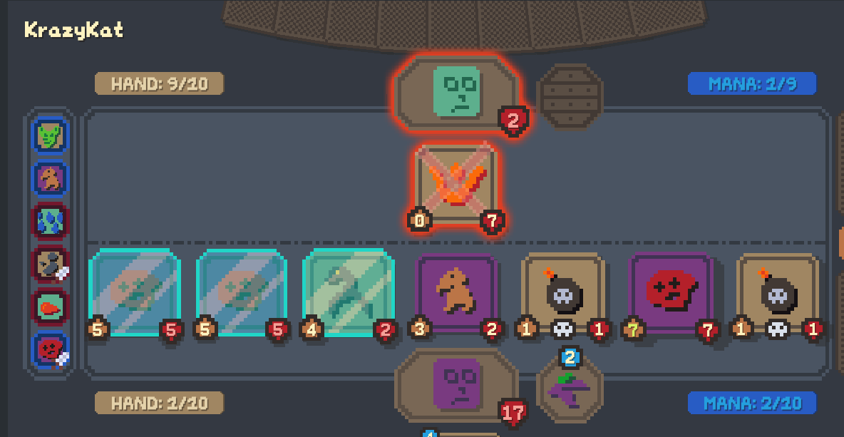
Glitch: two voidcallers dying simultaneously with two doomguards in hand resulted in both being summoned, but only one disappeared from my hand. The other one appeared to stay in my hand, then when I played it it functioned like Dr. Boom...