

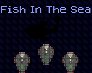
This is a fun take on the jams theme. The art was pretty basic, but all the post processing effects and particles helped make it stand out and feel more exciting. The upgrades were all decently balanced (although water damage felt like a must have later on), and the games length felt just right. Overall great job!
Brad Make Games
112
Posts
14
Followers
3
Following
A member registered Feb 21, 2019 · View creator page →
Creator of
Maneuver through an underwater cavern while collecting crystals, and find what else lies down below.
Adventure
Rally a futurstic ball into the face of your robotic opponents to win!
Action


Escape a spaceship using a futuristic camera to plan out your actions.
Puzzle
Play in browser

Recent community posts
This was a very technically impressive game, featuring many complex systems and game mechanics. And while it’s very clear where the game pulls its ideas from, it certainly has a “Creative Direction” that helps it stand out as something unique.
First I want to talk about the art. The backdrop that the game is built on top of has a really well done painted look to it (Maybe even hand painted and scanned in?). However, I think the game could have done a better job of presenting it. When the player first launches the game, the backdrop is already covered by fairly boring UI fonts and boxes. I’d suggest something like fading the game in from black to the full shot of the city, giving the art a moment to “Show Off” before fading the UI elements in.
Speaking of the game's UI, I think the font and general style is quite basic. And while keeping things easy to read and understand should always be the top priority, the visuals here tend to clash with the detailed backdrop and “Creative” character. With more time, I imagine you could have looked for a way to blend these elements together a bit more seamlessly, without impacting the readability.
As for the characters, they are certainly a unique style. But since most of them follow a similar meme look, which ties them all together well enough. And there's a lot of variety, which helps keep things from getting boring.
Unfortunately, the combat visuals do leave a lot to be desired. Most autobattlers thrive off the idea that by late into the game the fights become large scale spectacles. However in your game, it's difficult to read what each character is doing, and the attacks themselves have no weight. Leading to the fights feeling like a number simulator rather than a real battle.
To make the fights more interesting without blowing up the art budget, I would suggest a few ideas. Characters could have a small animation where they briefly move/nudge in the direction they are attacking, projectiles could be larger and include some kind of particle, enemies could flash red when they are hit and have some squash/stretch, and when enemies die they could spawn some smoke or other death particle in their place.
As for the audio, I think the sound track works well with the pacing of the game. The tempo makes sense for a strategy game, and its loop is long enough to not get annoying. There is a slight pause in between loops, which is a bit distracting, but overall not a big deal.
The sound effects you have in game work well enough to give player feedback for when they buy, sell, or reroll. And the level up sounds are a good indicator since there's not always clear visuals for what tier a unit became.
However I would suggest adding many more sound effects to the game. Adding sounds could give the player more feedback, as well as make your fights a lot more interesting and clear. Things like a sound to notify me when I’m about to run out of time, as well as effects for when my units attack, get hurt, or die. Even little things like clicking buttons or moving units having a sound would make the whole game feel more complete and satisfying to play.
Next I want to talk about the gameplay. I think you did a great job of recreating the traditional auto battling formula, having a large variety of unique units and groups that all seem reasonably balanced. The buffs from synergies are reasonable and seem worth it in most scenarios, leading to some thought when team building.
The overall difficulty of the game isn’t very high if the player already knows about auto battlers, but it's better to have your game be too easy than too hard (A mistake I often make when designing games). Although, I would have preferred a proper “Ending” over the endless survival approach (Even if you still wanted to give the player the option to continue forever after winning). As having a defined ending to balance the game around gives the player much clearer feedback on if they are doing good or not. As it stands, I made it to round 100+ multiple times, but I have no frame of reference for if that means I’m having a good run or not. In “TFT” the defined ending is when all other players die (Which is usually around the same number of rounds). This leads to dynamic early vs late game builds, where maximizing your efficiency in the timeframe is preferred over always going for super good scaling builds.
Additionally, it's important to remember the context that your game will be played in. Since you are not a multi-million dollar studio with a huge following and competitive scene, but rather an indie developer making a single player endless survivor, your players will only continue to play if they can easily understand the game. Because of this it is very important to include some kind of tutorial, or introduce the player to mechanics slowly.
As it is now, the player is hit with a huge overload of information without any warning from the moment they hit play, all of which needs to be digested on a timer that the player may not even realize is running. And while you may feel that any player that already knows “TFT” or similar games would pick up on how to play, since your game has many subtle differences it's easy to get lost trying to decipher which elements are the same or different. If you don’t have time to make a proper tutorial, even a button on the title screen to display a simple screenshot of your game with text describing each feature is better than nothing. Even after playing the game many times past round 100, I still don’t know how many of the little interactions in your game work, which makes it hard for me as a player to improve at the game.
But after playing the game enough to understand all the mechanics, I did find the general loop fairly fun. I think all the unique synergies having multiple tiers of unique buffs made trying each one out a good time. And the units had a good balance of tanks, melee, and ranged units (Even if it was hard to tell who did what with just the visuals). After a while the units did all feel very similar, since I don’t think any of them had unique effects (Or if they did it wasn’t clear). But with the game being rather simple, I think the synergies and stats give enough reason to pick different units.
Overall, I’m pretty blown away at how you were able to build so many complex systems in such a short time frame. And I think with a bit of polish and clarity, this game could be a very addictive “pick up and play” version of a traditional multiplayer genre. I apologize if this review was a bit much, but I'm doing this to all the games from this jam as I think critiques help us grow.
Most of the time when I play a jam game, I come out of it with tons of feedback I want to write up. Detailing every little thing I liked or disliked about the game, and the ways I would have approached it differently. However this was not a “Game” in the traditional sense, but rather something a little more unique. I didn’t get the feeling that any of the visual, audio, or gameplay features were implemented to make the game “Fun, but rather to create an emotional response from the player more akin to a book, movie, or visual novel. So please take this feedback with a pinch of salt, as I do not know what your original plans for this project were, and my opinions may not align exactly with the vision you had for the game.
First I want to talk about the art. When first opening up the game I am greeted with a title screen that doesn't really prepare me for the game I am about to play. While the background is technically “Pixilated”, it doesn’t match your game's artstyle at all. And the font choice has a similar issue, where the shaky lines almost look like pixel art, but are just different enough to clash with the rest of the game. Overall making your title screen feel a bit unprofessional.
As a small note, the title screen scales a bit differently in the windows build vs the we build. Giving the web build a smaller look than likely intended. I suggest using the “Scale with Screen Size” canvas setting to fix this for jams. Also, this is the Illinois State University Winter 2025 Game Jam, so it's a bit strange to make a game for next year's jam.
Moving on to the in game art, you do a really good job using a limited amount of sprites to create a very believable setting. The environment has a desaturated look to all the colors, helping tie everything together and creating a much more calming look. The distant background really helps sell the illusion that there's more out there, however adding a bit of parallaxing to the background and clouds could have helped make everything feel a bit more natural.
As for the player, I think the basic design works ok in this calm story driven game, however something about their animations feels off. The way they “sink” into the floor in their idle makes them feel a bit out of place, since everything around them is on the same plane. Typically the idle would have the head/hands bob up/down, so this approach was a bit unusual to me.
As for the audio, even though they are just royalty free assets, the way you implemented them really helps bring the world to life, and sets the tone for the rest of the game. Just about everything has a well made sound effect, even small things like birds flying away and going through doors, which really helps make your world feel alive. My only complaint is that the audio mixing can be a bit all over the place, making some sounds feel louder than others. This is particularly harsh with the rain sounds and doors.
As for the ambient sound, I think it helps set the mood. On other games I have commented that ambient sound is usually improved by layering music, but for a game like this I’m not 100% sure. I do think layering some soft music over the ambient noise might have at least helped on the title screen, since it doesn’t stand out right now.
Next I want to talk about the gameplay. I’m not sure if this was intentional, but starting the player in a confined space and then revealing a larger outdoors is a great way of making your worlds feel more complete (Like the opening to breath of the wild, but on a much smaller scale). Aside from that I think most areas do what they are created to do and feel like they aren't too big or small.
As for the gameplay mechanics like taking care of the flowers, I don't have much to say. They aren't really “fun”, but I get a feeling that's not the goal. They fit the tone of the game and that's all there is to it.
That being said, I wish there was something more to the decision to pet the dog or turn off the radio, but as far as I could tell messing with them has no further effect on the game. I don’t usually advocate for secret features in jams because if a player misses it then it doesn’t improve their experience, but since your game is so simple I was still hoping they had a secret purpose.
But overall the slow movement and basic mechanics lean into the calming gameplay and help the tense storm moment stand out, so I think it works.
Overall, this was a hard game to review, but an enjoyable experience to play. I apologize if this review was a bit much, but I'm doing this to all the games from this jam as I think critiques help us grow.
I'm glad you found it informative. This game stood out to me since my first steam release was a boss rush I spent almost 2 years on, so I had a lot of experience in this genre. I play each game many times before writing my comments, but I never know if the developers are going to find the in depth reviews helpful or think I'm just being a jerk. And I always assume many of the issues I point out are things you guys thought of but didn't have time to fix (like the sound effects), but I still bring them up since it's common to repeat mistakes in future projects unless people bring them to your attention.
This game takes the theme in a more unique direction than most, but one that works. And for a basic hack & slash platformer there's a lot of charm.
First I want to talk about the art. The title screen does a good job of presenting the theme of the game to the player, and contains a nice touch of movement from the rain that helps give it a more complete feeling. On top of that, the logo for the game looks really good and makes the project feel more professional.
That being said, the title screen has a couple issues that weaken your games first impression. To start, the grass, background, rain, title, and UI font all contain different pixel sizes. This results in multiple clashing pixel densities right off the bat, making the game feel less cohesive. To avoid this, make sure any sprites in the scene are not scaled differently from each other, and that your pixel particles follow a similar size (Unity scale doesn’t affect particles so the math to get pixel perfect match is a bit more complicated).
And as a very small note, I noticed the logo doesn’t change with the game's resolution, so fullscreening leads to the title looking really small (Similar issues occur with the rest of games UI as well). I suggest using the “Scale with screen size” setting on most canvases, as it’s much easier to use and safer in most scenarios. This is more noticeable in a web build since the resolution can change on the fly.
When entering the game I noticed that the tilemap felt very out of place compared with the characters and objects throughout the level. I believe this is because of the different pixel densities, but also the different levels of details in the sprites. The characters have saturated colors, simple designs, outlines, and highlights/shadows. However the terrain tiles don’t follow any of these same rules, making your world feel detached from the characters. It’s not always a requirement that the background follows the exact same art rules as interactable objects, but in this case I think it was a bit too far off.
With that out of the way, I do really like the sprite work for the player, enemies, and abilities. The animations look super fluid, and the anticipation frames on the enemy help with the gameplay. I will note that when jumping, the crouch frame lasts very long, making it so the player is already high in the air by the time they enter the floating animation, but simply shortening that frame would resolve the issue.
As a final note, the visuals when landing an attack are perfect. The screen shake, particles, and hurt animations all combine to make landing hits super satisfying, which is the most important thing in and hack & slash.
As for the audio, I think the music on both the title screen and in game fit pretty well. Synths and pixel art usually work pretty well together so no notes there. My only thought is that adding one additional track for the boss fight with a higher intensity would have helped it stand out better. As is, the final fight doesn’t quite have the intensity that the boss design deserves.
As for the sound effects, I think the attacks and hits sound really good and make attacking feel great. However, there are a lot of actions in the game that lack any sound effect, which makes things like picking up potions, power ups, killing enemies, and other things feel less important and weightless. Sounds for enemy attacks in particular would make your combat more intense, and make enemy attacks be easier to parry by giving an audio queue to the player.
Next I want to talk about the gameplay. As I mentioned previously I think the player’s 3 hit combo feels great and gives the combat a very strong foundation. The parry is also a nice touch, giving the player both an offensive and defensive option for each encounter. One small complaint with the parry is that it’s common to parry, but also take damage, which feels bad for the player.
As for the special attacks, I think most of them work well enough. However, since the player only gets stronger throughout the game, but the enemies don’t get any harder, it leads to an upside down difficulty curve until the boss. To address this, it may have been more effective to start off by encountering only small cloud enemies with less health/damage, and then using the larger cloud enemies with scaled up health/damage later on. This way the player would scale with their fights, giving more use cases to the special attack, and making the larger enemies feel more unique.
With that said, I like the design of the boss fight, encouraging the player to use the full moveset. However the arena was a bit lacking, and that combined with no unique music/sounds made the boss less impactful than he could have been.
Overall, I thought this was a very complete game, with a good variety of gameplay mechanics to keep the game feeling interesting. I apologize if this review was a bit much, but I'm doing this to all the games from this jam as I think critiques help us grow.
The gameplay loop of catching lightning to generate mana that allows for attacks is a very interesting concept with a lot of potential. With some adjustments I think this could make for a fairly addictive minigame.
First I want to talk about the art. The characters and enemies use a very simple pixel style which can work in a vacuum, however they clash pretty harshly with the much more detailed background tiles.
I really like the rain effect you layer over the top. I think it fits well with the characters and gives the scene a lot of life, but like with the characters, it clashes a bit with the background.
The UI throughout the game does have a fun style to it, but the very round sleek designs of the various bars and text is also different from both the characters and background, which leads to the game being less visually cohesive. Using pixel fonts and custom UI with pixel designs can help alleviate some of these issues.
The biggest issue with the visuals is that there is a lack of feedback for the player regarding certain actions. Things like taking or dealing damage don’t show any animation. By adding a hurt animation, or by simply flashing the character or enemy red/white, you could convey that information much more clearly.
In a similar vein, the enemy projectiles are very small and almost certainly won’t be noticed by players on their first few attempts. These should likely be larger, but could also have some kind of particle to help them stand out.
As for the audio, I think the background rain and thunder helps set the tone of your game. However I would still suggest layering music on top of the sounds that are present, as a looping song will generally create a more fun environment for the player. If music isn’t your thing, I suggest the Kevin MacLeod library of songs. You can pretty much always find royalty free music that fits your needs here: https://incompetech.com/music/royalty-free/music.html
And as a very small note, there's a brief stop/start for the rain when changing scenes. When the music/ambience aren't changing between scenes it may be helpful to keep the sound playing rather than letting it restart (This can be done really easily by adding a script to make your music object a “Singleton”).
Moving on to the sound effects, I think sounds that are all present are quite detailed and do a good job helping the player with timing their actions. However you can never have too many sound effects for player feedback. Adding various sounds for after the player hits does a “Lightning Absorption" could help inform them of how close they were. Other sounds for enemies landing hits on the player or the range enemies shooting could also help the player stay informed of how they are doing.
Next I want to talk about the gameplay. The core loop of catching lightning and then using that mana to attack creates an interesting back and forth where the player can stay away from the enemies until they need to jump in and get mana. This creates a really natural feeling of risk/reward which works well for this game.
The variety of spells to use is also a nice touch, however it’s hard to find a point where there's enough enemies on screen to get a lot of value from the larger attacks (Or perhaps the basic spell is just too good?).
That being said, the lack of enemy numbers may just be related to the roadblock that's stopping me from reaching later waves. Around wave 3 the ranged enemies become more common, and their homing attacks are guaranteed to hit the player (As far as I can tell). Not sure if that was intentional, but I would suggest making the projectiles larger, but removing the homing effect. This would still let projectiles be a threat, but not something that guarantees damage just because the enemy spawned. Based on other comments, this seems to be where most people got stuck.
My last note has to do with enemy spawns. It’s common for enemies to spawn in the arena, where they can be on top of the player and get a free hit. This is hard for the player to deal with, so its would be cleaner if they only appeared offscreen and walked into frame.
Overall, this is an intriguing concept with potential to become a very addicting game with a few tweaks. I apologize if this review was a bit much, but I'm doing this to all the games from this jam as I think critiques help us grow.
While a bit short, this game has a lot of character. Where the player’s in depth moveset sets up for a proper boss fight, all wrapped together by a nice little story.
First I want to talk about the art. While the visual style is a bit rough around the edges, it has a higher level of detail than we usually see in a jam. And since everything has consistent pixel density and quality, it gives the game a bit of a stylized look that works.
The title screen specifically makes a good first impression, giving the player something unique that showcases the tone of the game, but still fitting into the games overall artstyle.
In game the characters look great, containing lots of animations that make them feel alive. However, the background does feel a bit basic. While it’s important to not distract or obstruct a player's view in a game like this, the background makes up 90% of what the player sees, making it one of the most important sprites. I think some subtle animation with the clouds moving using a parallax effect could go a long way in bringing your scenes to life.
Along with that, a lot of screen space goes unused during actual gameplay. The top ~30% of the screen is unreachable and doesn’t contain anything visually interesting, making the game feel a bit off center. I would suggest raising the ground level up just a bit so that the player isn’t looking at the very button of their monitor at all times. And if you wanted to go the extra mile, you could make the camera more dynamic, zooming in/out to make sure the player and boss are on screen, without leaving quite as much extra room.
On a different note I think the font choice, while visually fitting, can be a bit difficult to read. Additionally, I noticed some special characters are not working (most obvious during tutorial), which is likely related to the web build of the game. For future projects, I suggest leaving a downloadable version of the game on the itch page in addition to the web build, since the web version never looks or runs as well as a local copy.
As for the audio, I think the music does a good job of setting the tone on the title screen and has a loop that is long enough to not feel overly repetitive. I’m not sure why there’s no music during the “Story” scenes when reading the scrolls, since I think it would have fit well there too.
However, I don’t think this music fits particularly well during the boss fight. The intensity of the song is quite low, and clashes with the action scene you create through the gameplay. A song with a higher tempo could give your boss fight a lot more energy.
Also as a small note, there's an awkwardly long pause before some of the music loops, which I suggest trimming down to avoid silence.
As for the sound effects, I think the boss sounds work well and convey the information they need to (even if they are a little goofy). However I would suggest adding more sound effects, specifically to player actions to give more feedback.
Simple actions like jumping, dashing, shooting, changing spells, etc. would feel better with a sound. But more importantly, hitting the boss and getting hit should have sounds as the player feedback would help make the game easier. As is, it's not always easy to tell if I got hit by an attack, so a sound effect to clarify would help a lot. And sounds when landing hits would make me need to look where I’m shooting less, allowing the player to focus on dodging.
Next I want to talk about the gameplay. Having a tutorial is super important, and the one you implemented is a very nice touch. However, making it a second button on the title screen makes it easy to miss, which will likely cause some player confusion (I’ve made this same mistake during previous jams). It doesn’t need to be a hard requirement, but something like a second menu after the player hits play, asking if they want to do the tutorial, ensures they won't miss it. Although, making it required is often safer, since players will skip optional tutorials and then complain that your game is confusing.
Another note about the tutorial is that I think it throws too much at the player all at once, but still doesn’t contain all the game's mechanics. It wasn’t until I looked at the Itch page before my third playthrough I realized there was a double jump and dash. To fix this, I would suggest breaking up the tutorial into multiple screens, where leaving one takes you to the next. Then you could have a platforming room to just teach movement, and another for combat. Overall lowering the amount of text on screen at a given time, and giving the player more time to process each feature.
As for the controls, I think the movement was standard and easy to understand, however I found the scroll wheel selection for the spells a bit clunky. Having to look away from my player to the top left to see what spell I cycled to made changing spells mid fight feel risky. Because of this, I would have preferred using number keys to let me switch to the exact spell I wanted without looking away from the action.
Along with that, it would be nice to know each spell's cooldown without switching to it. As is, the player needs to keep looking at the top left repeatedly to see if the spell they switched to is the one they want, and if it's on cooldown, which becomes very distracting when trying to use all the spells optimally.
Jumping over to the movement, I think the general feel was ok but had a few oversights. The left/right movement felt a bit stiff, with either very little or no smoothing at all. And while you don’t want a game like this to have “slippery” controls, having a very small amount of accelleration/deceleration makes things feel better.
Along with that, it would be very nice to have a variable jump height, where releasing space lets you not jump as high (accomplished in most games by increasing gravity when the player releases space and still has a positive velocity). It’s pretty standard in most platformers today, and makes games feel less floaty.
As for combat, I think the boss attacks are all well designed and fit well together. However a slightly longer delay between attacks would have helped (At least after the horn attack with the slow projectiles), since it was common for him to start a new attack before all projectiles had cleared the screen. This often leads to “Unfair” feeling moments where the player has to avoid 2 attacks at once.
Also, since the hitboxes are not super clearly defined through the art, I would suggest always leaning in favor of the player, and making boss/attack hitboxes smaller, since players will never get upset about a close dodge not hurting them. However you don’t just want to make enemies hitboxes smaller, since then you have the problem of the player missing shots when they think it should hit. To address this in the past, I’ve given enemies 2 hitboxes. A larger one for the player to shoot the enemy, and a smaller one for the enemy to hit the player (Although I understand this is probably overkill for a jam).
My last comment about the combat has to do with the spells. While there is a large variety, I think the 3 long range spells accomplish the same thing (Dealing more damage from a distance) and are more or less interchangeable with each other. This leads to the player usually wanting to spam every spell off cooldown without any thought.
This unfortunately isn’t helped by the 4th close range spell, since the distance is so short (and the boss hitbox is so unclear) that it’s almost never safe to use. Resulting in the player most likely avoiding this spell.
To address this, I think replacing some of the current spells with more situational spells that have other utility than “Dealing damage” would have helped. For example, things like a spell that deletes all projectiles on screen for when you're in trouble, a short range spell that also heals you to make it worth the risk, a spell that freezes the boss and pauses their current attack for when the player needs a moment, etc.
Overall, while I think there are areas for improvement with the movement and spellcasting, this is still a very fun and polished game. Boss rushes are a notoriously time consuming genre to pull off, so it’s impressive to see a well made boss fight in a jam. I apologize if this review was a bit much, but I'm doing this to all the games from this jam as I think critiques help us grow.
While I can see the vision for this game, it’s clear that it needed a bit more time for polish.
First I want to talk about the art. The style used on the title screen is very different from the visuals in the rest of the game, which makes the game a bit less cohesive. But it’s clear that most of it was placeholder art, which is better than nothing.
As for the visuals after entering the main game, the actual spritework looks really good. However there are many different pixel densities, which creates some clashing visuals. To avoid this, you should try to ensure all pixel art is not rescaled in engine by drawing all the sprites “To Scale” before adding them. This way you don’t end up with different sized pixels on each sprite. Which helps keep the game looking consistent and professional, even with simple sprites.
As for the audio, the ambient sound does set the tone for the level, however it’s a bit boring. I think keeping the ambient wind/storm sounds could work if you also layered some actual music over the top.
For the sound effects, I think most of them were fitting and helped with clarity. More sounds on enemy deaths and the player taking damage could help polish the game more, but I assume you ran out of time for stuff like that.
Next I want to talk about the gameplay. The general concept is easy to understand, and most of the mechanics are there. However a few game breaking bugs make it hard to progress far and enjoy most of it. Specifically, the stationary harpoon seems to break the shooting, and enemies killing the player doesn’t seem to do anything. Additionally, the invisible level walls make maneuvering a bit unclear.
Overall, I think if the bugs were cleaned up and some balance changes were made, you would have a complete game with engaging gameplay. I apologize if this review was a bit much, but I'm doing this to all the games from this jam as I think critiques help us grow.
This was a very literal take on the jams theme, and reminds me a lot of many classic flash and roblox games. The visuals and sound effects come off as very goofy at a glance, but it fits well with the over the top concept the game is going for.
First I want to talk about the art. The title screen opens with a relaxing shot of the night sky, which I think fits the game well and sets the tone. However, it also immediately hits the player with 3 clashing art styles. There's a pixel art background, the “smoothed” pixel art text, and the non pixel art buttons. All these assets make the visuals feel a bit less cohesive, and give a less professional look to your game. To avoid this in the future, I suggest using a fully pixel art font with hard edges, and not using the Unity default UI. Instead, just set the UI sprites to “None” so they appear as full rectangles (You can even add a larger box behind your UI elements to add a nice border effect if you want).
Additionally, I find that having any movement on the title screen can help your game appear more professional and leave a better first impression. Making the stars twinkle or having some slight background movement could help sell that calm feeling you’re going for.
Moving on to the in game art, I noticed that the pixel density changes on many of the sprites (most noticeable on the storm clouds/tornados). Meaning that the size of individual pixels is not consistent, giving the game a less cohesive look. This can be avoided by not using the scale tool, but rather redrawing the art to be whatever size you need. Redrawing sprites is time consuming, and not always feasible during a game jam, so it's important to plan out exactly how big things need to be before you create the pixel art.
I did notice a very small amount of z-fighting. Particularly with the moon and storm effects. This likely won’t be noticed by the average player, but we always want to be careful with the “Order in Layer” when setting up our sprites.
However with all that said, I think the basic pixel art is quite clear and conveys all the information it needs to in a charming way. The environment's sprites look good and the particle effects used to create the weather makes the scene come alive. And I appreciate the little details like the glow on the moon, the animations when people get thrown.
As for the audio, I think the music fits the setting pretty well. Jumping between the different remixes of the song helps the music all fit together, and highlights the current setting very well. That being said, the loop is a little short, so having all the music be so similar does make it a bit more repetitive.
Speaking of the loop, there's an awkwardly long break at the end of the song before it restarts. I suggest cutting most of the silence at the end of a track so that it doesn’t stand out as much. It's not usually feasible for a jam, but tracks that are built to loop into themselves seamlessly are a bonus.
Additionally, I think blending between the songs would make the jumps between environments less jarring. As it is, going from day to night (or to the shop) has a very sudden tone shift, which could be avoided if the tracks took a moment to fade out/in. (It sounded like maybe you had some blending when hitting start from the title screen? If so its really fast)
Moving on to the sound effects. I think the sounds you have in the game fit pretty well with the goofy style. The noises the people make help sell the illusion of them being in trouble, and give some feedback to the player about the game state.
However, there's a lot of important areas that are lacking any sound. Many of the environmental effects lack any weight because they are silent (earthquakes, tornados, etc). And just as importantly, the player actions are silent (placing blocks, hitting certain buttons, etc). You made the shop feel good by having the cash and error sounds, but try to extend that out to hitting the button to enter/leave the shop, skip the day, and anywhere else the player can “Interact”.
Next I want to talk about the gameplay. I was impressed with the variety of storm events and I think you did a really good job of conveying important information to the player with all the little tooltips for incoming events and shop items. Most jam games overlook informing the player of what different features do, so this was really nice to have.
I also think the shop had a good variety of options that all seemed useful, making money management important and interesting.
I also like that your game had a clearly defined ending, with an optional endless mode. With a game like this it’s common to see it labeled as “Survival”, where you go until you die. But having that victory screen shows that you had a point you balanced that game around, and something for the player to strive for, rather than just playing until they get bored and quit. This is even more important in the jam format, where your players are looking to see a game to completion, and then move on to the next game (Not that we should be “Meta Gaming” our jam submissions, but it's something to be aware of).
With that being said, my issues with the gameplay are mostly related to the lack of agency I have over protecting the people. While it's nice to know what storms are coming, I didn’t get the feeling I could build different defenses to help my people more or less based on that information. Maybe this is a skill issue on my end, but I found that using the same “Dome” of blocks with Metal blocks on the sides to be the go to for every storm. This made it feel very random if the people lived every time, and made the building phase less interesting.
To fix this, It would be nice to have more specific answers to each problem. Like lightning could hit the metal blocks only, so the player can position those further away or not use them at all when they see lightning coming. Tornados could have no effect on metal blocks, making them better in those situations. A larger change would be letting the player pick where to put the people so they can start on top of structures, and then having the “High Tide” come above the island's floor, but conversely having hail actually kill people on contact rather than pushing things. Leading to a back and forth of building structures to support holding people up, or protecting them from above based on the incoming weather.
These are just random ideas off the top of my head and obviously may not work in practice. But my point is that it’s important to consider how our obstacles impact a player, and if they have the tools to react to them appropriately.
My other issue with the gameplay was the time constraint when building my structures. My first playthrough I was still spending most of my time reading what storms and shop upgrades did, making me miss building for roughly the first 3 days. And since the building was already pretty basic, most of the player’s decision making going forward was still spent looking at the shop/storm UI. Which overall made the rush feel unnecessary, since I imagine reading speed isn’t the skill you were trying to test in your game.
Another small thing, was I noticed I could grab and hold blocks with a left click most of the time at night. This wasn’t specified anywhere in the game as far as I know, so I think this feature is easy to miss (Unless this was a bug?).
Overall, I found the game to be a fun little chaotic minigame. Even though there were areas that could use some polish, the overall idea is good, and the little details help keep the game enjoyable. I apologize if this review was a bit much, but I'm doing this to all the games from this jam as I think critiques help us grow.
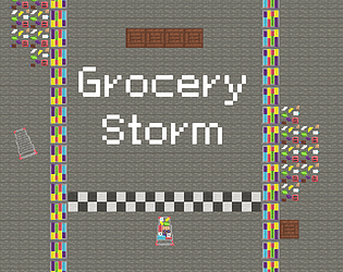
This is a fun twist on the theme. I like the pixel art for the characters, and the sounds and visual effect that plays when you take out an employee is very satisfying. The gameplay isn't to complicated, but I think the levels start off a bit overwhelming the first time seeing them. Maybe starting with smaller levels and then building up to bigger rooms with loads of employees would help ease the player into things. Overall great job!
This is a fun take on the theme with great execution and polish. I think the little town you built with all the npc cars driving around to be very believable and cute, and all the UI elements are very clean. The car feels good to drive, and all the minigames are intuitive. However the difficulty feels very random based on where I have to go and what minigames happen to appear. I also rarely ever got to see the top side of the map since I always started in the bottom. Overall great job!
Quick edit: I noticed there's only physics when you crash on the downloaded version. Just curious, is that intentional for performance reasons?
This is a very fun idea with good visuals and polish. The bridge maintenance is satisfying and the physics of the bridge being destroyed are fun to watch. A few suggestions would be to allow me to rotate the camera for better piece placement. And to ramp the difficulty up a bit quicker, since there is a lot of waiting towards the beginning. Overall great job!
To start I want to say that this was a very polished and unique game. The art, music, sound effects, and design all give this game a very complete feeling. Its an interesting way to twist the theme that provides a very unique style of gameplay.
First I want to talk about the art. There's a good variety of sprites throughout the game and they all maintain a high level of quality. Additionally you did a good job of building a sizable and believable town that makes for a simple but effective background for a mostly UI focused game (Not that it's bad, but were there any initial plans to either explore or have the fights more physically take place in the town? Seems like a lot of art for just the background).
Speaking of the UI, I really like the eldritch runes style that is maintained for all the different elements. From the title, to the intro, and the gameplay it really ties everything together. I also found the stat runes to be very clear and understandable, while also fitting into the aesthetic of everything else (I noticed that the "i" was using the Amplify rune, which is a fun detail).
Additionally, I really like the way you maintain the purple and orange aesthetic throughout the game. The colors fit the eldritch theme (At least I think they do), and
One minor detail I wasn't totally sold on was the font. It stood out to me among all the pixel art. And while I do feel that the non-pixel art fonts are often more readable, It does take a little bit away from how consistent everything else was in my opinion
As for the audio, I found the music to be very fitting. It loops well and was quite dramatic, without feeling to fast/intense for a puzzle game. The music on the title was a little abstract, but a good fit for the "spooky" eldritch theme.
Also the sound effects were really satisfying and impactful, which really helped make building out the board and watching the fights feel much better.
Next I want to talk about the gameplay. While the concept of building runes to create a monster is really cool, I have a few suggestions. To start I felt like I never had a clear goal when building my monster. Since I never knew what was coming all I could do was hope I got the pieces I thought were good combinations. If there was a little info on what stats my opponent would have each fight, I could have tried to play around what was coming.
Additionally, since I couldn't tell how much each rune actually buffed my monster by, I felt like I was guessing that certain combos would be good, rather than being able to actually "math out" a good strategy. It was also hard to tell what base stats my monster had leaving me with questions like do I have base crit/dodge, what's the base crit multiplier, how good is defense, and so on. I feel that showing me my own monsters stats as I build my board would have been helpful and made the game feel more strategic.
And lastly I felt that the actual rune building was a bit shallow. I feel as though I may be missing something, but since you always get 2 amplify runes the only consideration when building a board is which runes to pick and which should be amplified. Other than that, I didn't get a feel that positioning mattered at all, which made the gameplay feel a bit basic. I feel like introducing a 1 or 2 additional mechanics each round that leaned into the puzzle aspect could have helped give the player more to think about, and kept the game from getting repetitive. Things like "a diagonal line of runes gives this effect", "you can't place 2 of the same rune next to each other", or "this tile is now cursed, adjacent runes are 0.5 times as effective".
Overall, this was a very impressive game with great direction and style. I apologize if this review was a bit much, but I'm doing this to all the games from this jam as I think critiques help us grow.
This is an interesting way to use the theme, and seems like a fun idea. However, like you already mentioned its clearly not a finished game. That being said there's still some feedback I would like to give based on what is here, but please take this all with a grain of salt since you probably would have resolved many of these issues with more time.
First I want to talk about the art. I really like the design of the character and his animations. Although I do notice that the animations don't seem to loop very well, leading to the players character "snapping" when most animations restart. Additionally, I like the way the objects in the world look. Cyber plants is an abstract idea but I think you convey it well enough here. However there are some issues with the player overlapping in front in behind objects when he shouldn't.
Moving on to the environment/tilemap, I like the general vibe it has but there are some adjustments I would suggest. When making "detail" tiles, like the ones with weeds/flowers that are dotted around the map, I would suggest not filling almost the entire square with detail. This way when the more detailed tiles are placed its less clear where that tile starts/ends, and gives it less of a square shape, allowing it to blend with the tiles that have no additional details.
Additionally, the water tiles look ok, but clash quite harshly when against the grass. If you had more time, I would suggest having some blending tiles that more smoothly combine the water and grass with some kind of ridge. The same could be said for when dirt is tilled, although I feel that this one doesn't clash nearly as bad.
As for the audio, The music on startup is a bit jarring at first and had kind of a scratchy sound that was a bit hard on my ears (Although this is very subjective). That being said, I really liked the music used in gameplay. Its just techno enough to fit the cyber theme, but also slow and relaxing enough to fit the farming aspects of the game. Overall a pretty good track that could loop for awhile without getting annoying. As a side note, neither the main menu or game music loops, but I assume you knew that already.
Next I want to talk about the gameplay. This ones a little tricky to talk about with so many features missing but I do have a couple suggestions. First off, the controls felt a little unintuitive since they would be used in the direction of the mouse, but the player wouldn't turn and face that direction. This often lead to me swinging one way, but tilling land or chopping a tree the other way. I would say to either have the player rotate to face where the mouse is on click, or ignore mouse position and only use player position to determine where I act.
Additionally some of the hitboxes feel a bit unnatural when running into rocks or trees. It looks like these are each a full tile large, but the art is much smaller/larger for some sprites. Not a bit deal in a game like this, and I'm not sure how easy this would be to fix in your engine, but it's something to consider.
Overall, even though the game isn't finished its certainly something to be proud of as even getting a project to this point isn't easy. If nothing else I hope you were able to learn from this experience, and I wish you luck in any future jams you participate in. I apologize if this review was a bit much, but I'm doing this to all the games from this jam as I think critiques help us grow.
Fins, Friends, and the Strange Machine jam comments · Posted in Fins, Friends, and the Strange Machine jam comments
This was a super charming little experience with cute art and fun characters. All the assets come together nicely to create a very playful and relaxed environment which ties in nicely with the gameplay.
First I want to talk about the art. While overall I think the sprites on the title screen are fine, I get the feeling that it was all a bit rushed. There's a big variety of pixel densities going on with a mix of pixel art coral, the sorta pixel art machine, and not pixel art UI. I've also made my fair share of rushed titles, but when you can spare some extra time to make something special it can really help make your game feel cleaner since it directly impacts the players first impression.
Additionally it feels very static, especially since I know you animated the machine in game. Some easy changes I would suggest to really bring the title to life would be to use the animated machine, have the lights sway side to side, and maybe have the coral move just a bit.
Moving on, I really like the different designs for each of the sea critters. It seems like a lot of the focus was used here for the art and its well worth it since they are the stars of the game. Additionally the unique designs and color schemes they each have makes them easier to tell apart which helps during gameplay when I had to go back looking for somebody.
One small thing was that the player's feet would raise up during the idle, unlike with other characters who's feet stayed firmly on the ground. Most likely a quick fix by moving his art up a pixel or two in the sprite (unless this was intentional and I'm just interpreting it wrong).
Also, the environment felt pretty basic but since the gameplay was all located in a pretty small space this doesn't feel like an issue. However when the tile pallet bends in certain places there are some hard lines that border the black void. This doesn't look great and probably could have been avoided with some additional tiles. I would also suggest looking into Unity "Rule Tile", which will automatically place the correct tiles for you once set up, so you don't have to do so much manual work when designing these kinds of.
And the little pickups all over the map look good, and there's a great variety. The bobbing effect also helps sell the kind of cartoony vibe of the game, although one minor suggestion I have is to desync the bobbing since it stands out when you have so many next to each other. This could be done with a script on start that run the following:
myAnimator.Play("My Animation Name", 0, Random.Range(0f, 1f));
As for the audio, I really like the gameplay and victory music as it fits the cozy underwater environment that the game has. However I'm not as fond of the water sounds that were used on the title. I get that you wanted to show off the "Dark/Scary" machine, which the music does sorta help with, but its very jarring on startup and doesn't really fit the vibe of the rest of the game.
However I do like all the "watery" sound effects that were used throughout the game. They really bring it to life and add great player feedback. I wasn't quite as fond of the abstract "ding" sound effects, like when picking stuff up or talking to people, since they were less fitting/satisfying in my opinion, but they still get the job done. (Were those made with sfxr by chance?). On their own these generated sounds are usually ok, but in combination with more realistic sounds they can sometimes stand out.
Next I want to talk about the gameplay. The player movement was a bit stiff and he can get stuck on walls (This is caused by the many boxes a tilemap creates for the collider. Adding a composite collider will avoid this). Additionally he also moves quite a bit faster when moving diagonally. This can be avoided by taking your movement vector and normalizing it. Overall this is barely an issue since the gameplay is mostly unrelated to the movement.
As for the map design I think you did a good job of making something that feels natural while still including space for everything you need. Its easy to go way to big with these kinds of maps but I think you spaced everything out nicely.
One complaint I do have is putting the "Strange Machine" behind the player on start. I (and possibly other players) walked directly right on spawn without paying any attention to what was behind me, and didn't realize that was the machine they were talking about until I walked back that way while exploring later. I think it would have been better to have that first npc on my right when I wake up to explain what's going on, then have me see the machine as I walk to the main hub. That way I understand what I'm seeing and the player won't miss it.
And lastly for the writing, I think you did a great job of giving each character a unique and fun personality. I especially liked the quests that involved bringing characters together since it forced me to remember each of them. Additionally when they reference each other it adds some worldbuilding and makes it a more believable community, rather than one off joke characters.
However the ending did feel very sudden. It gets the job done, but maybe something like having the player walk back to the machine after collecting enough allies, and then giving a couple lines of dialog about how they would have had some better pacing.
Overall, this was a great entry with lots of personality. I apologize if this review was a bit much, but I'm doing this to all the games from this jam as I think critiques help us grow.
As always you have found a way to take a perfectly good game jam theme, and create an experience that is experiencing.
First I want to talk about the art. The floating letters and different speeds along with the slow floating motion of the RefrigerAItor create a very soothing atmosphere that really helps sell the vibe of the game. And the RefrigerAItor itself is quite simple but has really fluid motion that is just satisfying to watch.
Additionally, the "lip syncing" on the fridge is pretty accurate, which really helps sell the effect that I am talking to a slightly "unhinged" (Get it?) AI giving me all kinds of advice.
As for the audio, I think the music is a perfect fit for this calming experience. It really brings the player into this otherworld where they feel like a RefrigerAItor can interrogate them in peace.
Next I want to talk about the gameplay. At first I didn't know what to expect, but then it all clicked for me.
As for the story, I really appreciated all the little nods to other games you have worked on over the years. Even since I left I have kept up with the club projects and the game jams so I was able to recognize most of the references.
Overall, my comment template has never worked well with the games you make for these jams. And I want you to know that I make it a goal to fully play through every game in these jams at least 3 or more times to make sure I don't miss anything, and your games have never been an exception. I apologize if this review was a bit much, but I'm doing this to all the games from this jam as I think critiques help us grow.
This was neat take on a very simple idea, with lots of little details that give the game some charm. I think the combination of goofy art with the simple music and cartoon sound effects all come together to give the game a unique but fun atmosphere.
First I want to talk about the art. Making a 3D environment for a jam can be quite a challenge and very time consuming. This game did a good job of limiting the environment to only what was necessary for the gameplay, but still filling the world with little details that give the game its charm.
The combination of 2d sprites and a 3d world works ok in this case, although I didn't feel that the sprite work blended particularly well with the textures/style of the world. They just have a lot of details, while the other textures used have very minimalistic patterns. Additionally with the sprites being so detailed, and deciphering them being the focus of the game, I feel that they could have been made larger. This would allow the player see the details on these complex sprites a bit better and make their decisions easier.
The main art issue that stood out to me was the UI. Even if all you have time for is quickly doodling something simple, it can really help give your game some extra style to make your own buttons. The default Unity buttons stand out compared to all the custom more fun looking art all throughout the game, and take away from everything else you built just a bit. This is especially important when its the first thing the players will see when launching the game.
Another UI change I would suggest is to take a moment to pick out a more fitting font. With everything else having a more silly appearance, it felt strange not having a font to go along with it. For jam games I would suggest picking something from dafont (https://www.dafont.com/) that fits your games style. It only takes a moment to implement into your game and can really help with creating an aesthetic.
As for the audio, I think most of the sound effects fit the "cartoon" style your game falls into. They also give good player feedback and made sure I always knew when I did something right or wrong. However I think the volume is a bit all over the place, making some effects very jarring while others are barely audible.
I felt that the music was fitting enough and wasn't annoying as it looped. Although, one thing I would suggest is to have songs fade in/out, as having music hard cut in/out is often jarring to the player.
Next I want to talk about the gameplay. This simplistic endless style of game can be quite addicting, although this one was a bit hard to understand at first. There's a large variety of bugs to sort out, and the cans on the right don't do a great job of explaining what I am sorting by. This leads to the gameplay feeling more like I am guessing and remembering where everything goes, rather than sorting them out. This wouldn't be an issue on its own, but the 3 strike rule makes the "Guess and check" approach not very effective. Also the speed the bugs came at was so slow that I never felt overwhelmed by them. I would always lose by eventually misclicking one of them into the wrong bin, or not knowing where one went at all.
One solution to this may have been to provide the player with a map for which bugs went where. Then you could have sped up the spawn rate of the bugs to make things more frantic.
Additionally I had some issues with the bins not aligning with where I had to place the bugs. The cans opening was usually enough feedback, but it still made the game quite a bit harder. I assume this has to do with the aspect ratio. I suggest always testing your games on a variety of ratios before building. Just putting the game window in free aspect and trying a bunch of random scales usually is enough (Although I'm on a standard 16:9 ratio, which I believe is the most common so maybe the issue is unrelated?)
Overall, this was a fun little experience with great detail. I apologize if this review was a bit much, but I'm doing this to all the games from this jam as I think critiques help us grow.
While the controls did feel quite rough, I thought the level design did a good job of ramping up in the first half. I appreciated the frequent checkpoints, they made me feel like I never had to redo tedious sections. I did get to a point near the end where I had to go side to side and after respawning at the checkpoint, but I'm not sure it would have been possible to complete with how close the storm is after the respawn. Other than that, this was a simple, yet enjoyable little project!
This game was fun after I understood how to play. The wall of text at the start was a bit overwhelming, and there was so much to read I had a hard time remembering everything for a bit. I think a proper step by step tutorial could have helped a lot of people out. Once I did finally grasp all the rules I enjoyed it. The randomness made some losses feel unavoidable, but I think it was pretty balanced overall, and the difficulty option was a nice touch. The sound effects were fitting, but I think some music would have worked better than the ambient rain. Overall great job!
I didn't know what to expect with this, but I certainly got something.
First I want to talk about the art. The old school retro graphics look great and really make me believe this could have been a game from the past. There's tons of particles and animation polish that really make everything feel clean.
As for the audio, I think the music is fun and uplifting which works well here. The sound effects give great player feedback and bring the world to life.
Last I want to go into the actual gameplay. The controls felt a bit slippery which doesn't matter at all, and the intro upset me.
Overall this was an experience.
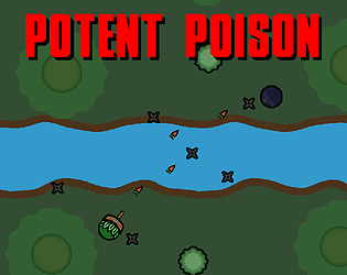
This was a very well designed and polished experience. You took a very simple concept of brewing poisons, and used it as a catalyst (get it?) for fun storytelling and worldbuilding.
First I want to talk about the art. While I'm not exactly sure how much you made yourself compared to how much was external assets, the end result is a very well put together environments with lots of details. The undead castle vibes fit the game very well, and all the interactable objects pretty much explain themselves.
In addition I really like the layout of the room. Its a fairly small area that makes good use of all the space. Nothing feels to far away, and the simple design means its easy for a new player to memorize.
As for the audio, I think the music here fits decently, giving the game a bit of a magical and fantasy feel. Personally I might have opted for something a bit less upbeat to match the dark environment, but that's more my opinion and not a critique of the game.
On top of that, there was a nice variety of sound effects that really bring the game to life and add some good player feedback when completing certain actions.
Next I want to go into the actual gameplay. The concept of crafting potions is nothing new but I really like how you kept it simple. When making a game like this its easy to increase the scope/complexity and make the brewing process much more complicated. The simplicity here allows the player to focus more on the games fun writing and atmosphere, which is where I think it really shines.
The brewing itself worked well and there were only a few times I had to make some leaps in logic I wasn't totally sure about (Although there was one instance where it wanted me to melt something that could "melt" and the chili and sunflower didn't work. The writing made it seem like those were the right options so I'm not sure if I was missing something).
One minor complaint is that early on it was a bit overwhelming, since I felt like I needed to read through the whole ingredient list each time I made a poison. I think this could have been alleviated a bit if only half the ingredients were available at the start, and then you unlocked the rest later once you already understood the first half.
As for the writing, I really liked how you would build little stories across multiple potions. It made it feel like I was in a connected world and not just filling out random orders. Knowing there's more stories to see made for good motivation to keep playing and creating poisons.
Unfortunately there were a couple issues I ran into. These don't necessarily impact the experience much, but they are noticeable. First I realized that movement was based on the exact direction I was looking. Meaning when looking up/down I would go slower (and not move at all when looking straight up/down). This was very unusual, and made me keep thinking about my camera placement to move as fast as possible.
And just to touch on the movement a little more, I think the speed was ok, but in instances where I had to go across the room I did find myself checking if there was a "sprint" button. Something like holding shift to move quicker could have been a nice quality of life option.
One other issue I ran into was the camera movement changing based on framerate (at least I think that's what was happening). I could tell my sensitivity would change if I was standing in certain spots. Whenever I went by the portal or the bones in the wall, the game would run really slowly and my camera would zip around. I'm not on a slow computer so I would have larger concerns on other machines. Even still this caused me to try and avoid walls when walking around the room so that the game wouldn't freak out (Let me know if this is a known issue, or if it was exclusive to me).
Overall, this was a fun time and an impressive entry for a one week jam. I apologize if this review was a bit much, but I'm doing this to all the games from this jam as I think critiques help us grow.
This was a very simple but polished experience with some great atmosphere. The concept takes the theme in it's most literal form and makes something interesting out of it.
First I want to talk about the art. While there isn't a huge variety of sprites, the ones that are here are executed well and do a great job of building a coherent aesthetic. The black background and purple line art make a very relaxed abstract environment which works well within the context of the game. Everything is very clear and there are no assets that don't match, which is a nice bonus.
As for the audio, the song that plays fits really well and continues to build on the already great vibes. In addition I really like how you shift the pitch/speed when you take damage. It makes it clear I made a mistake, and the speed up adds good tension. Although, I do think some basic sound effects could have helped make the game feel a bit more complete. Something like when you add poison, drink, and so on could have helped with clarity.
Last I want to go into the actual gameplay. I think the little story elements do a great job of easing the player into the game, and giving a reason for the player to want to move forward. In addition, was glad to see this game had a very intuitive tutorial (something many jam games are missing). Otherwise I think a game like this would feel a bit unclear to a new player.
With all that being said while I do find the actual gameplay interesting, it did feel very luck based (Which isn't always a bad thing). Fortunately the checkpoint system makes death a lot less punishing when you do lose. I did notice the AI wouldn't pick ones they poisoned (at least in my playthroughs), which gave the game a bit more strategy. And the addition of purify and swap certainly added more depth to later stages.
In addition, I liked that you added the notes page so that I didn't have to memorize everything that happened. Having the notes allowed me to look back and make strategic decisions, rather than hoping I remembered something from earlier.
One complaint I had about the gameplay was how slow all the actions were, especially since many had no animation or sounds. I get that it's simulating time for the AI to think and things to happen, but it made the game feel a bit more clunky since I couldn't take my action even though nothing was happening.
Another issue I had was that I couldn't always tell what the AI did without checking notes once the purify and swap were added. At first I didn't even realize I could check, so I was just assuming they could only poison. (This may have been something I missed, and if that's the case then my bad)
Overall this was a charming entry and a fun experience. I apologize if this review was a bit much, but I'm doing this to all the games from this jam as I think critiques help us grow.
A faithful sequel to the original. It does a good job of fitting all the traditional J-rpg battle mechanics into a nice battle gauntlet.
First I want to talk about the art. Its a little rough around the edges and some UI pieces don't quite fit the art style. That being said the focus of the game is on the characters and they all fit very nicely together and have that old school flash look to them which works well here. And even when some characters were partly reused, they would have some sort of change to keep them unique, so I have no issue with it.
As for the audio, I think the music fit very well and didn't feel to repetitive. Due to the "retro" gameplay the lack of sound effects isn't as noticeable, but I do think some sound effects could have helped make the game feel a bit more alive. Just some simple attack and hurt effects that would play when you do certain actions.
Last I want to go into the actual gameplay. While it took me a few attempts to really get some progress, once I understood the game and had a strategy it was fun for awhile. I like how every button served a purpose and felt actually useful (except the "Win" button. I assume it did nothing the whole game, but if I missed some secret oh well).
At first I was skeptical if the "-1" in a stat really had much impact on gameplay, but eventually I realized how big of a difference the one point made over time. It made finding the right stat to nerf a fun puzzle, but once I figured it out it was pretty straightforward.
The games balance was a bit on the hard side, but it had a good pace and didn't ever feel impossible. You also showed a good amount of information to the player, which helped us make decisions rather than guessing at random each fight. And while it's not a huge issue, I do wish I could see the strength stat of an enemy to estimate how hard they would hit. Some fights would end with me getting 2 shot from full health the first time I saw an enemy because I didn't realize they would hit much harder than others at similar stages.
My only major complaint with the gameplay is that it drags on a for to long. The gameplay is fun, but not deep enough for the number of fights. Enemy's don't have unique mechanics or attacks that keep each battle fresh. And the lack of any checkpoints makes death very punishing once I get far in. I was hoping to see if there was something at the end, but after losing to the computer virus enemy I just couldn't bring myself to grind up to that point again.
Overall I think this is a solid entry and fairly complete J-rpg battle simulator. I apologize if this review was a bit much, but I'm doing this to all the games from this jam as I think critiques help us grow.
A top down horde shooter feels like a game every developer makes at some point, but I like how you incorporated the jams theme to add a bit more complexity to what is usually a very classic arcade style game.
First I want to talk about the art. Its all very functional and does a pretty good job explaining itself. That being said I would recommend keeping your UI in the same style as the games art. Mixing pixel art and standard art is usually a bad practice. I'm not as familiar with game maker but most engines have an easy way to swap a font out for something from https://www.dafont.com/ (Just make sure any fonts you grab are a free to use license).
As for the actual characters themselves I like how they look and move. And the little splash effect from bullets hitting things makes it feel a lot better when shooting. I also really like the little guys you used in the Itch thumbnail, but I wish they were in the game somewhere (Maybe the character select screen above each of the players options?).
Unfortunately the lack of audio does hinder the experience. Just adding some looping background music to give the game a bit more excitement could go a long way. If you're not somebody who likes to make music I recommend looking at Kevin MacLeod's library (https://incompetech.com/music/royalty-free/music.html). There is free to use music for just about any game you will ever make.
Last I want to go into the actual gameplay. I didn't run into any issues or bugs, and everything worked how I would expect. The player did feel a little fast for the small environment and would sometimes get stuck on walls, but once I knew to look out for that it wasn't a concern.
There was a large variety of buffs/nerfs that meant even with 6 options each round I would still get new options often. Balance felt fairly good for each of them and difficulty ramped up at a good pace.
Overall it's a fun little endless shooter with an interesting twist. I apologize if this review was a bit much, but I'm doing this to all the games from this jam as I think critiques help us grow
The Crypt of Severus(Jam Version) jam comments · Posted in The Crypt of Severus(Jam Version) jam comments
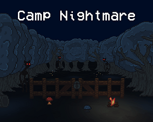
This game has a clear goal, great atmosphere, and a great amount of polish.
First I want to talk about the art. I think the art is really well done and everything fits together well. The sprites are well animated and everything feels pretty alive. Also, URP is also a great addition to any 2d game. I did notice that some of the walls didn't stand out well against the floor which was a bit annoying, but once I knew to look out for it I was fine. Overall I like the variety, and it builds a great settings.
Next I want to go over the audio. The music's a great fit and creates a spooky but exciting feeling. The sound effects were simple but clearly convey what's going on. The silence on the title and during the intro are a bit off putting, but not a huge deal.
Last I want to go into the actual gameplay. I think the intro is nice touch (but be aware that wall of text will usually be skipped over). The calm beginning the introduce the player to your game is nice, and the variety of tools I got access to was cool to see. Although, I wasn't a big fan of the controls, and found myself just holding shift most of the time (It was also annoying to try and open a chest, but accidently use an item as well.). There's a lot of keys on the keyboard, don't be afraid to use them.
Additionally, while I like the concept of the traps, they run out fast and are tedious to use correctly. This often leads to me just punching things slowly to death.
One last thing to note was with the movement. It felt a bit slippery overall, and the player "jumps" when changing directions or going from stopped to moving, which caused me to get stuck on walls or bump into enemies on accident.
Overall, this game was very charming and one of the most polished entries. Cant wait to see what you all make next. (As usual) I apologize if this review was a bit much, but I'm doing this to all the games from this jam as I think critiques help us grow.
This is a cute game with a lot of charm and has a seemingly endless list of mechanics, but I can't help but feel like the scope creep may have gotten in the way of polish.
First I'd like to talk about the art... there are certainly some boxes on screen... and that default unity blue background... really? But hey, I could tell what the point of everything is. The claw is a claw, the circles look like I can grab them, and I know an angry birds pig tower when I see one. And also, the visual of changing screens is pretty clean.
Next I would like to go over the audio...
Last I want to go into the actual gameplay. I think the concept of this game sounds a bit rough to implement, but you actually got it (mostly) working as intended. I do feel that the overall speed of things could have gone quicker (grabbing especially), and that it is hard to actually pull off a grab and throw successfully. But, when you do pull it off, it is satisfying to see the building fall apart.
Overall, While I think its clear this was constrained by time, its a fun little proof of concept. (As usual) I apologize if this review was a bit much, but I'm doing this to all the games from this jam as I think critiques help us grow.
This is a cute game with a lot of charm and has a seemingly endless list of mechanics, but I can't help but feel like the scope creep may have gotten in the way of polish.
First I want to talk about the art. I've always liked the "hand drawn" look and I think it works well here with the simple animations and little movements everything has. I like the bright colors, and the day night cycle has a noticeable but not obnoxious effect on the look of the game. I also really like the style of the upgrade screen, with the scrolling effect and general charm of it.
That being said, I think there's a few to many visual bugs that get in the way of the art and make it hard to appreciate. For example the upgrade screen looks great, but it doesnt fill the whole menu, and it took awhile to realize I could scroll. Also the tiling of the floor (and being able to see off the map at edges), makes the game feel a bit unfinished.
Next I want to go over the audio. The music's nothing crazy but fits the overall vibe of your game pretty well. I think a bit of variety could help, but in a jam you only have so much time. The sound effects are also quite basic, but they do enough to inform the player of what is happening.
Last I want to go into the actual gameplay. I really like the intro and end scenes. They make the game feel more alive and give a reason to play. The controls are simple and are explained well, but I did notice that the players movement feels clunky (The circle keeps moving after I let go of the key).
In addition, I'm really impressed by the enemy variety and number of options in the upgrade menu. It makes the game much more repayable, and makes my actions feel more meaningful. Although, I did feel like even though there was a variety of enemies to fight, they all felt very similar to fight. Using 1 or 2 of those enemies as bigger mandatory bosses throughout the game could have helped give some variety to the combat.
Overall, I think this was a great entry with a lot of fun little details. Cant wait to see what you all make next. (As usual) I apologize if this review was a bit much, but I'm doing this to all the games from this jam as I think critiques help us grow.
As always, you've made a very charming and goofy game with a unique look and feel.
First I want to talk about the art. I like the mix of 3d and 2d elements to create a very unique look, while somehow managing to keep the games visuals cohesive through the use of bright colors and random patterns. In addition, the cutscenes and little details add a lot to the the visual appeal of the game (like the cups face while fishing changing).
Next I want to go over the audio. The music is quite strange and the sound effects are abstract, but all of it is fitting with your visuals and still enjoyable to listen to. There's nothing that stands out as "wrong" or unpleasant.
Last I want to go into the actual gameplay. To start, I'm glad you had some visuals to indicate the controls, and they are fairly simple, but it did take me a moment to realize I could hit space to flip them (this wasn't really much of an inconvenience, but if somebody were to completely miss that it would impact them quite a bit. So just make sure controls are always clear).
In addition, I think the block dropping game style somehow fits with the wacky style your game has, and is a well proven fun game style. I like your use of it, and its carried out fairly well here. My only complain is that by making it so I only have to clear some vertical lines, it leads to me kinda just waiting for the right piece to clear the line I want, and dumping everything else in slots I don't care about (not game ruining by any means, but it took away from some of the depth block droppers usually have).
Overall, another great entry from you, and I always look forward to seeing what you will submit next!ogize if this review was a bit much, but I'm doing this to all the games from this jam as I think critiques help us grow.
This was a fairly simple but polished arcade style game.
First I want to talk about the art. I think the art style for this game is actual quite a clean look. Even though its just black and white with simple pixel art, the particles and cohesive look make the game feel aesthetically pleasing to look at.
Next I want to go over the audio. I think the song is an ok fit for the game (maybe it could have felt more "wintery", but that's just me being nitpicky), but the incredibly short length of the song causes it to loop a lot. This gets annoying pretty fast, especially considering the already simplistic and endless gameplay. As for the sound effects there aren't many needed for this game. I only notice the abstract "hurt" sound when you take damage, which works well enough considering the art style of the game.
Last I want to go into the actual gameplay. I want to start by thanking you for putting your controls in your games somewhere. While the controls are incredibly basic, its very important to tell the player, and that's something a lot of people missed in this jam so good job.
For the actual game loop, I think you do a good job of initially ramping the speed of the snow (At least I'm pretty sure they speed up?), which makes the difficulty feel pretty good. That being said I think you cap the speed a bit early, making it pretty easy to carry on the game forever, which turns the "highscore" into a game of patience instead of skill.
Also, I noticed its easy to camp the top left corner, making it so no snow will hit you (there than when you are big enough to survive a hit). This could easily be fixed by allowing snow to go a bit higher (Or if it is actually possible to get hit there while small and I'm just lucky, ramping up the snows speed and spawn rate more would have also worked).
Overall, this was a charming little game that excels in its simple but appealing visuals. Cant wait to see what you do next! I apologize if this review was a bit much, but I'm doing this to all the games from this jam as I think critiques help us grow.
This game was a very complete and polished. with a handful of little details that make it an enjoyable experience (But that won't stop me from telling you everything I don't like).
First I want to talk about the art. I think your style for this game is very simplistic and cute which works well. You also do a good job of keeping your pixel density consistent which is a pretty big deal when trying to make a consistent look with pixel art (Other than the bullets which are scaled down ruining their pixel density relative to other stuff, but they are moving and nobody would ever notice that detail so I'll let it slide).
One thing I will say regarding the consistency/cohesion of the art in this game is that the characters stick out just a bit to much compared to the background. The characters have shading (which seams to swap between gradient (like on the slime) and linear (like on the square robot)) and a bold outline while the environment has none of that, causes them to conflict a bit with each other. This could be made better if the grass and trees had an outline (probably just a colored outline), and if the trees had shading similar to the characters.
I also noticed a few visual bugs, but they are very minor. Some of the water seems to not be animated, I noticed this in the first level but I'm not sure if it happens elsewhere. Also, the player seems to jitter while moving, making them feel less smooth. This is most likely caused by the players rigidbody2D not having interpolate mode set to "interpolate".
On a positive note, I like the small details you added to your game such as the flower on the player, the way the title changes after winning, and the smooth transition between scenes. Things like this do a lot to make the game feel more polished and complete.
Also, this isn't necessarily an issue, but I think giving your characters an animation (even if its just a second frame they loop between) could go a long way in making them all feel more alive. They are ok as they are now, there's just some missed potential when using the static art style.
Lastly regarding art, I notice that once the game starts there is text above some of the slimes head. Because your game is in a pixel art style, the non-pixel art font stands out quite a bit from the rest of the game. There are lots of pixel fonts that are still easily readable, so I would suggest you use one of those instead to keep a more cohesive look to your game.
Next I want to go over the audio. While there isn't a huge variety, what is in the game fits well. I think the music is a great fit for this game. Not to slow or fast, and fits the cheery vibe you have going. In addition, the shooting sounds from both the player and enemies fit pretty good, although they are a bit quiet compared to the music. I do think that having sound effects for killing enemies, dying, winning a level, etc. would make the game feel more alive, but overall the audio works well enough.
Last I want to go into the actual gameplay. I think you chose a pretty straight forward genre and carried it out quite well. In addition all of the levels are designed very well, with enemies being introduced at good intervals. Overall the levels feel natural and fun to go through.
Unfortunately there's a couple major issues with the gameplay that hurt the overall experience quite a bit for me. The first one being how you used the theme for this jam. I think the idea of using health as the ammo for your attacks works well on paper, but in reality it leads to a lot of downtime where all you can do is wait for your health to regen so you can keep shooting. This, combined with the fact that most enemies aren't a threat when you have cover, means that almost all encounters are won by simply waiting until you have enough health to one-shot your enemy, causing most gameplay to involve just sitting still (or dodging very basic enemy patterns). I know you were trying to force me to balance health and damage, but I felt like I was balancing damage and patience.
^This section comes off as really harsh, but the feature doesn't ruin the game or anything. I just think its a feature that doesn't make the game more fun, meaning it is probably unnecessary.
The other issue I have with the gameplay is that you drag the game out for longer than necessary. While having a long game isn't bad in its own right, currently, you don't add many new features to keep the player engaged (the new enemies are good, but not enough to keep the game feeling fresh).
Overall, this is the best game I've seen from you and you have certainly improved a lot. I hope you enjoyed working on this game, and I can't wait to see what you do next. I apologize if this review was a bit much, but I'm doing this to all the games from this jam as I think critiques help us grow.