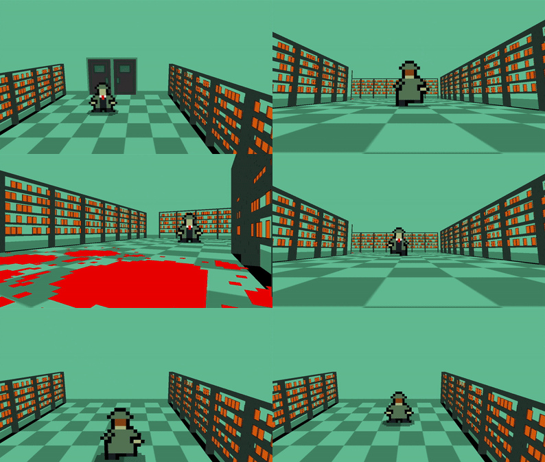
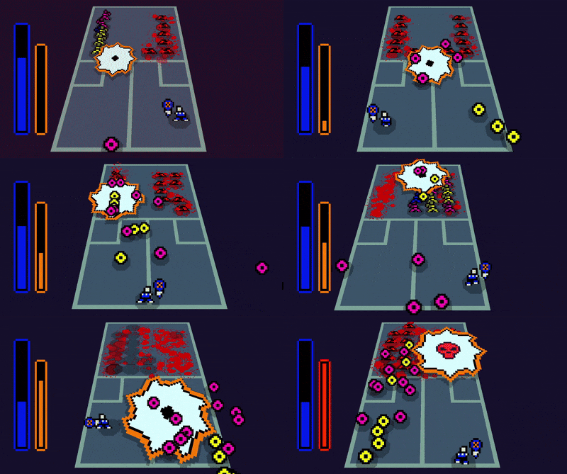
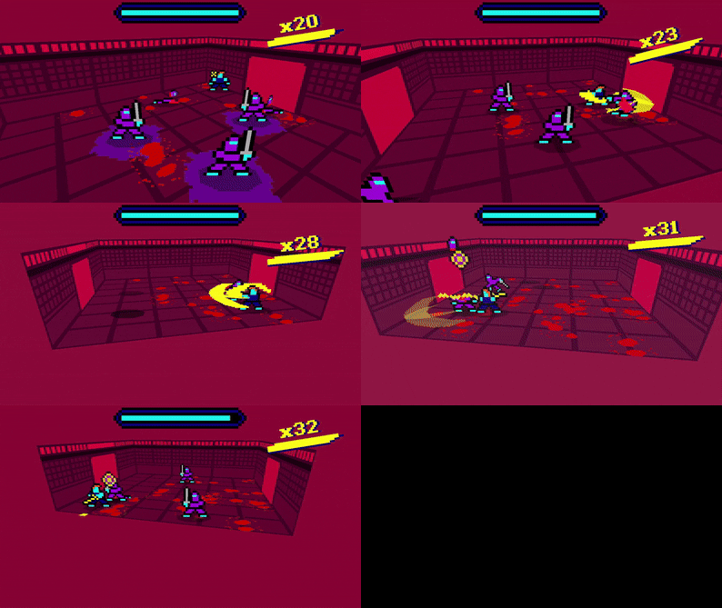
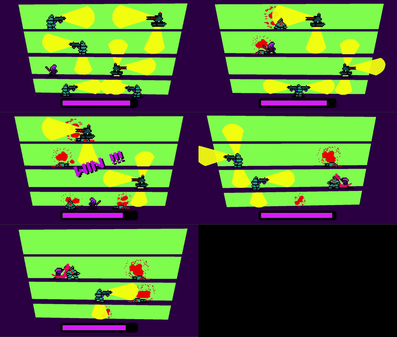
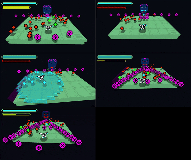
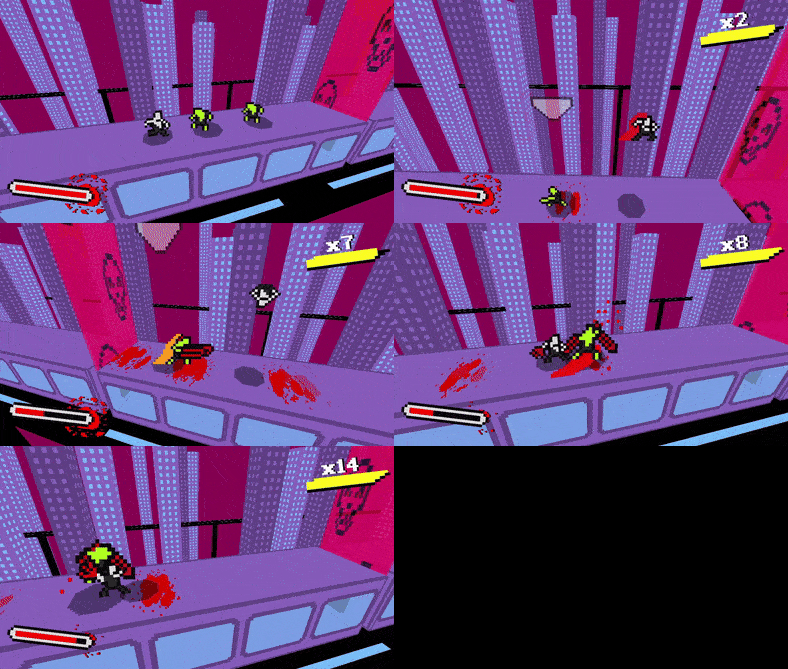
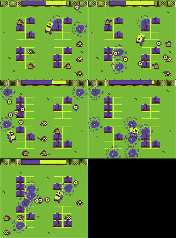
Haven't finished it yet, but I'ma try to. This game is peak
Bad Piggy
Creator of
Recent community posts
Always love to see what you put out. Been a fan ever since I saw Olija and played Abyssonaut in Ludum Dare
The only qualm I have with this is that it becomes pretty hard to tell which spaces that you can actually fit through when you get bigger. That and the game kinda crawls to a halt in terms of performance, but admittedly only towards the end.
Still, cool game all things considered.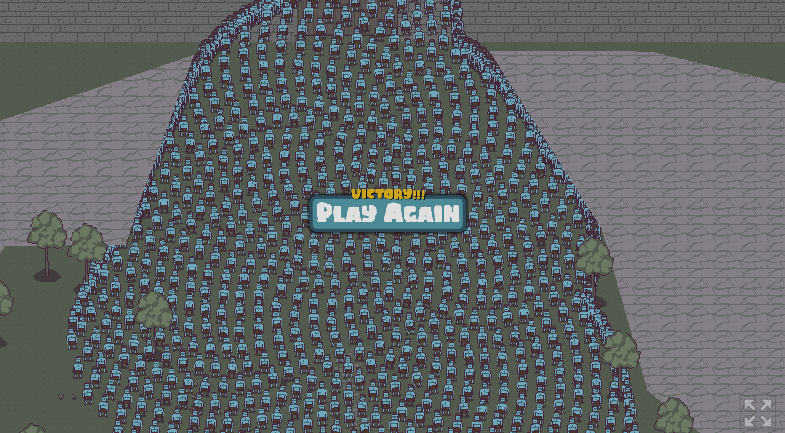
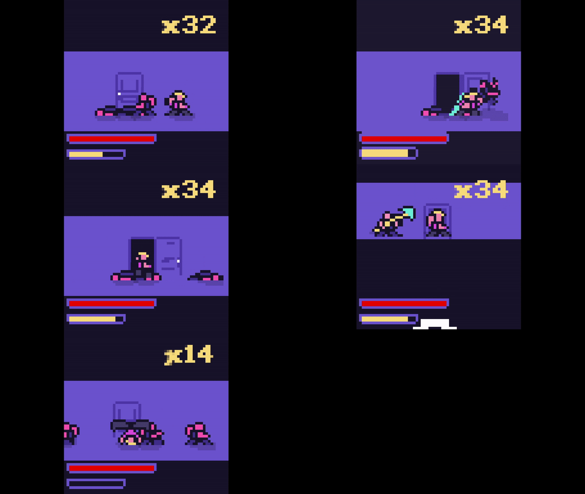
Absolutely loved this. Love how your strategy changes with each enemy type. Everything is also very clear and readable
My only suggestion is that doing damage to other enemies should maybe re-fill your life meter a little faster. Just to incentivise acting quickly as combat gets more intense
Apart from that, extremely solid game

Any chance for a windows download ? Frickin love this game
Reminds me of burnout in the best way possible. Only instead of the relentless aggression of burnout, you're more on the defensive here. Having the option of using your emp and being strategic about where and when you use it is also pretty interesting.
The only piece of feedback I have is that it isn't really as clear as it should be what you're minimum health should be to be able to use your emp. Maybe if it was a different colour when your health is below the limit ? A good number of my deaths were because I thought it was high enough, but the emp didn't happen
Other than though, this is amazing. I kinda want to make something like this now lol. Great stuff
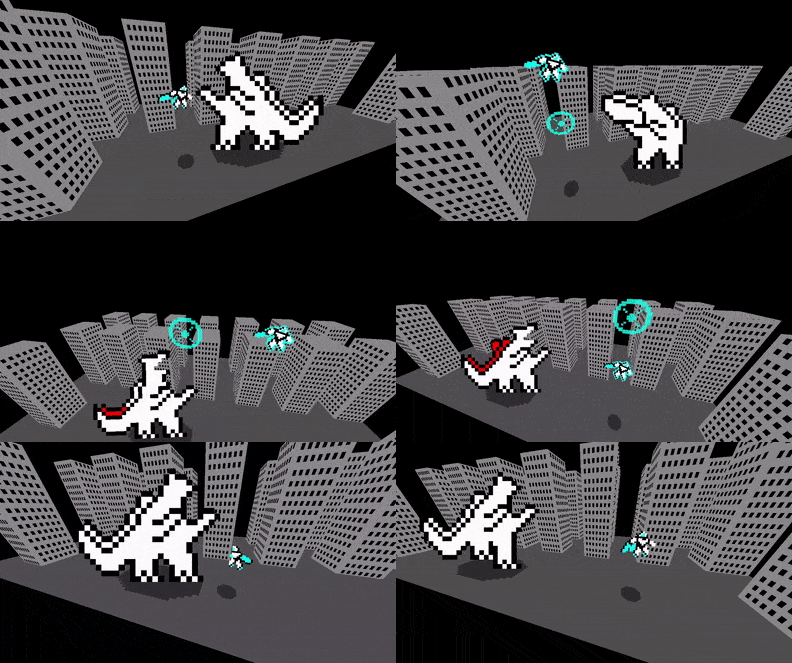
I'm not sure whether that last part was hilarious or scary, but all I know was that it was peak
Honestly, I think my only qualm is that it seemed a little too hard to actually place the mouth in the right place. I ended up taking far more time than I would've because it kept falling off
Other than though, phenomenal presentation. Nothing else to say really.
The max I was able to get to was to that final tower. I tried for like 20-30 mins straight but couldn't do it lol. A shame I couldn't review this before due to that game breaking issue though.
Either way, very cool game once you get a good flow going. I love expansive the environment was. The atmosphere of the game was already pretty great, but the scale of the levels really helped sell it more. On one hand, I think the game does look pretty great with the one texture used everywhere, unfortunately it also meant that a lot of levels felt a little too similar. I got lost pretty damn easily and had to repeat a lot of sections because of this. Might just be a skill issue on my end, but I think having more noticeable landmarks or smaller objects around could've helped with getting my bearings with each segment of the world.
I'm also not entirely sure how to feel about the knife jump tbh. At it's best, it feels fluid as all hell launching yourself from walls, the floor, angled walls and then catching rings ( very shady knight-esque btw ) and also launching yourself towards those orange pickups. The vault for short platforms was also smooth as hell ( also very shady knight-esque lol ). However, there were also multiple times where I was just not sure how exactly I'm supposed to use the knife jump since it doesn't seem to launch me much. There were a few places ( primarily towards the end of the game, or atleast what I'm assuming is the end ) where it felt like I was using the knife less to launch myself, and more to just kinda keep myself in the air. My issue with this is that even trying to look downwards and push yourself upwards from a wall doesn't do much. Maybe it's just a gigantic skill issue on my part, but I think this could've used some tuning.
Frankly, all of my issues with this game could probably just be skill issues, especially since I couldn't finish that final climb lol. No matter because it doesn't take away that this is still a great game none the less. It's honestly remarkable that you were able to finish this within the time of the jam.
Kudos to you and Noom
Very well made platformer. Loved the overall presentation, especially the octopus. If I had to hazard a guess, I'd say the head is a cube which is really the only thing that's animated, whereas the tentacles are physics joints ? None the less, it looked adorable and felt squishy in a good way. Also love the overall look of the level. It felt grungey in an industrial way, but not necessarily all that dirty or grimey. Definitely aided with the adorable tone of the game.
At first I thought having camera control would be a bit clunky for a 3D platformer, and my thoughts didn't really change since I died a few times because of it due to how my depth perception got a little screwed. However, I grew to appreciate having camera control the more I played. All I needed to do was aim a little differently during each part of the level. Some sections were more easier navigated when I tried a top-down view, some were more easily navigated when I went for a side view and so on. As the game went on, I liked the depth associated with needing to position the camera myself to ensure that my jumps were more precise.
The only thing that I'm not really a fan of is how some sections really required you to jump onto the yellow railings. That felt a bit awkward, especially with how thin the yellow railings were. Or maybe there was another way and I missed it, in which case I take this back, but if that was the intended solution for some of those cases, then I think maybe the railings could've been made slightly more wider.
But that aside, platforming felt fluid and fun. The variety of obstacles and platforming puzzles had the right amount of difficulty to them, and the way you kept upping the challenge with each one felt pretty well paced. All of this also helped ensure that even if I did die, there was only so much ground I had to cover again, but it was also engaging ground to cover again. That really helped the game remain fun even though you start from the beginning.
All in all, I'd say you made a really well polished and awesome entry here. Great stuff
I think I almost made it to the end by just letting the wind carry me at level 10 lol. It also caught me off guard when the wind blew me towards the left lol. Unfortunately, I admittedly couldn't make it to the end no matter how I tried. Definitely more of a skill issue on my side than anything else though.
I'm usually not one for rage games, but I do think this game is very interesting as one. I love how the level had multiple paths, allowing me to either try different paths or combine them in unintentional ways when the wind allows you to jump higher lol.
I also think the obstacles in the level were paced pretty well i.e going from simple and straightforward platforms to more narrower and smaller platforms which required a little more precision. I also love that the acorns were placed in some pretty dastardly places. Honestly speaking, I have no real issues with this game, since it succeeds pretty well at being a rage game ( even though I was laughing more than I was getting angry ).
Good stuff for your first game jam
When the game said that it was going to crash in the end, I thought it meant that the game was just going to close. But no, it really crashed in the end with an actual crash log as well
PEAK
Anyway, solid game right here. I love how the aim was to effectively master the inherit impreciseness of being a pinball, and try to precisely shoot other enemies. At first I was kinda stumbling through the game getting hit and barely landing shots on the other enemies. As a result I was going into every level with very few hearts.
I thought I'd replay the game and this time around I'd change my strategy. Rather than trying to kill each enemy at a time, I mostly kept myself moving all over the place landing shots whenever I could on whichever enemy was close enough to me. Ended up with a lot more hearts this time around in each subsequent level. I appreciate that the game holds you accountable and asks you to really try to learn how to play it.
That said, I thought the spritework for the duck made aiming a little hard. It's not that the spritework is bad or anything. On the contrary it's very good and adorable ( applies to the other enemies as well ). It's just that the game kinda requires you to be fairly precise at times while shooting, and so I felt the directional sprites weren't as helpful as they could have been at indicating which direction you were going to shoot in. This is because there were only a few directions that the duck's sprites would actually look in. Maybe there could have been some sort of aiming reticle or something next to the duck which rotates towards the direction that you're actually going to shoot in ? Something like the prototype in this video maybe ?
It's probably just a skill issue and the change I suggested may result in a different type of game, but I felt it was worth noting. Also there was a bug where I got yeeted through and into the wall and couldn't move from there.
Another issue I had was that with how fast you move at times, it's a little hard to tell if the enemies actually died or not. Again, not that the animations are bad or anything, just that it's hard to tell sometimes when you're moving at the speed of an F-22 lol. Maybe for the sake of readability, enemies when dead change their colour or something ? Or maybe a more visible effect could be spawned at their position, or a more distinct audio cue. Just a suggestion of course.
The final boss was a pretty cool test of everything so far. Smart usage of enemies along the sides of the environment as well to ensure that you couldn't just mindlessly bounce around in that fight. Honestly, this was a pretty solid game overall and a cool execution of this idea. Kudos to the whole team on this one
( side note : When I first heard " Quack overdose ", I thought that they died because they blew out their voicebox by quacking too hard or something. The don helped me realise what " quack " actually meant in this case lol )
Always love seeing 2D and 3D mixed. The presentation as a whole here was great. The visuals in general were pleasing to look at, and the audio was cool with hilarious voice acting. That said, I thought some voice lines repeated a little too often.
The swing mechanic combined with dashing all felt good to use and toy around with in the levels.
Honestly speaking, I don't really have any issues with what's currently here. I would've liked to see more, but I think you did the right decision in polishing what was already there. Good stuff all things considered.
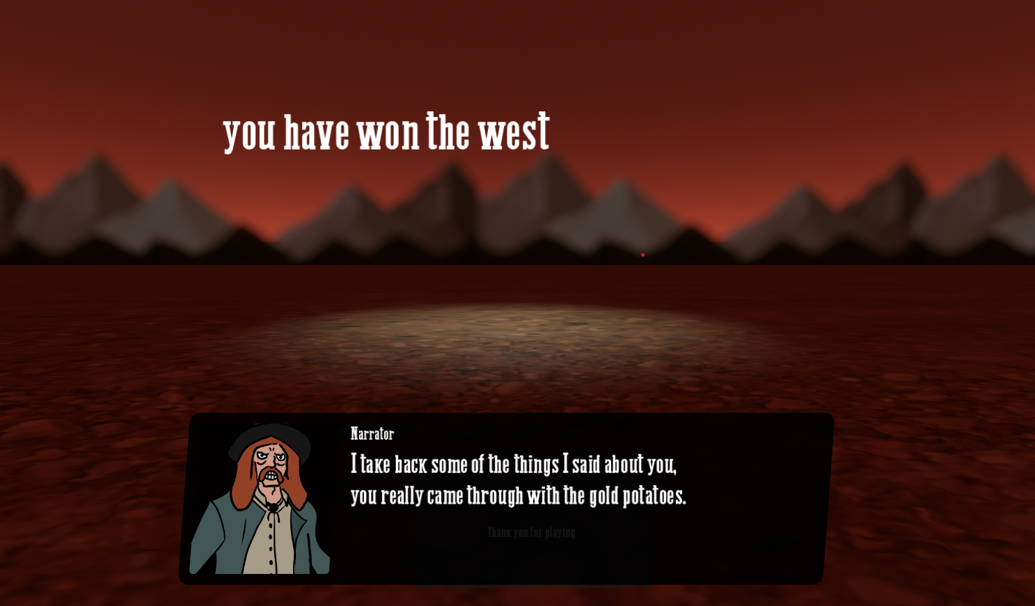
I love how some random enemy is named " Rattlesnake Jake " but the actual snake boss which is basically Jake from Rango is named something else.
PEAK
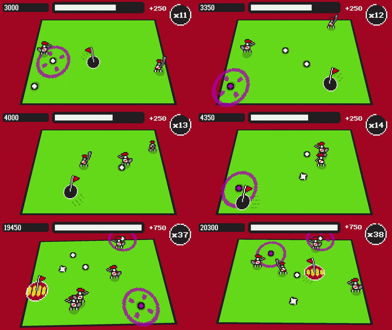
As someone who's not that into card games, I have to say that this was an extremely interesting take on a deckbuilder. Atleast as far as I know, I've never seen anything like this. I love how the game really requires quick thinking and improvisation. I know most deckbuilders also require that sort of thing, but the added element of needing to shoot cards as fast as you can definitely adds another layer of strategy here.
I also love how the order in which you shoot the cards matters.
i.e If you're shooting a blue card, you really need to shoot it either first or maybe in between, whereas there wouldn't really any point to shooting it last.
One major issue I had was that I didn't really need to change my strategy much when it came to the various encounters. I usually always shot the blue armour cards first and then went for damage, only occasionally going for health if required. I'm also not entirely sure if this was intended, but there were a number of times where some cards effectively spawned on top of other cards, almost to the point that I couldn't really shoot them
The horse section definitely seemed and felt unfinished, but I'll let that be since it seems more like a product of overscoping than anything else. Though I wasn't exactly sure what the tumbleweeds were doing since they didn't seem to take from my health.
All that said, I'd say y'all definitely made something cool here. Great work and kudos to the whole team.
As much as I would like to give feedback for this, the fact is that y'all were aiming to make something that was dumb fun, and I say you nailed it.
Great presentation overall with lots of little touches like the cracked glass on the phone and package cam. About the only issue I have is that it felt like it was a bit random at times what actually caused the package to take damage.
I think my favourite moment in the game was when I was actually driving pretty carefully to the next point with a completely green healthbar for the package, and then my car flipped and did a 720 and the package got completely destroyed. After which I just said " screw it " and stepped on the gas breaking every other package.
PEAK
Kudos to the whole team on this one
First of all, is it possible to get a downloadable windows build after the jam ? I kinda want to play this offline
Anyway it took me a few tries to really get how to play this, but I have to say that I really enjoyed the hell out of this when I finally got it. This is an extremely stylish and charming game with a solid amount of depth to it's mechanics as well. The overall presentation was great. Audio was cool and the art was honestly sublime. I love how immediately readable everything was with how fast the game could get.
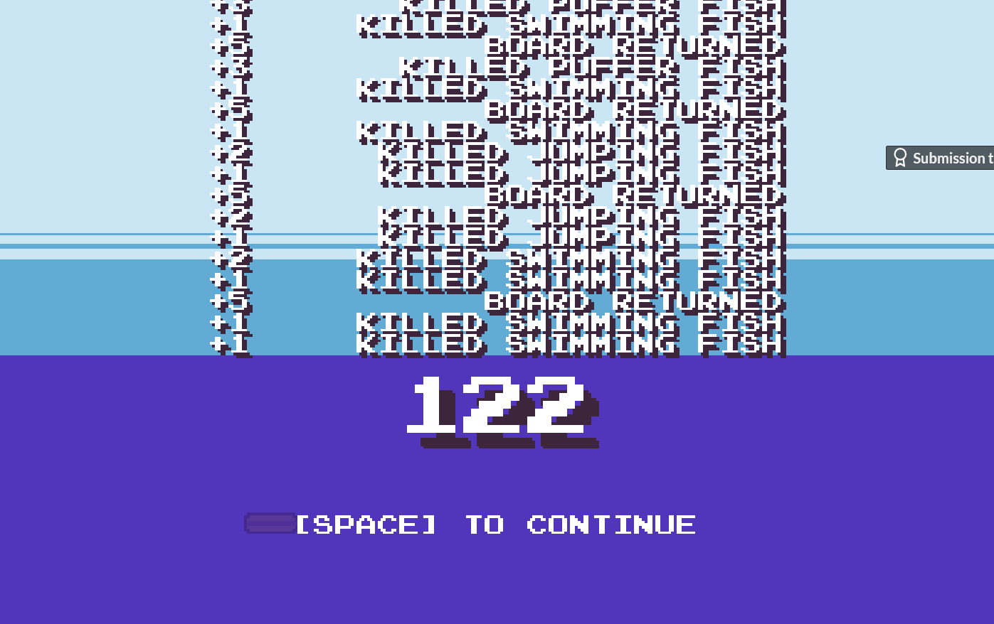
The feel of the game was also great. Killing the fish always felt good because of the feedback. That said, I do kinda wish that killing the different types of fish led to different actions happening. Something like the pufferfish exploding. I don't think I ever got any seagulls, so I take it back if I maybe missed something. ( Unless something does happen, but if so then it wasn't all that noticable ). I also love the little screenshake while swimming to get your board. It made it feel even more frantic lol.
I wasn't really a fan of the board's targetting so to speak for when it tried chaining fish. There were numerous times where it effectively missed and left me stranded for something which wasn't really my fault. This by itself isn't that big of an issue, but it can kinda compound when you have fish blocking you and the waves catching up. Maybe this is just a skill issue, but I thought it was worth pointing out.
Another thing which I'm not really sure is an issue or not is the fact that you can kinda just go on forever without actually hitting a fish. Maybe to compensate the number of fish increases as you go on or something which blocks your path maybe ? Maybe more humans spawn or maybe you could have a timer which gets replenished when you hit fish in general ? But then again you already have the waves. I'm not really sure how to fix this all things considered. Especially since the waves also become less of a threat the further you go.
All that aside though, this is a great little arcade game. Really fun stuff
Very interesting platformer here with some charming presentation to match. Those cutscenes were definitely hilarious.
I love the player mechanics and how you made use of them in the various levels. I think the way you taught things to the player and the pace at which you did it was honestly pretty damn good. I do think some of the puzzles got a little repetitive though with how a lot of them came down to throwing your sword and turning around so that the door opened. It felt like the game could've used atleast one more type of puzzle obstacle.
On that note, I still think you could do a lot with this game's mechanics. Pardon my dev fan-fiction, but I can already see the game having special walls that you need to throw the sword into, after which it reflects and becomes stronger and breaks down a door or something ( maybe it even hurts you as well if it touches you in this state and so you need to jump to dodge it ). Honestly, just thinking about this makes me want to make something like it more and more lol. That said, I think the colliders on the spikes could've been made a little smaller.
Player mechanics aside, I love how minimalistic the visuals were in general. The game looked and felt clean. That said, I thought the game demanded a little too much precision at times for what the player could do. I'm referring primarily to the short ranged sword throw and the mace and how I was never really sure where exactly they were going to land. Maybe just a skill issue on my side, but I felt it was something worth noting.
The boss also felt slightly underdeveloped which left somewhat a sour taste, but it's the only real issue I had with the game to be frank and doesn't take away the fact that I felt that the rest of the game was pretty damn great. I did love how you allowed the player to use both the sword and the mace though. It allowed me to sort of combo hit the boss a bit.
All in all, I think you made a pretty damn good game here. Very solid work
I could add a particle effect for when you shoot. That would definitely help ensure the direction is in one's mind
Apologies for the camera sensitivity. I don't know what it is about the web build, but the sensitivity is always off there no matter how I tune it. Along with that I didn't really have time to add a slider, so that issue is still present in the desktop version as well
Still, thanks for playing and for the feedback :)
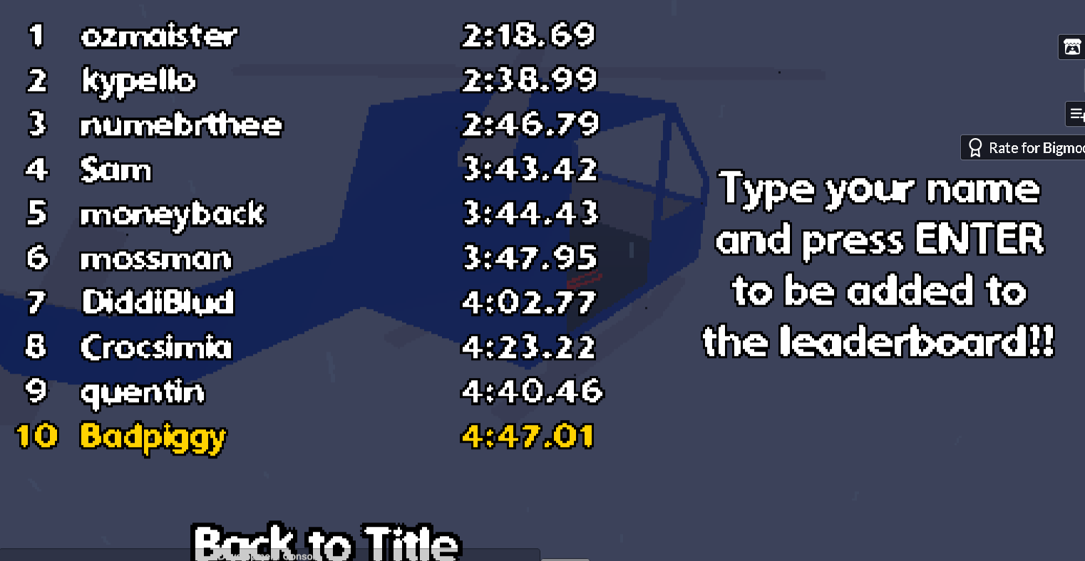
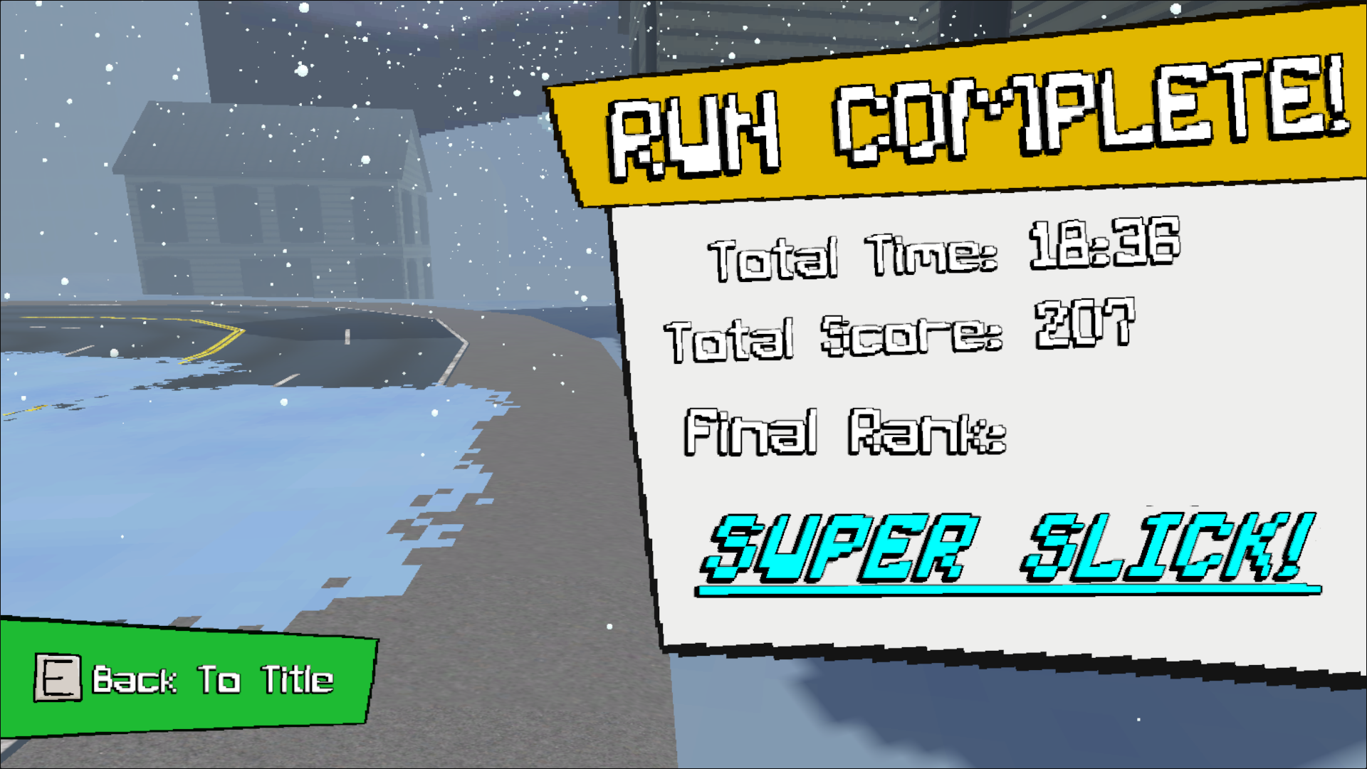
I want to say something besides the fact that this game feels slick, but the truth is that " slick " really is the best description of the style of this game. Incredibly satisfying movement when you chain kills together, and the slow-mo definitely aided with how fast you could get.
The presentation was also pretty cool. Loved the steampunk look and the overall atmosphere of the game. The environments felt like they had the right amount of detail so to speak. I also love the layouts of the levels. It's great that each one felt unique, both in terms of the actual layout and the flow of the level
( i.e the first non-tutorial level is pretty vertical, the third level is a giant slide etc. )
I love how well the enemies contrast with the environments. It enabled them to be visible and readable even from far away which definitely helps with the type of game this is. Unfortunately, this is also where one of my main issues with the game arises, namely the fact that many times I tried shooting enemies ( point blank sometimes ) resulted in nothing happening. Not sure if this was a skill issue, or maybe due to the game lagging somewhat on my potato, but I still think it's worth noting.
This issue also kinda bled into causing another issue, which was that enemies don't get instantly killed during slow-mo. I'm guessing the aim was to go for more of a max payne-styled slow-mo kill ? It's still pretty satisfying to kill enemies this way, but due to the above issue, there were many times where I thought I missed an enemy only for them to die a bit later.
On another note, I love the sway of the player's hands and the sound of the player's steps while moving. It really sold the weight of the player well. Part of me does think that the actions of the player could've had more weight to them, like the slide and the downwards dash ( especially since I couldn't really tell the difference between falling normally and using the downward dash ), but I'd say it works well enough all things considered.
All in all, I think you guys made a pretty damn good game here. Kudos to the whole team
Absolute Ratcinema
Memes aside, I love the dirty and dilapidated presentation of the game. Everything felt grungey in a good way. Also love the character designs in general
Been a while since I played a skateboarding game, but I think this is very solid for a week's worth of work, though it definitely needs some tuning. Pulling off tricks like ollies were doable and fun, but the bars to indicate rail grinding and doing a mono didn't really show how close you were to falling off well imo. I also thought the UI looked too similar to the one which shows how many tricks you'll be able to do in the air, so sometimes I thought I was doing a trick when I was grinding instead and vice versa.
I realise in the post you mentioned at the bottom of the game's page that you guys added grinding pretty late into development, but I think this is still worth noting none the less for the sake of readability.
I also think some sort of indicator for the timer when it's close to 0 would be helpful.
i.e maybe some sort of sound or music to indicate that you have 10 seconds left or something. Just to ensure that the transition to getting washed away doesn't feel like it just comes out of nowhere ( unless that was your intention )
I also think the child support payments should really increase in cost with each day or session because it got kinda monotonous with the current system. Basically it was pretty easy to afford child support, and fuel slick's gambling addiction. I think you could really do a lot with a gambling skateboarding game, so there's definitely some cool groundwork here.
All in all, this was definitely a pretty interesting game all things considered. Kudos to the whole team on getting this out
First of all, I just wanted to say that " Don't let them in " and " Guns 'n' Stallions " were actually some of the first games I ever played on itch back when I was just starting out with gamedev. They were also part of the inspirations behind the art style I use in my games. I've always loved the crunchy 2.5D style that you use, and I think this game is also another wonderful example of that.
Everything about this game is pretty simple all things considered, but you've done it wonderfully. The presentation in general is wonderful. Everything about the game looks and sounds wonderful with a boatload of charm to boot. I love the presentation of the bears in general. They were admittedly kinda scary, but I have to say that the whole game did kinda have me laughing more than anything else in general. I also love how the bears moved and acted like quarterbacks in american football. I could never really tell for sure when they'd charge at me and it definitely kept me on my toes.
Speaking of presentation, I love the visual variety in the levels. Each biome definitely looked and felt the part. That said, I think the actual layouts of each level could've used a little more variety. The layouts that were present became a little too noticable after a while with how much they repeated, so much so that my brain kinda went into auto-pilot whenever I recognised one. Admittedly the bears still made things tense none the less, but I still think it's something worth noting.
Another thing worth noting is that I think the shed mechanics are somewhat underdeveloped. I get that the idea was to have players scrounge the shed looking for upgrades, but the problem is that I think the stamina upgrades really should've just been something you gain no matter what anyway. A lot of my deaths were because I got further into the game, but I still had very little stamina since the stamina upgrades didn't really spawn and so the large numbers of bears got me pretty easily. This might just be a skill issue, because you can definitely avoid bears even without stamina, but I think it's worth noting for the sake of balance.
The door upgrades also seemed kinda pointless imo. Mostly since the door is gonna come down quickly anyway because of the amount of bears that start chasing you as you get further into the game.
But all that aside, this is still a relentlessly fun and hilarious game. It always felt good to get near misses on the bears and mantle over logs. Great work on this overall.
This game has some very interesting ideas. So much so that I kinda want to use some of them lol
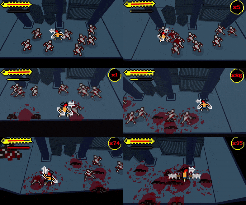
First of all, I love how the tank effectively acts like a brawler character in a beat-em-up so to speak. The fact that you can bash zombies by swinging the gun of the tank is honestly kinda genius, and I do wish that the game leaned into it more. The gun felt inconsistent in it's use though. Sometimes it fired, but sometimes it didn't. I do like how the gun pushes the tank when it fires though. Firing the gun and then effectively YEET-ing myself into the zombies was fun as all hell.
That said, I think the way the game is structured is kind of a detriment to itself. The fact that there isn't any real time limit or anything else that's an immediate or impending threat basically means that you can freely rack up kills on the zombies without any resistance. If the aim was to make more of a speedrunning game, then I guess that's fine, but it's definitely something I feel could've used some tightening in terms of design.
The only things in the game which really felt threatening were the holes you could fall into, especially since there was ice next to them. I think the game could've used more sections/scenarios like that.
Never the less, I think this is still a pretty damn cool game overall. Kudos to the whole team since the game looks, sounds and feels really damn great.
Not going to rate this since it's not really working properly on my potato of a laptop
( But from what I've seen and been told, this is most likely just a problem with my laptop specifically )
I will say that from what I did play, the platforming and mantling felt fluid as heck when it did work. The atmosphere is also incredible. Probably one of the best examples of minimalism used in general
Wish I could play more, but either way, great work on this
Prototype was actually one of my main inspirations behind this game lol. Glad that inspiration shone through.
Hell, the name " Protomous " is basically a riff off of prototype. And yeah, the aim of this game was to basically make sort of a supervillain game if that makes sense
( hence why the player is a computer virus )
Thanks for playing and apologies for the camera issues lol. Didn't have time to add camera sensitivity options unfortunately
Extremely addictive game. Any chance for a windows build after the jam ?
I really love how it's only one track though. Randomisation would've gotten frustrating. This on the other hand is focused on mastery of the controls and it works wonderfully.
I also love the little touches like the way the rain stops when you enter a tunnel. Great execution of a drifting game
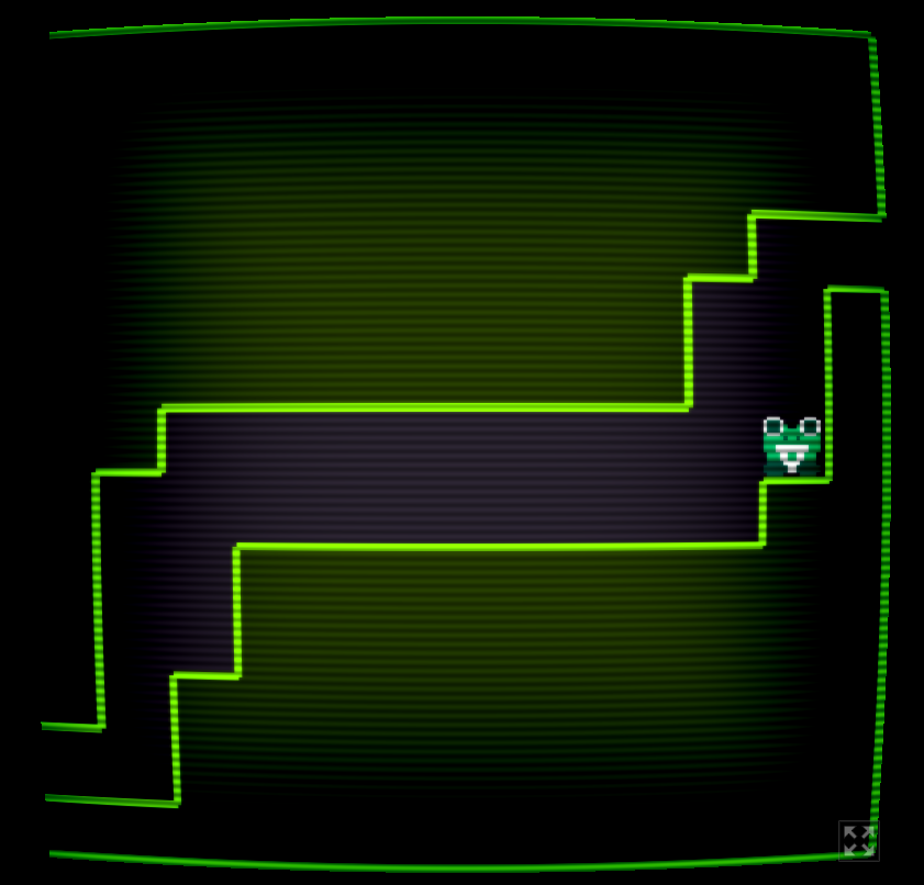
Got softlocked here unfortunately. That aside though, great little game. Has a pretty simple mechanic, but you've made use of it beautifully.
I think the best thing about this game is how well it's paced. New obstacles are added into the fray at a pretty steady pace ( like the flies and the bubble guns ). It's a shame that the game softlocked since the water also seemed like a very cool idea. Effectively acting as sort of a timer.
The presentation is great as well overall. Both the visuals and the audio were just pleasing to interact with in general and the frog just looks adorable. Level design as a whole was also pretty solid in how each level felt like a puzzle when it came to getting from point A to point B so to speak.
Unfortunately, this is also where I think the game's biggest fault lies. There were a number of times where the tongue didn't pull me to a spot that I thought I could get to, but then I tried it again and it worked. There were some spots where I just couldn't get to because I guess they were just too far from the frog, but because this wasn't really consistent, I was a little confused in some places. I also think the game demands platforming which is a little too precise for what the controls allow. The prime example would be the bubble puzzle right before you get the phase ability. It feels like it's tuned more for when you have the ability as opposed to before when you don't for how precise it requires you to be
The above issues that I pointed out might just be skill issues from me, but I felt it's something worth noting. All that aside, this is definitely a cool entry. Great job on this
Very cool and " slick " game. The feeling of speed that you get is great, and of course the poses are still as goofy and cool as ever.
That said, I think the game gets a little disorientating when you try to boost. I'm not sure if it's moreso because of the web build lagging slightly, but it happened every time I tried to boost. I also felt that there maybe could've been more than 1 enemy trying to attack you at a time, because it got somewhat monotonous jumping and shooting them without much resistance.
Still, very cool game here none the less. Great stuff Quentin
My highest is around 14k. Good game all things considered
The presentation is pretty cool. Always love to see 3D and 2D assets mixed together, and this does look amazing. Especially love how a lot of the spritework actually looks 3D because of it's shading etc. Audio was also adorable and pleasant to listen to.
That said, while I think the game looks great, I don't think the visuals really work all that well in terms of functionality. More often than not, I had to squint to see anything upcoming. It also didn't help that the colours of most things like the pickups and hearts effectively had them blend entirely into the background. I think they could've contrasted better with the environment, like how the bullets shot by the cops atleast contrast pretty decently. That combined with the low resolution meant that I really couldn't see a lot of objects up until they were right next to me.
Might just be a skill issue, but it was definitely my primary problem with the game. That and also there were numerous times where obstacles were spawned right at the point where you take a turning, which meant that I couldn't really react or see any of them until the turn happens and I get hit.
All that aside, when the game does work, it feels extremely satisfying. Rail grinding and doing tricks with those powerups was fun as heck and the environment always looks amazing regardless of my issues. Great work here and kudos to all involved
I saved the world and had to cook 10 million pizzas.
Peak
Fantastic game, ngl. It goes without saying that the presentation is incredible so I won't dwell on it. Especially love how clear and readable most if not all of the game's visuals were, and that's pretty important for a game like this where you're zipping through most of the level. Kudos to your artists and sound designers.
I always love it when games have grapple or grab mechanics ( which is why I tried it in my jam game lol ), and you guys didn't dissappoint. Grappling is not something I would've expected in a skateboarding game though lol. None the less, I love how it allowed for contextual-based puzzles so to speak. I really had to think on my feet at times about where, when and how I should use my grapple abilities like the grapple jump and trying to speed up with the spin. Outside of that, rail grinding also felt smooth and while wall bouncing took me a little while to get used to, it also felt extremely smooth to pull off.
I think one of my favourite aspects of this game is how you guys communicated so much wordlessly, but also built upon the mechanics that you had set up. I lost count of the number of times I instinctively understood how things worked in this game, like the part where you grab a box where you're in front of a wall that closes if you're holding an item. By then a player's instinct is to grab whatever they can whenever they can and so they'll probably stumble upon that realisation the same way I did. I think my favourite example of this was grabbing the ufo and floating. Felt like a cool subversion of everything that had been established till then.
That said, this is also why some of the issues in the level design stuck out as much as they did for me. I understand wanting to have different paths for secondary objectives for the sake of secrets, pizza pickups etc. but it also resulted in some levels that were pretty confusing to navigate at some points. This is most likely just a skill issue on my part, but it felt like levels were sometimes switching between being sonic speedways and focussing on exploration which kinda meddled with the pace of the game imo.
Another issue I had which really stumped me was that I didn't think that you could actually grab certain things like those blue spiked enemies or the fan etc. Again, maybe just a skill issue, but at the time I felt there wasn't really any indication that I could actually pick those objects up.
All that said though, y'all definitely made something pretty damn slick all things considered. Great stuff here and kudos to the whole team
Love the trade off that the weapon pushes away, but maybe you shouldn't be able to move while firing
I found it kinda easy to sort of just stay in place by moving in the same direction that I'm firing
Apart from that though, the presentation is exquisite. I'm honestly in awe that you were able to make this in 12 hours lol. Great stuff


