Indie game storeFree gamesFun gamesHorror games
Game developmentAssetsComics
SalesBundles
Jobs
Tags

Aw, that's lovely!

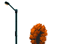
There's just one thing that somehow feels out of place to my eye: that foreground green bush.

I'm no artist but maybe the style is different? I was probably expecting something with more contrast, more black, and more rim-lighting? 

Maybe I'm just picky, or got obsessed with that detail :D

...or maybe it's because of the palette and colour count. But again, maybe I'm just obsessing over that detail :D

Loving the pack! It really gets the right vibe!

(still, that bush really bothers me, apologies :D :D )

(+1)

Thanks for the feedback. Fortunately, the bush can be removed easily.

(+1)(-1)

I do see how the green bush pulls the eyes in. Can easily be fixed using the same colors. like I've done here.