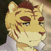
 it might just be me, but his head looks a bit.....off
Viewing post in "Santa Lucia" Build 20 Now Available! comments
Hey, sorry I didn't notice this thread beforehand as I tend to get most of the art feedback on our discord.
I'll definitely look more into it once I have more time. I will say new Carlos is a lot closer to the actual vision I had for him way back when, I just did not have the skills to pull it off (once you see the mistakes of the old sprite, it's hard to not notice them haha).
I realize it may be tough to adjust after seeing him one way for more than a year and a half, but I do believe the new sprites are all for the better. I do appreciate any and all feedback, though!
- Dev

