If you mouse over the big number in the middle it talks about meeting AA and AAA requirements. Just know that AA the minimum for most people. AAA covers almost everyone. Only very select cases does it not meet the needs of everyone. Try to hit AAA if possible (4.5 ratio, also written as 4.5:1) AA as a secondary (3, also written as 3:1) That :1 added is basically black text/white background. Best possible contrast.
Viewing post in Version 0.45 - Polishing Things comments
Thank you for the resources and insight!!
I'll do my best to implement a better experience for the next update, some general changes and a more extensive toggle which will increase it further for those who wish.
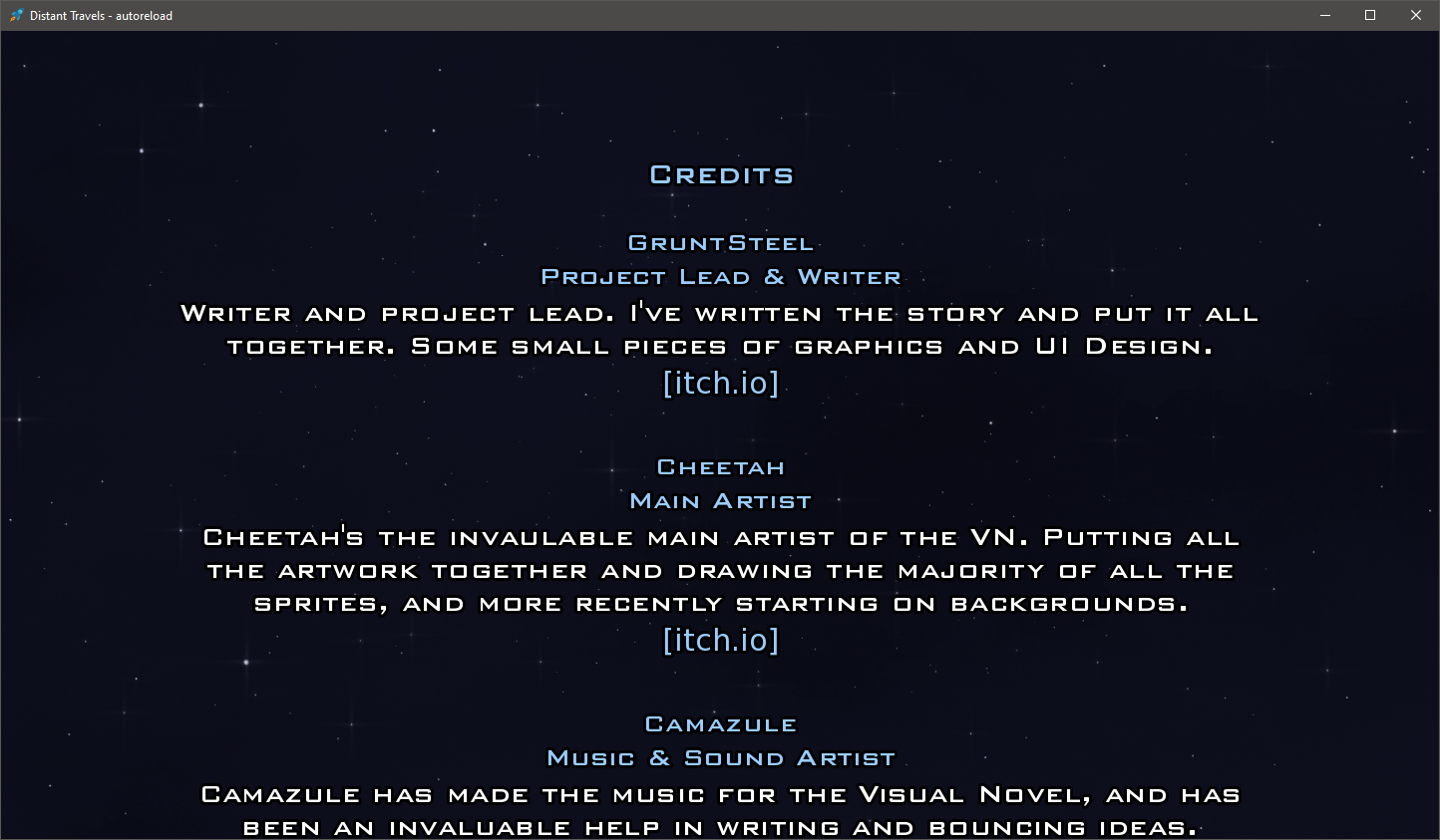
As a side question, if you feel like you have the time I'd greatly appreciate it if you could check the screenshot below out. I promise I won't bother you more.
I'm experimenting as the "default", aside from the toggle in which there's more visibliity.
This is with a brighter color for the text (11:1), and a black outline, the main question is the black outline, since ren'py font size is relative at best.

As I mentioned this happens to be a passion of mine and I'm excited that you're taking the request seriously! I have no problem reviewing anything. I just may be a bit slow sometimes in responding.
That screenshot is a thing of beauty. To give you an idea of how much that has improved clarity, I could read that without having to view the full size image. Viewing the full size image I see the black outline and that is perfect in this regard. It further accentuates the contrast without being so in your face in other methods. Thank you thank you and thank you again for taking the request seriously

