Indie game storeFree gamesFun gamesHorror games
Game developmentAssetsComics
SalesBundles
Jobs
Tags

Thank you for taking the time to research and test things.  To answer your question here is a website that helps in determining if you've got enough contrast in regards to text:

Contrast Ratio: Easily calculate color contrast ratios. Passing WCAG was never this easy! (contrast-ratio.com)

That should link you to it prefilled with the background and text color of the splash screen before the changes you just mentioned (I took a screenshot and grabbed the color values for them).  That number in the middle is what is important.  While 3+ barely meets the min contrast ratio, it is only a pass in the regards to the font sizes that are larger.  According to WCAG that is 18pt font size and above or 14pt bold font and above.  The magic number you want is above 4.5.  If you change the color for the text (field on the right) to just plain white (#ffffff or just type white) you'll see that number jump very high.

21 is the best in the contrast ratio. 4.5 is min for most cases of visual impairments in regards to contrast impairments and colorblindness.

I can't tell you what font/color to use as its your vision.  All I can help is guide you to make informed choices.  Higher contrast is always better and covers most impairments.  Just the fact that you took the time to read/adjust shows a lot in your character.  Thank you very much.


For the a highly detailed explanation in this regard:  Understanding Success Criterion 1.4.3: Contrast (Minimum) (w3.org)

If that's too much (it is even for me), the key take away is this one paragraph:

Benefits

People with low vision often have difficulty reading text that does not contrast with its background. This can be exacerbated if the person has a color vision deficiency that lowers the contrast even further. Providing a minimum luminance contrast ratio between the text and its background can make the text more readable even if the person does not see the full range of colors. It also works for the rare individuals who see no color.

If you mouse over the big number in the middle it talks about meeting AA and AAA requirements.  Just know that AA the minimum for most people.  AAA covers almost everyone.  Only very select cases does it not meet the needs of everyone.  Try to hit AAA if possible (4.5 ratio, also written as 4.5:1)  AA as a secondary (3, also written as 3:1)  That :1 added is basically black text/white background.  Best possible contrast.

(6 edits) (+2)

Thank you for the resources and insight!!

I'll do my best to implement a better experience for the next update, some general changes and a more extensive toggle which will increase it further for those who wish.

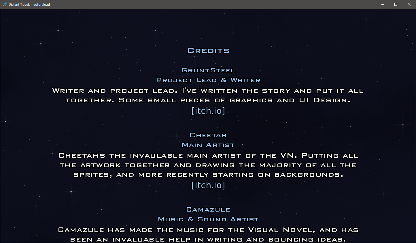
As a side question, if you feel like you have the time I'd greatly appreciate it if you could check the screenshot below out. I promise I won't bother you more.
I'm experimenting as the "default", aside from the toggle in which there's more visibliity.

This is with a brighter color for the text (11:1), and a black outline, the main question is the black outline, since ren'py font size is relative at best.

Link for full size image


(+1)

As I mentioned this happens to be a passion of mine and I'm excited that you're taking the request seriously!  I have no problem reviewing anything.  I just may be a bit slow sometimes in responding.


That screenshot is a thing of beauty.  To give you an idea of how much that has improved clarity, I could read that without having to view the full size image.  Viewing the full size image I see the black outline and that is perfect in this regard.  It further accentuates the contrast without being so in your face in other methods.  Thank you thank you and thank you again for taking the request seriously