Indie game storeFree gamesFun gamesHorror games
Game developmentAssetsComics
SalesBundles
Jobs
Tags

Hey!

First of all, thank you very much for all your feedback, really appreciate it!

There are certain things you fail to notice after you spend months replaying your games over and over, so it's nice to hear opinions from actual players.

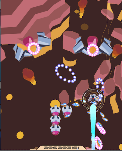
You make a really good point about the hitbox, the shard collect FX make it hard in some instances to see your hitbox. I'll find a way to make it stand out more, and probably tone the collect FX down a bit. I wouldn't remove it completely for now as I quite like it, but I'll keep it as an option in case it's still confusing after these changes.

Regarding the Ship design, I added the circle around the player to make sure you always know where you are. From my past experience during demos at conventions, players tended to lose track of their ship and got frustrated, so I think that works well. There's no added functionality though, and I can confirm there's no Grazing mechanic in the game. And yeah, I guess the trail could be a bit smaller, I'll look into it!

Thanks for sharing your game, I'll check it out and let you know what I think! 

I should be able to upload a new build soon with some improvements and some preparatory work for Steam, I'll start looking into those changes too.

Cheers!

(1 edit)

Thank you for reading and replying!
Thanks for sharing about the circle, that makes sense. It does let you know where you are. It was confusing to me because your actual hurtbox is so much smaller.. maybe if there were lines linking from your circle to your hurtbox (probably too noisy? just brainstorming).
If you're targeting "serious" SHMUPers with terms like "TATE" for vertical then please consider either
* Ignoring complaints that players can't see where they are - they are too beginner for SHMUP
* Re-evaluate the entire visual design of the game. If "serious" SHMUPers who know what TATE & grazing means can't find hurtbox or their ship, that's telling you something!

You have great art. I think you just need to think a little more about how it all goes together to communicate gameplay.

I don't think the trail is too much of a concern (most of my time was spent near the bottom of the screen anyhow) - but possibly it contributes to players not knowing where they are. There's a lot of color going on. Yellow hurt box + yellow backgrounds + yellow shards makes it difficult to see where you are.
The player shoots blue bullets and the enemy shoots many blue bullets. Visually they look rather similar.
I want to emphasize that I don't think the effect of the collection is a problem - it's the overlap + same color.
I recommend you try this very simple tweaks before anything else:
* Change color of player hurt box to bright red.

Secondary considerations:
* Experiment playing the game yourself with only black for background then compare to regular mode. I still think a darker bg would help.
* Please consider moving the Z index of the collectable to behind the hurtbox (this assumes hurtbox + collectable are different colors). What you have now is basically a blending of the same color so I lose focus of the Hurtbox. If you change hurtbox color to say, red, but the collectible appears over it, then I lose focus of the hurtbox.

Random brainstorm to improve the circle + collectibles: Getting a shard inside of your ring collects it - it animates & disappears right away. The ring pulses or expands in thickness as it charges your LASER, giving you a visual indicator that LASER is ready without having to look up from your ship at the meter on the left.

test