Hello, here are my first impressions of Oath. I am skipping impressions on story & theme as I usually don't play SHMUPs for the story and I don't want to detract from gameplay & interface points.
First, controller support working right away was nice. I had a problem in the menu identifying where my cursor was. I went to Game Options and it was hard to differentiate between white & yellow to tell which item I was looking at. When I went to controller mapping the lack of clarity white vs yellow to see where my cursor was made me hesitate and I left. Not a problem since I saw the default mapping covered the 2 actions with 4 face buttons on Xbox controller.
I tried to reduce continues available to 0 but could not. This is an important feature for serious SHMUPers.
Inferno mode killed me within a minute, which was a good sign. I retried on Normal.
Game speed is still very quick, which is good. Satisfying sound effects for the laser and explosions.
Ok, onto things I did not like. Please keep in mind my perspective which is I emphasize mechanics & readability first above all else.
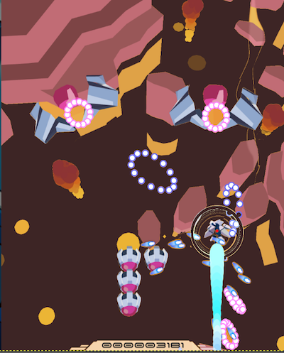
Dodging:
Very difficult to tell what my hurtbox is! At first I didn't even recognize the Yellow Dot. I looked for it on me second game, then noticed.
It is yellow which blends in with the background way too much - which is often yellow. There same color scheme issue of yellow + white from the menu selection happens with the laser - a big white laser appearing around me.
When I pick up yellow powerups (yellow on yellow background, again), they flash around my hurtbox. Since this animation is the same color as my Yellow Dot, this further confuses me on where my hurtbox is. I think these animations could go away entirely, sticking with a sound and seeing LASER meter rise in peripheral vision.
The best change here would be for dark backgrounds.
Ship design:
At first I thought my entire ship was a hurtbox and the Ring around my ship was a shield. Then it seems to do nothing. Perhaps this was intended as a Graze mechanic but I didn't see any feedback about grazing bullets as Combo was only for killing. Even if the ring had functionality, it is incredibly distracting and disorienting for determining where my ship is. The White Ring + Yellow Dot and White Beam makes it even harder.
The blue contrail at the back of my ship looks excessive - it takes up about 40% of the screen vertically but has no gameplay function.
Ship looks pretty but it needs to be more functional for gameplay.
Boss:
I like that the Boss was multi stage. Stages 2 and 3, however, I found it easy to shoot the second half's core (when the arms are gone) by staying at the bottom of the screen without moving. Many SHMUP bosses have weapons that track you + geometry weapons (like you have). The superimposition makes for a default challenge from geometry weapons and careful dancing with weapons that track you.
Bullet design:
The bullets that curved didn't look different from the ones that didn't curve. This isn't terrible but some indication ahead of time that they behave differently would be nice instead of just watching the pattern every time. I understand that this is a common trope so don't think too much about this.
Player bullets move very quickly and are fairly easy to ignore because they take up a consistent amount of space. I think this is good, as watching your bullets is of minimal importance since they are fast and have a big spread. However, the blue of my bullets overlaps with the blue of enemy bullets. I would consider changing the shape, color or effect of how these look to let me identify enemy bullets easier. Again, a dark background would help tremendously here.
Conclusion:
Visual issues aside the gameplay was good. Constantly getting a stream of LASER but having to be just slightly careful about not wasting felt good. Varied enemy types and armored enemies were nice.
I think your game has a lot of good core but so much is shadowed by the lack of readability.
I recommend checking out the minimalist approach I took in Quantum Pilot as a contrast in readability. I chose rounded bullets for enemy bullets and a mix of animating & straight lines for your bullets. Even though you both shoot the same color with no border I think it's very clear which bullets belong to who. http://QuantumPilot.me
I recommend reading this thread on Appealing Art in Bullet Hell / SHMUPS I started on TIGSource. Look up the games mentioned and compare screenshots to Oath. https://forums.tigsource.com/index.php?topic=58125.0
I wish you the best of luck and I'm subscribing to your itch because you are working on quality game.