Indie game storeFree gamesFun gamesHorror games
Game developmentAssetsComics
SalesBundles
Jobs
Tags

I really like the ZX fonts but have found a lot of them to be just a bit too blocky or otherwise weirdly spaced.  I went to the creator's website and found his Fontstruct page where he had this:

https://fontstruct.com/fontstructions/show/1395997/pointandclick

It's Bamburgh-esque but a little less rounded.  The quotation marks weren't quite right, so I fixed that and a few other small things for a very slightly modified version which I think works pretty well.  It's here:

https://fontstruct.com/fontstructions/show/1857233/pointandclick-1

Nice. It'll be good to see the font in a screenshot of you have time.

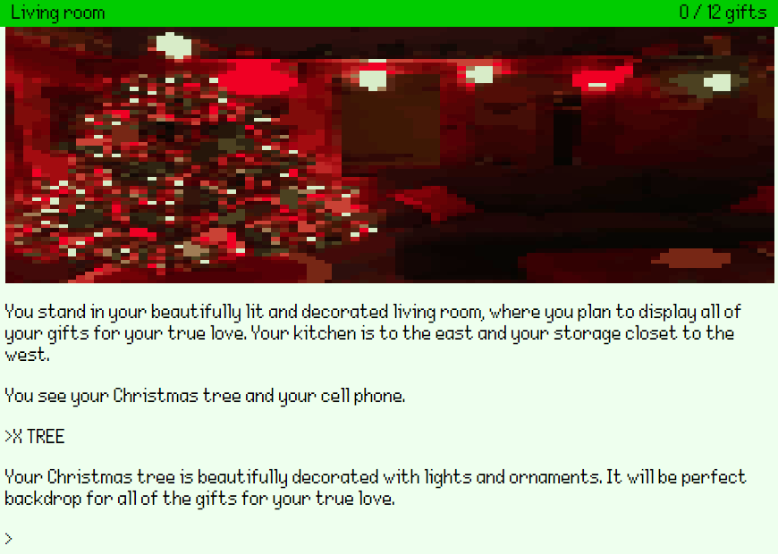
Sure.  Here's how it's looking so far.

Looks good.  

Recommendation (try any or none of them).

  1. Digitised graphics at low resolution often looks a bit messy so maybe consider doubling the resolution?
  2. Try out the beta version of Adventuron, it'll make it so that the image aligns to the left and right of the status bad. (adventuron.io/beta). Back up your game in a local text file on your computer  before hand in case there are issues.
  3. Set the text colour to not quite black ( #333) is good.
  4. Set the background colour to grey (#ddd).
  5. Add scanlines (shader = "scanlines" in the theme_settings {} section inside your theme).
  6. Set the header pen colour to #fff.

Anyway, love it that there are 12!! gifts, sounds like a sizeable adventure, and 

Chris

(+1)

Cool.  Thanks for the suggestions!  I'll test them out and see what looks best.

To thine own self be true.