Played on Windows 11 in Chrome.
Short version: there’s a solid Survivors game here, and the weapon-building system is the real hook. I’m a big fan of the genre, so I feel at least somewhat qualified to nitpick this one 😏
I love that it’s built in Godot. The music fits the game well (but needs to be updated at some point), and putting the latest development updates directly in the main menu was a great touch. It tells me the project is alive without making me hunt through devlogs.
The basic loop works: fly, survive, fill weapon slots, then mutate those weapons into increasingly stupid projectile machines. Good stupid. The individual modifiers, including damage, firing speed, range, projectile size, parallel shots, and spread, create more build variety than the initial presentation suggests.
The issue is that the upgrade screen hides the interesting decision.
When several cards are all called Shotgun, Sniper, Repeater, or Broadside and use the same artwork, they look like duplicates. The meaningful change is buried lower in the card. I’d lead with the mutation instead:
- Twin Barrel: Adds a parallel volley
- Hair Trigger: Fires faster
- Wide Load: Adds projectiles and increases spread
- Heavy Shot: Increases damage and projectile size
Keep the weapon family underneath. Show me the decision first and the arithmetic second.
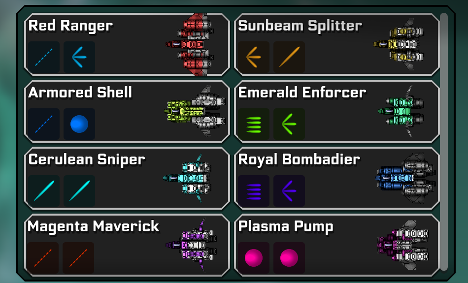
The ship designs are cool and gave me some FTL vibes, but I’d push their silhouettes further apart. At a glance, I want each ship to feel like its own machine, not mainly a variation of the same shape.
The ship-selection screen also has a ton of room, but most ships only get a sentence or two. It doesn’t need to become a spreadsheet. Just give me a little more: intended playstyle, starting weapon behavior, difficulty, strengths, and weaknesses. Something that helps me think, “Oh, that’s the precision ship,” or “That one turns the screen into soup.”
Also, not sure how you feel about this, but I’d love mouse-only movement as even an option. The aiming already lives on the mouse, so being able to steer there too would make the game easier to pick up and more comfortable for one-handed play. Not a joke. I have CTS and I always appreciate being able to use my trackball for games like this.
The wide purple enemy confused me. I assume the bullets are hitting some kind of shield, but visually it looks like they simply fail to reach the body. It feels unsatisfying and, honestly, reads like a bug. If there is a shield, draw the shield. Give me a bubble, ripple, impact flash, or whatever fits your style. If there isn’t a shield, then yeah, something’s busted.
Combat generally needs more juice. Stronger hit flashes, impact particles, recoil, enemy reactions, brief hit-stop on important attacks, and better player-damage feedback. The usual stack. Not noise everywhere. Hierarchy.
Because the core concept is relatively simple, I expect more polish around the entire presentation. Simple games live or die on feel. Every shot, pickup, upgrade, level-up, and reward screen needs to carry more weight because there aren’t fifty other systems distracting me.
The reward screens especially need to pay out harder.
Look at how Vampire Survivors handles a chest or major upgrade. Twinkly sounds. Escalating reveals. Flashing rewards. Anticipation. Then a big stupid celebration shoved directly into your face.
It’s almost casino-like, and I mean that as a presentation reference, not a monetization suggestion 😅
You don’t need to copy that exact style. Do it in your own brand voice. But when I earn something important, make me feel like I just hit something. Better reward sounds, stronger reveals, more movement, more anticipation. Right now the functional result is there, but the dopamine delivery could be much stronger.
I know you’re using Godot and this is a Unity asset, but FEEL is an amazing reference for this stuff. I’ve played with it and replicated the same general feedback system in my own non-Unity game. Worth a look.
The itch page needs real work.
Right now it opens with controls, then asks about the mailing list, then asks for feedback, then gets into changelogs. None of that matters until I know what the game actually is.
Tell me the fantasy first.
Something like:
Aim manually, mutate every weapon slot, and turn a precision fighter into a screen-filling arsenal.
Then show me a gameplay GIF. Seriously. Early build, upgrade choice, ridiculous late build. Bam. Now I understand the game.
I’d structure the page like this:
- Core hook
- Gameplay GIF or short video
- Ships and their playstyles
- Weapon-mutation system
- Controls
- Prototype disclaimer and feedback request
- Mailing list
- Changelog
You played my game, so you already understand my philosophy here: presentation matters. A lot. People decide whether something is worth their time before they’ve experienced the systems underneath.
My priorities would be:
- Improve combat and reward feedback
- Clarify the wide purple enemy
- Rework upgrade cards around the actual mutations
- Add more ship information and stronger silhouettes
- Consider mouse-only movement
- Rebuild the itch page around the real hook
- Add gameplay videos or GIFs immediately
There’s already something worth developing here. The weapon system has real potential, the music fits, the ships are cool, and the late-run projectile nonsense delivers the correct kind of Survivors chaos.
The game just needs to communicate its strengths faster and celebrate them much, much harder.
Oh yeah and in response to your other comment asking about how to arrive at a good hook or twist:
Obviously, this is another Survivors-like. I’d think about how BALL x PIT approached that problem. It didn’t just start with general popular roguelike ask how to make the formula slightly more unique. It took classic brick-breaking gameplay and asked what a roguelike version of that could become.
Your game already feels like it has a nod toward Space Invaders. I’d start there. Ask what a modern roguelike version of Space Invaders could become, then borrow whatever progression ideas you need from Survivors games.
That might lead somewhere much stranger and more ownable than starting with another Survivors-like and trying to differentiate it afterward.
Thanks again for playing my game!