
Indie game storeFree gamesFun gamesHorror games
Game developmentAssetsComics
SalesBundles
Jobs
TagsGame Engines
(1 edit)

Time torment you a little, Aerosys. <3
Refer to the graphs for proper details. 
1.
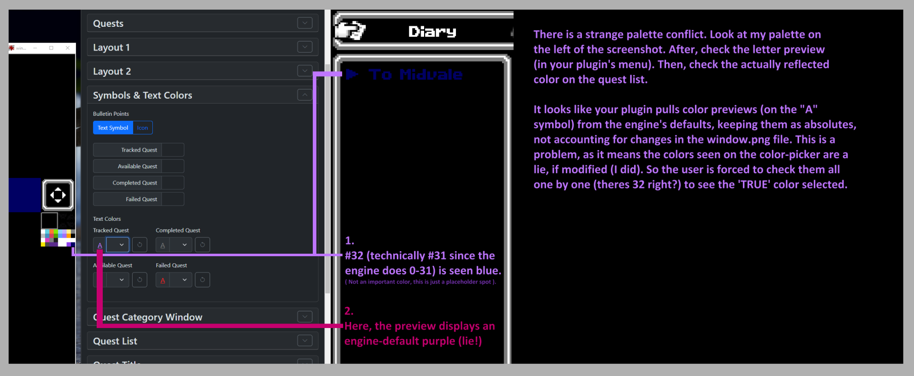
2.
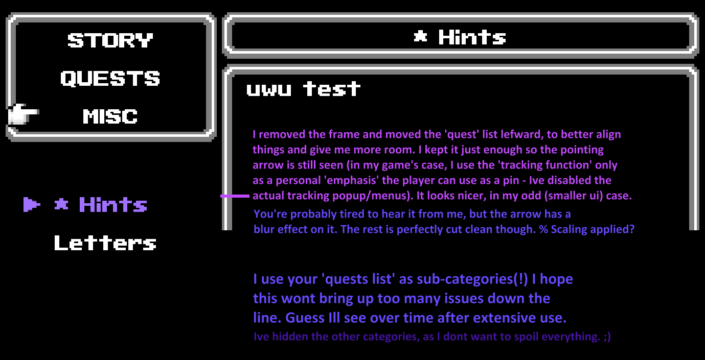

3.


While I do not use icons in my tier-1 categories, I think the option for others to have icons right next to the titles instead of to the far left would be a nice addition (I had things set to 'centered' on this screenshot, I think). Categories here are from an earlier WIP (so it should read 'Story/Quests/Misc'). Pay it no mind.


There's 'entry type', 'entry subtype', 'description' and 'sub-description' (I know its not the way you named/intended them but its how Ill make use of your .JS!) I really like your plugin, Aerosys. <3 Everything is very easy to adjust and understand. I'll give you 5★. 

(+1)

Hey Nirriti,

first of all, thank you so much for your very detailed feedback!

Text Color Picker:

Yes, the text color picker uses fake colors. I always have to find a good balance between code complexity and actual results, and since most people don't change the color palette and the impact also isn't that much, I decided that the color picker uses static colors in its preview.

Blur:

I still don't know why this keeps happening, it's a completely different menu scene :/

Icons' positions:

To be fully transparent, that was a deliberate design choice to put icons to the far left. It came because most of the menus are top-to-bottom, and I always hated how Visustella didn't put the icons on the left when centering commands. It looks so "shuffled". However, I can certainly add more options, especially when a menu window is horizontal.


In the end,

thank you so much for deep-testing my plugins and making them better :)