
Indie game storeFree gamesFun gamesHorror games
Game developmentAssetsComics
SalesBundles
Jobs
TagsGame Engines
(+1)

After cooling down a bit I wanted to say that even though I complained a good amount, I can see what you're going for with a pure discovery game. And due to that, suddenly jumping into that kind of game can be off putting if not in the right head space. Taking a couple attempts to really get it. Though, perhaps you could onboard with a simpler scenario to ease in gameplay elements.

 > explanation of stats

Okay that makes sense I guess. Typically ranges are shown as '3-6', and mult would be '.25x-1.3x', though I can understand why not as it makes the stat display wider. However, if you can't make it more obvious that is the range, then I don't know if that's a worthy trade off(for one who learns purely from playing). Another way to make it more obvious is actually displaying what is rolled somewhere, like the end turn event screen or above the event card area.

Also regarding drama cards only affecting the card to the left, you could add a graphic that binds those two cards together so it's more clear, or use arrows. Here's my artistic rendition of that, ie bookish style on left, arrow on right.
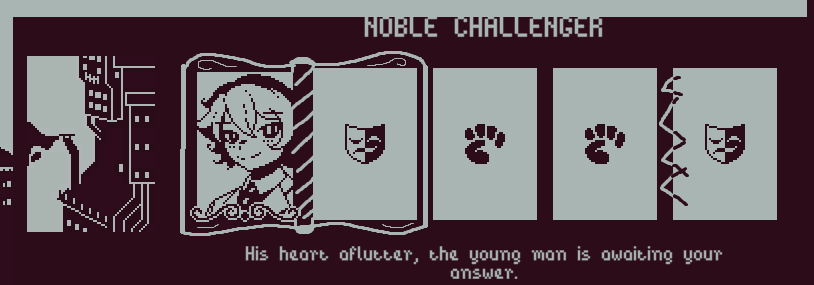

(+1)

I really need to fix the ui in different resolutions, that header displacement is atrocious.

>"After cooling down a bit I wanted to say that even though I complained a good amount, I can see what you're going for with a pure discovery game."
Dont worry, it was fair feedback and as i stated im unsure if i even want to continue. Ill give it a bit more of a try but if i consider the total feedback from everybody i will most likely project hop to something simpler once more.

I  didnt do it because of it being too wide.. But nobody understood what i was going for, so i either have to explain it or just make it wider.  Showing the rolled result at the end was on the list.

The book and arrows are a bit hard to use, as in the case of the noble challenger the fifth emotion slot can actually affect the 3rd and 4th slot. I would most likely just use a line and maybe a colour indentation to visualize groups within an event. But thank you for the idea and feedback, its very helpful.