

This is the first time I'm leaving feedback on one of your games, so fair warning, I can get a bit into tiny details at times. I tend to give a lot of advice. Please take this as my personal preferences/opinions and do with it what you will to make your game.
The Settings button is a bit faint. On the web it is also covered by the "User Tools" links on Itch. I didn't see it until I hid those. Going into fullscreen would also show it, and I'm sure many people do sue fullscreen for the web games to deal with those links. I take notes while play, and not all fullscreen games play nicely with that, so I start without and test as I go.
It would be nice if there was BG music on the title screen.
When having volume controls it is good to have something playing so the player can adjust the volume and get feedback on their changes. BG music on the title screen would work for the music adjustment with your settings also being there. For SFX we play a short sound every time the volume is adjusted.
I do like the debug type unlocks you offer in the settings, and may try some later.
I started the tutorial, and it was also silent. I double checked my sound settings, then restarted and went into the main game, at which point I got sound. I then returned to the tutorial.
I like how you cover over elements during the tutorial to bring focus where you want it. Many will just highlight the key part while leaving everything else, but this does a good job of making it clear what the focus is.
When you start you see 3 ships, but when you get to the step that says to click on any of your ships, that blocking of other parts of the screen, is now covering up the top ship. I just see the bottom half of the text "( MOVE )". I can click on either of the others, but it did stand out to me that it says to click on any, but limits to 2 of 3. This is a bit nit-picky, but when giving jam feedback, I like to mention what I notice and leave it up to the dev to decide what to do with it.
After selecting the Assassin ship, it said to select the Basic Attack. While moving my mouse to it, I noticed that the Shotgun card also had a light-up/glow effect as I passed over the left edge of it. The basic attack had that effect, but the other 2 cards did not. The Shotgun also only had it on a small portion. At the vertical middle you have horizontal lines on either side. It only highlighted from the left edge up to the start of that line. I was able to right-click to get the info popup for the Shotgun card.
When you mouse over the cards it says to right-click to see more info. You may want to disable that text during this step of the tutorial. Your overlay seems to cover much of the card. I was able to close the card by clicking off to the side, but it lacked a clear way to close it.
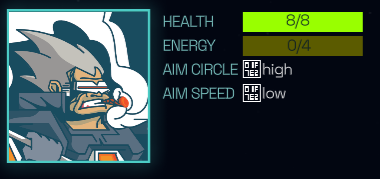
The Aim Circle/Speed look to be using special font characters that may be OS specific. I am on Linux and see that your download is Windows, so I am guessing you are using a Windows system font for that display. I recommend including any fonts you use in your export, and not relying on system fonts. Looking at a screenshot, it looks like when Normal, there should be a green circle there.
When I clicked on Basic Attack I got some sound. It was a bit loud, so I adjusted my speakers, but then tried to click on the sound icon at the top right of the screen. That cause the ship to fire. It wasn't straight on, but I was lucky and it was close to center and still hit the enemy.
I like the way the sound changes to reflect how close it is to the center.
For the Move step, I think it would be nice if the "Click here" text had an arrow, as you aren't supposed to click on that text, but the Move text below it. You could even do away with the "Click here" text and just have an arrow, maybe pulsing, pointing at the button.
The Move text in the area that looks like a tab is thin, and the hover effect is fairly faint. You may want to add something more to the hover. The Move text under the ships have a glow to them, so maybe add that to the tab location as well.
I had chosen the bottom ship. I moved straight forward. The bottom edge of the ship, and the movement remaining indicator were cutoff by the tutorial text. The Stop button was also covered.
After moving I did the Basic Attack again. This time there was no sound as the indicator moved. There was sound when it fired.
For the message about gaining energy and fuel, I think you should add the word "is", making the end "its fuel is refilled".
Now that I can see the full card when right-clicking on it, I don't see a clear indicator of how to close the view. Clicking on the card itself does nothing. Clicking anywhere else, including on the text about the card, closes it. If there is no action for clicking on the card, then I would recommend closing it when clicking the card as well.
After our recent discussions about the Shotgun, I had to go with it for the Assassin. Since you said the spread was reduced, I moved straight ahead with full movement, and fired. It seemed like the spread was still reasonable, and all 3 hit the main target.
The description for Band Aid looks to be missing a space in "reverse damage".
I had moved the bottom ship mostly straight forward and stopped with the front just left of where the Move tab starts to angle down. When I went to click on the Move text below the ship, it did not respond initially. I was able to get it to react by moving the mouse up to the top third of the text. You have the tabbed Move button right there, so it is not a big issue blocking gameplay. Edit: After starting the next combat I retested this and found that even when starting I had the same issue. I'm guessing you have a Container extending edge to edge that is above the ships and blocking access to the Move button. If so, and you don't need it to pass things up, you may want to change the Mouse setting to Ignore.
I finished the tutorial. The targeting sound was intermittent as I played. I did not pay enough attention to figure out if there was a pattern. It may be the first ship each turn had it, but I cannot confirm that at the moment.
I gained 5000 Credits, and clicked the button for cards. Then I got a screen that had some header text saying "You've unlocked new abilities", with a large empty area and a next button. I waited a bit expecting something to show up in the middle area. Personally, if all that is meant to show up there is that text, I'd move it to be more vertically centered so the screen doesn't feel so empty and like there is something missing. When I clicked next it took me to what looked like the main game screen. I did not see anywhere to spend the credits or buy new cards. I'm guessing that may be related to it having been the end of the tutorial and not being able to buy anything going into the main game, but it could use with something more there to explain the situation.
I could now move between circles to select a mission. The first shows as completed, which is likely from my previous play. Moving between the missions, I can go from the first to the last with a single click. From the last, however, I can only click on the previous mission.
I like the intro. It is a good length, and gives a nice starting point for the game.
The music fits the game well. Combat feels much better having the music playing.
I started with the bottom ship. After clicking Move the bottom UI was hidden, and I acknowledged there was a fair amount of screen space down there. I decided to spread my ships out. I did think about how the UI might cover up a ship that went too far down, but wanted to try it anyway. I angled the ship down at a 45 degree angle and moved forward. It went a short distance in the direction I was aiming, and then started to slide to the right. I would prefer if the UI, or most of it, remained to show the limit of where you can go. I'm going to say that the bottom edge lines up with the larger line going across below the Move & End Turn tab-like buttons. Maybe just hide them, and the cards, but leave the lower UI outline to mark where the player can move.
Pressing the power icon brings up a Quit Game panel that looks a bit out of place. It is very bland an un-styled, like it is missing your main theme.
I'm going to be taking a break now. It is dark now and the loud festivities are starting. I'll play again later tonight or tomorrow and actually play through the main game.