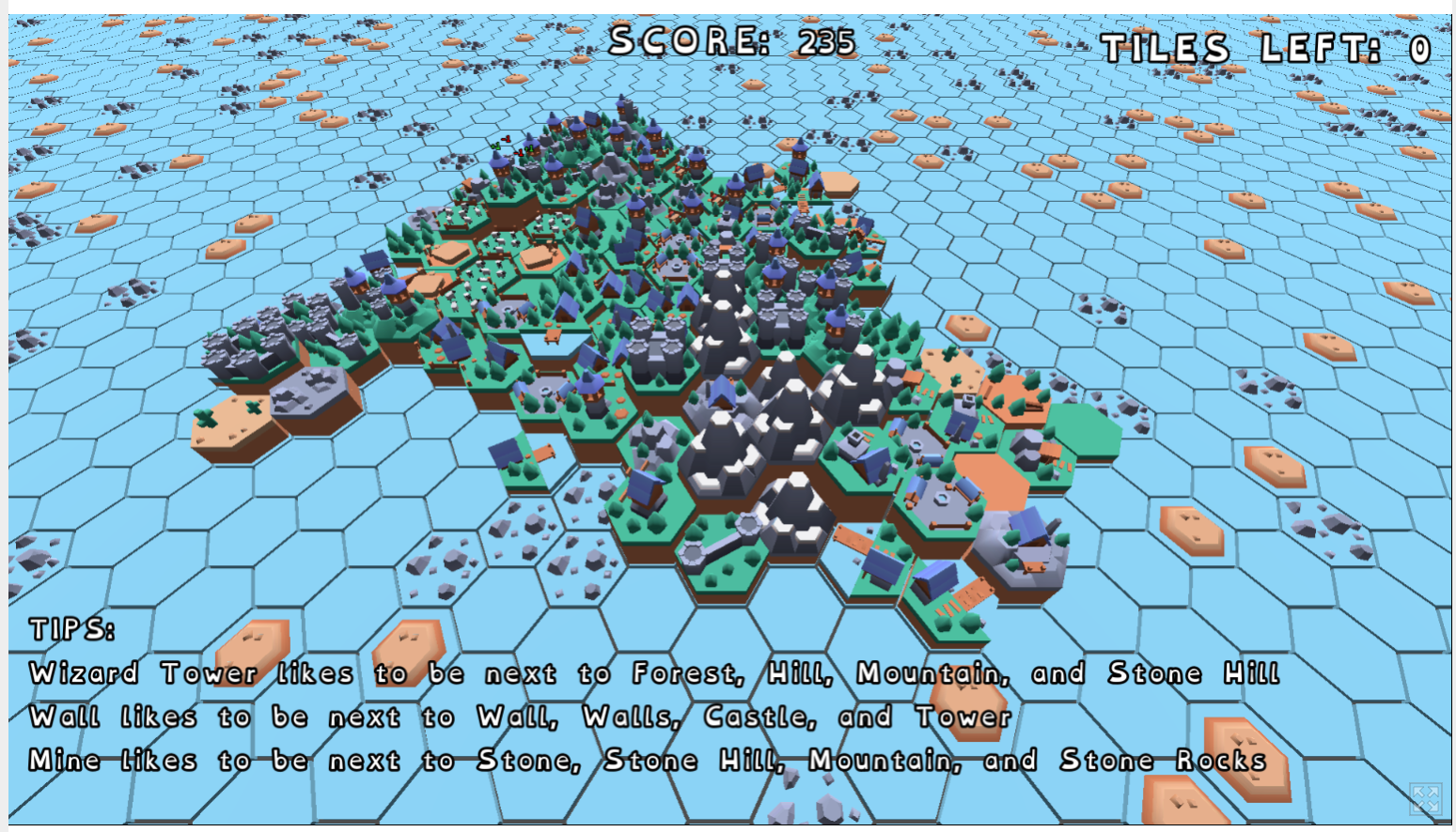
I played through one game until I ran out of tiles. My end score was 235. Early on I was not expanding the island at all, and then I realized I really should have done so sooner, as my choices were sometimes not where can I best place this tile to gain points, but to how do I lose the fewest points. After that I expanded at every opportunity, while trying continue building up what I had. This was fun to play, and I will be suggesting it to my partner and kids.
It would be nice if the semi-transparent background for the opening text was a bit darker/more opaque to add contrast and improve readability of the text. The text in general could be hard to read sometimes, depending on what was behind it, though the Tips do have to balance being readable and not blocking the play field.
I like the tips showing up, especially as a new player. I wasn't always sure what I had and the text made sure I knew, along with the tips on where to place. If you continue working on this, it would be nice if there was an option to disable them for those who don't want them. Perhaps also options to adjust the font size (larger or smaller), and if they have a background.
The red and green numbers popping up were helpful in making decisions, though adding them all up often did not match the change in my score after placing a tile. It would be nice if there was more clarity on how your score will change, as several times something that looked really good ended up being very minimal. Later in the game as things got crowded, and tall, I wasn't always sure what was in each spot, so those numbers were really nice to have, and I wish I could have trusted them more.