It seems your canvas stretch settings are a little weird in godot. Meaning the game looks weird on my 1440p monitor. 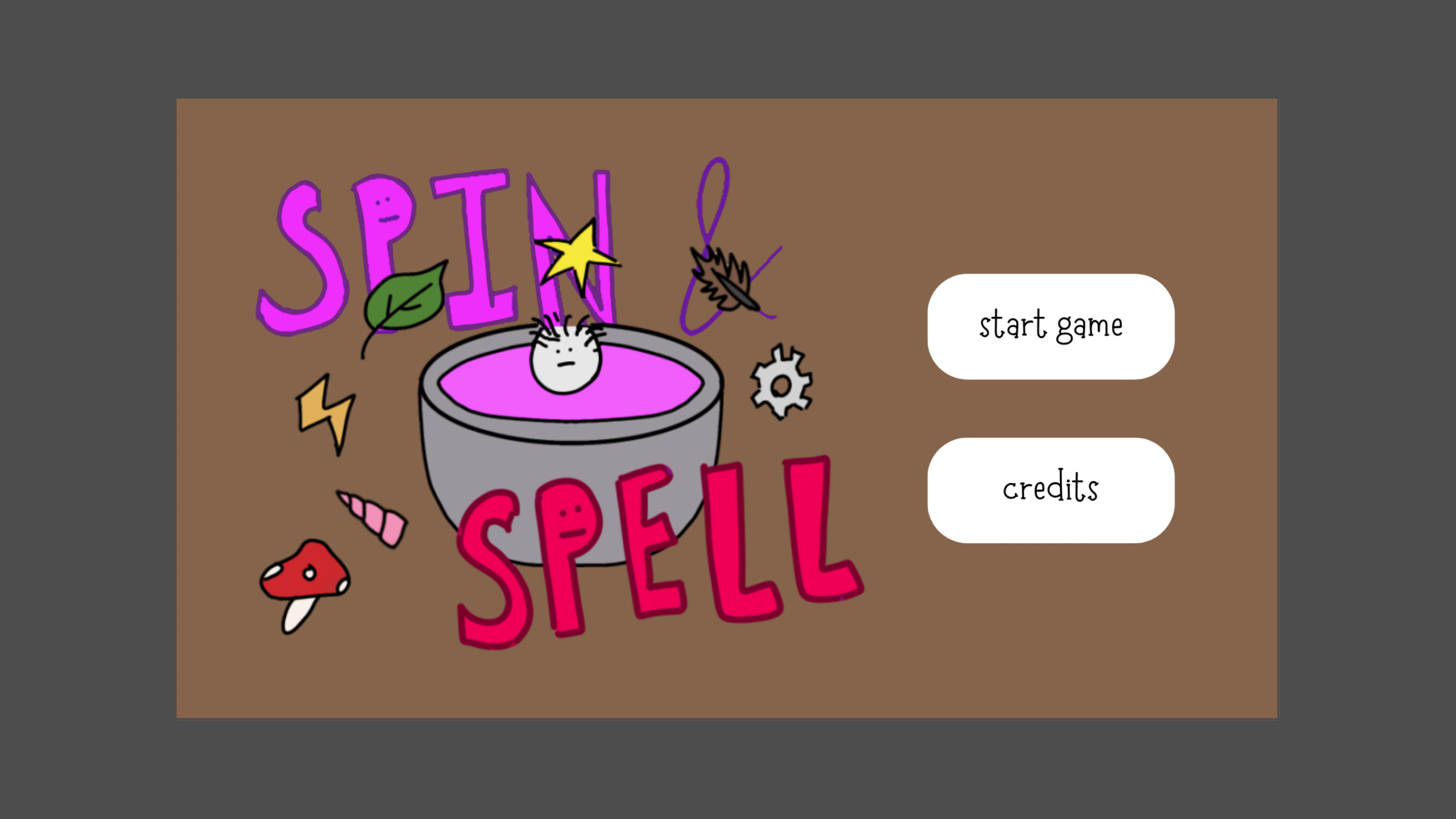
These 22 looking things are maybe an symbol you used in the text? You have to include a font that has them in godot as a resource for them to be visible.
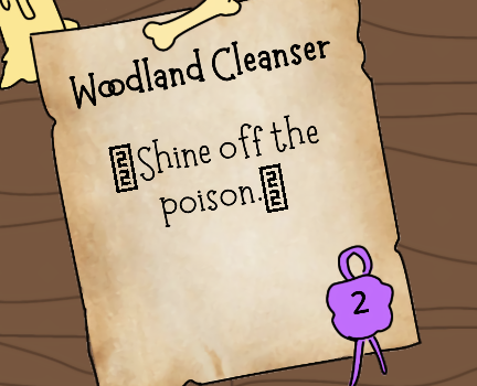
(sry if that was intended symbol it doesn't look too bad tbh.)
The graphics are enjoyable to look at since the style is very consistent! (Maybe draw those menu buttons yourself they're the only thing that sticks out a little)
Could be the the game being smaller on my screen, but I found myself not properly dragging the ingredient a lot of the times. If not already make the hitbox a lot larger than it needs to be. Seems to be no downside for that in this type of game. (Of course make sure they don't overlap with other ingredients still)
Same thing with the spoon or whatever. I think the hitbox should be more generous. Ingredients/Spoon could also be highlighted in someway when they are properly hovered.
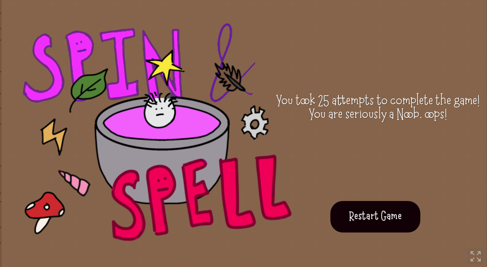
I feel like I was bruteforcing a lot of the puzzles and not getting any "A-ha! moments. The last clock puzzle however was really fun since it really felt like I was playing a puzzle game! Nice game even if I'm a noob :(