Hey thanks for the feedback! I really appreciate it :)
I never cared much for the statues in the first place so that's a-okay :)
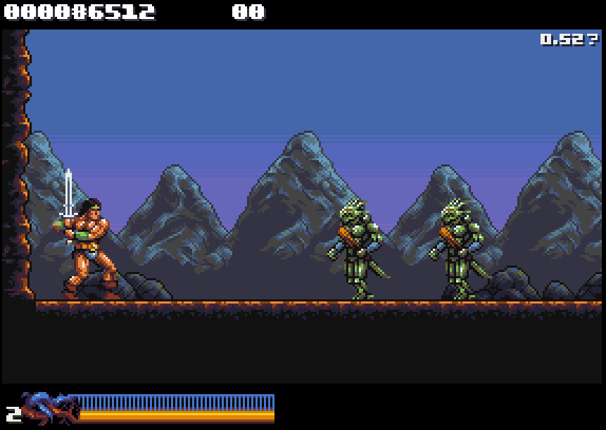
Fake tan... that does not sound great lol :o Check out the comparison gif below. It shows 0.50, 0.51, and the current changes:
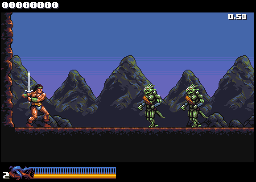
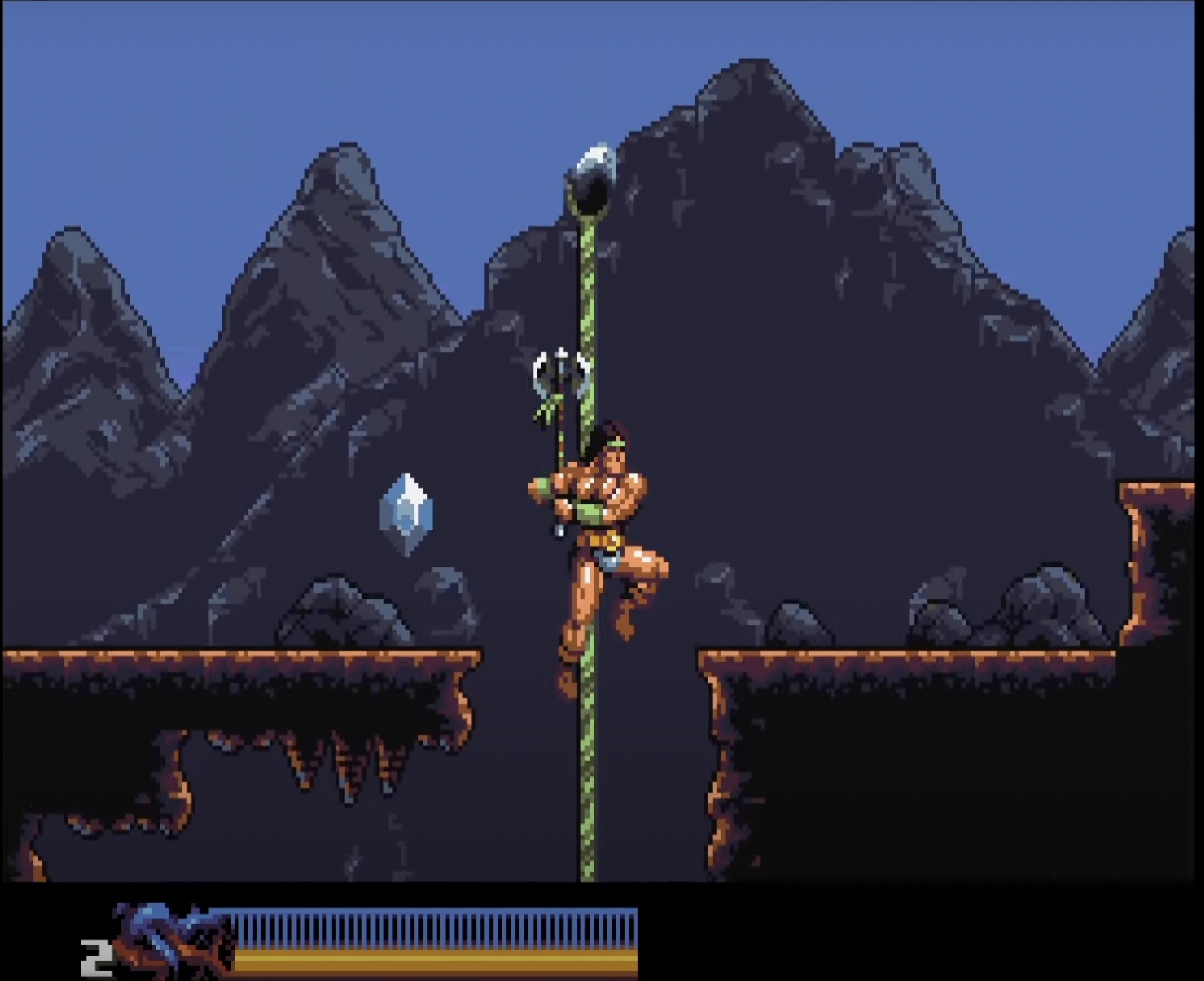
Between 0.50 and 0.51 there's not much visible change in this scene, apart from Rastan himself. On 0.52 I made the greens darker and more of a muddy yellow in the mid-range to make the mountain highlights less prominent and a smoother blend with the blues, at the cost of a little pop on the lizard folk.
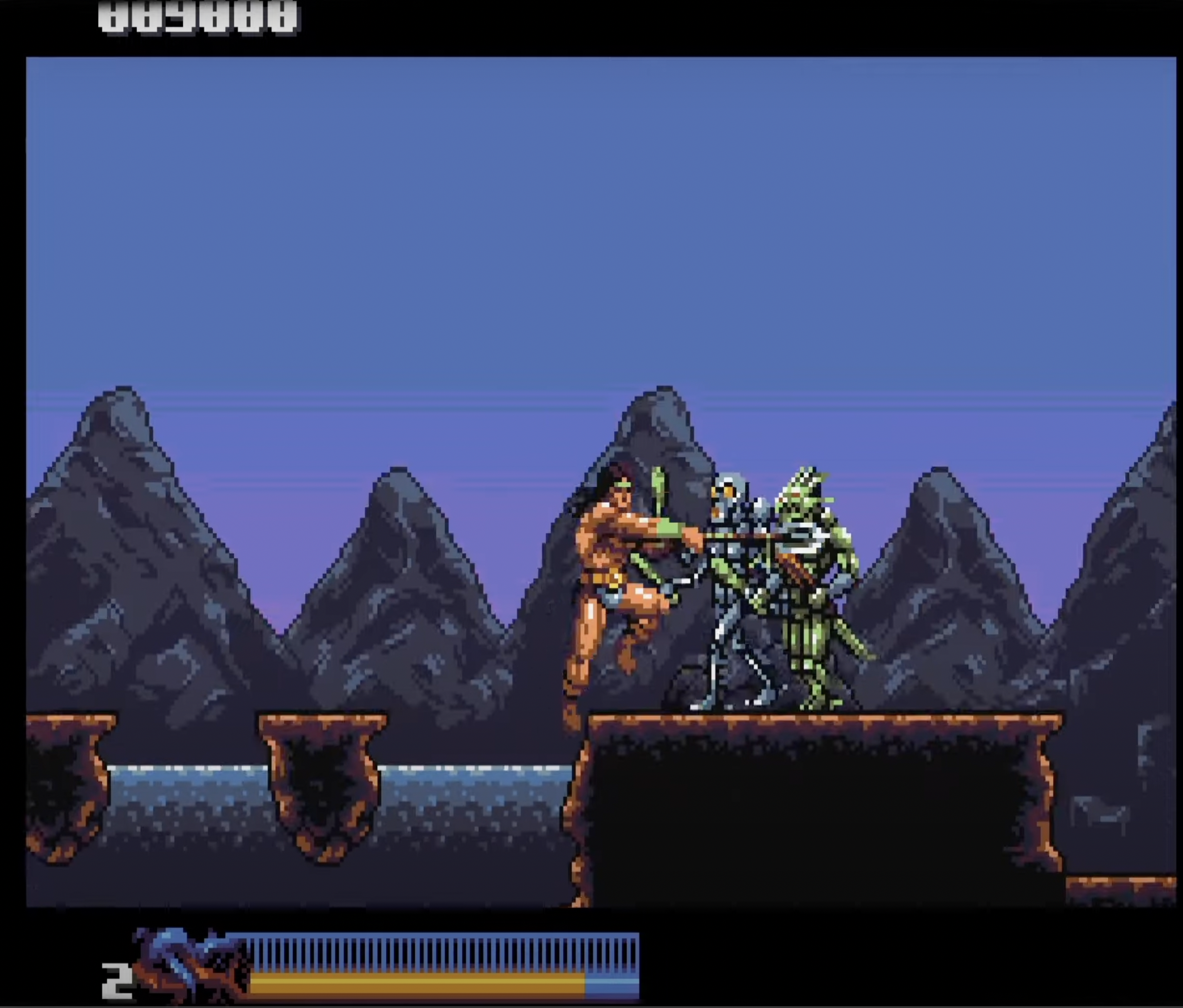
I totally get ya with the mountain range receding into the background. The goal all along has been to try and get the enemies to pop with saturated, high contrast colors and use more muted ranges for the background to give a sense of distance, separate elements by visual priority and all that. It *is* tricky with only 16 colors that I can use freely ofc :) Change one color and you affect everything since they all do double-duty.
I wanted to give the mountains some more detail because I felt they looked a bit crude the way they were. There's been some grumbling from people about the detail levels on Stage 1-1 too, so yeah :)
How does it look? Can't get around using greens completely, but hopefully the current contrast/saturation on em work better.
Rastan is a full sprite now so I got more leeway with him (separate 16 color palette). I'm keeping the color differences between the sprite palette and main palette subtle tho so he can still revert to blitter drawing when needed.
EDIT: Oh, and don't worry about critiquing my stuff. Constructive criticism is always welcome! :D