Well, thank you for your response! Don't worry too much about my "fake tan" comment. I have a tendency to be over-dramatic. The fact is I didn't notice anything until I placed both versions side-by-side.
I totally get what you're saying about the limited 16-colour palette. I think you're doing an incredible job with it. Really looks like a lot more than 16 colours.
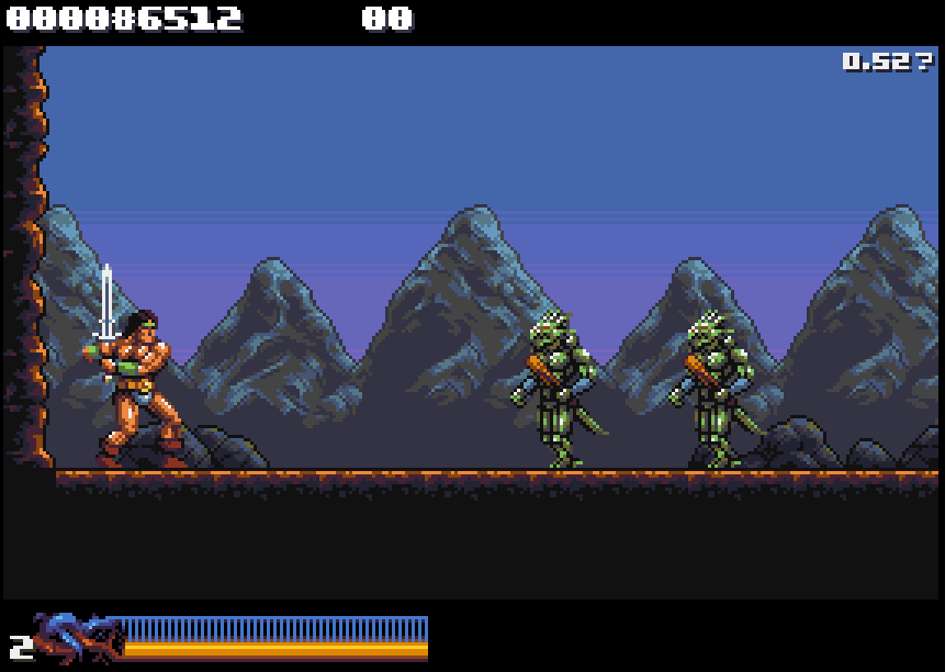
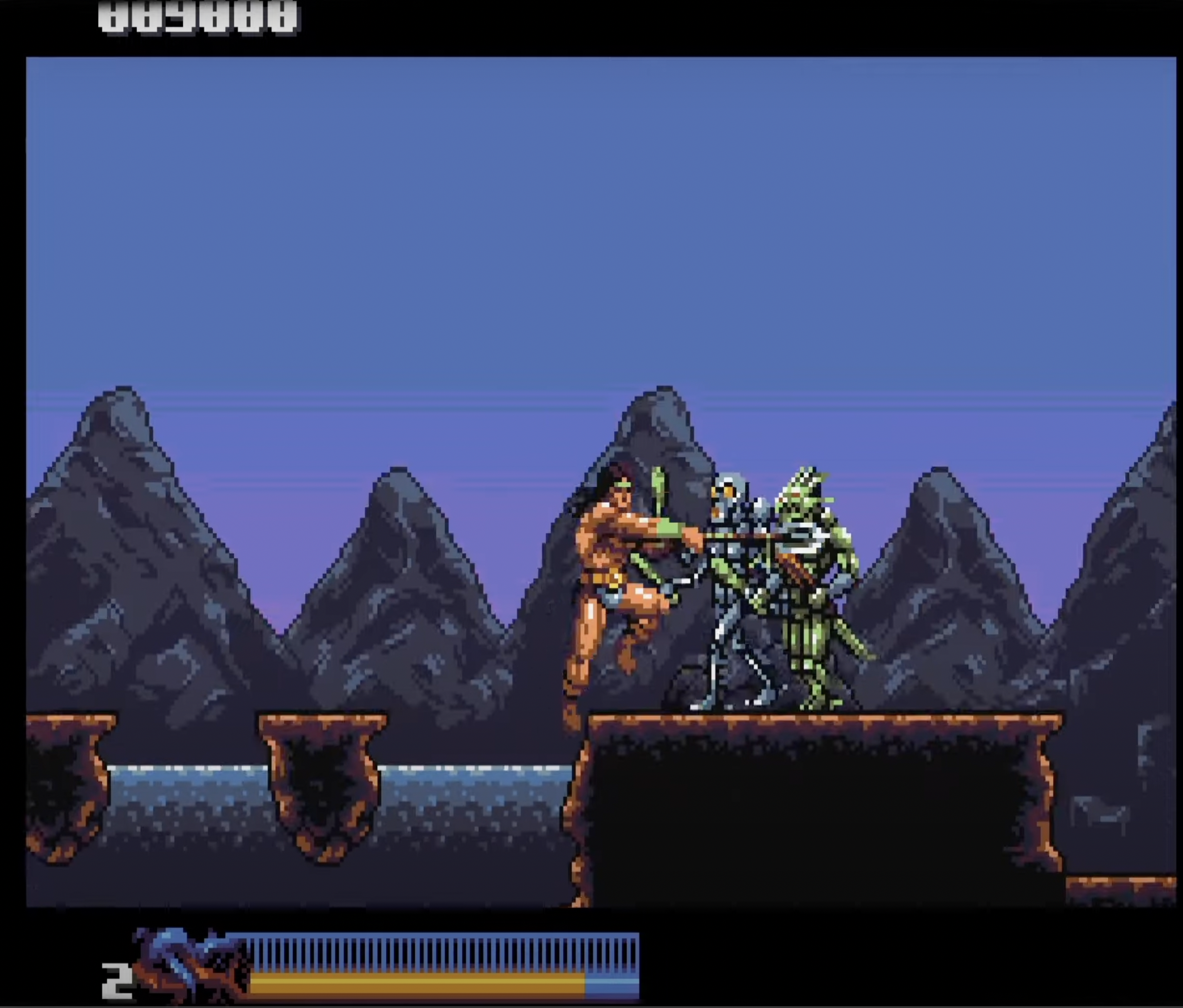
Very interesting that Rastan is now made of hardware sprites. Presume that improves performance? I notice that you seem to be able to get 5-6 walking enemies on screen at once with no apparent slowdown. Very impressive!
Well thanks for posting those comparison screen shots. Here's how they strike me:
I definitely prefer the colouring of Rastan in 0.50. In the others he looks a little too saturated to me.
If I had to choose, I would prefer the muted highlight in the mountains in 0.53. The effect on the lizard folk is barely noticeable and they still look great.
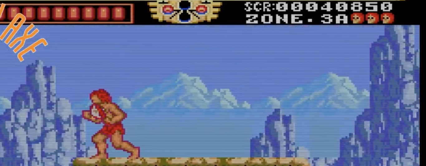
But to be honest, I get that people were grumbling about the original look of the mountains, but I definitely prefer how they were coloured in these two screenshots below - with three shades of grey. The greys allow them to stay in the background and allow the more colourful elements to gain prominence in the foreground. For me, the green, whether it be bright or muted, doesn't quite seem to work in the mountains.
In saying that, I am trying to respect your style , sensibility and decisions - rather than impose my own.
But just to offer an alternative perspective: I would feel like exploring a way to get the mountains to fade further into the distance - for example by allowing the background colour to bleed through at the base - as if the mountains are rising out of a mist etc.
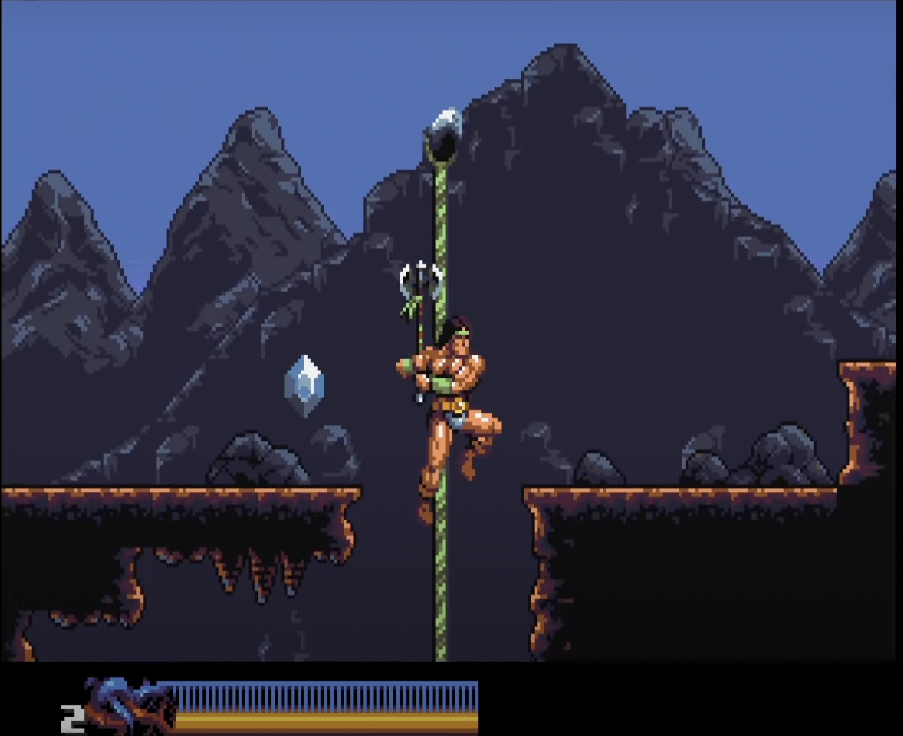
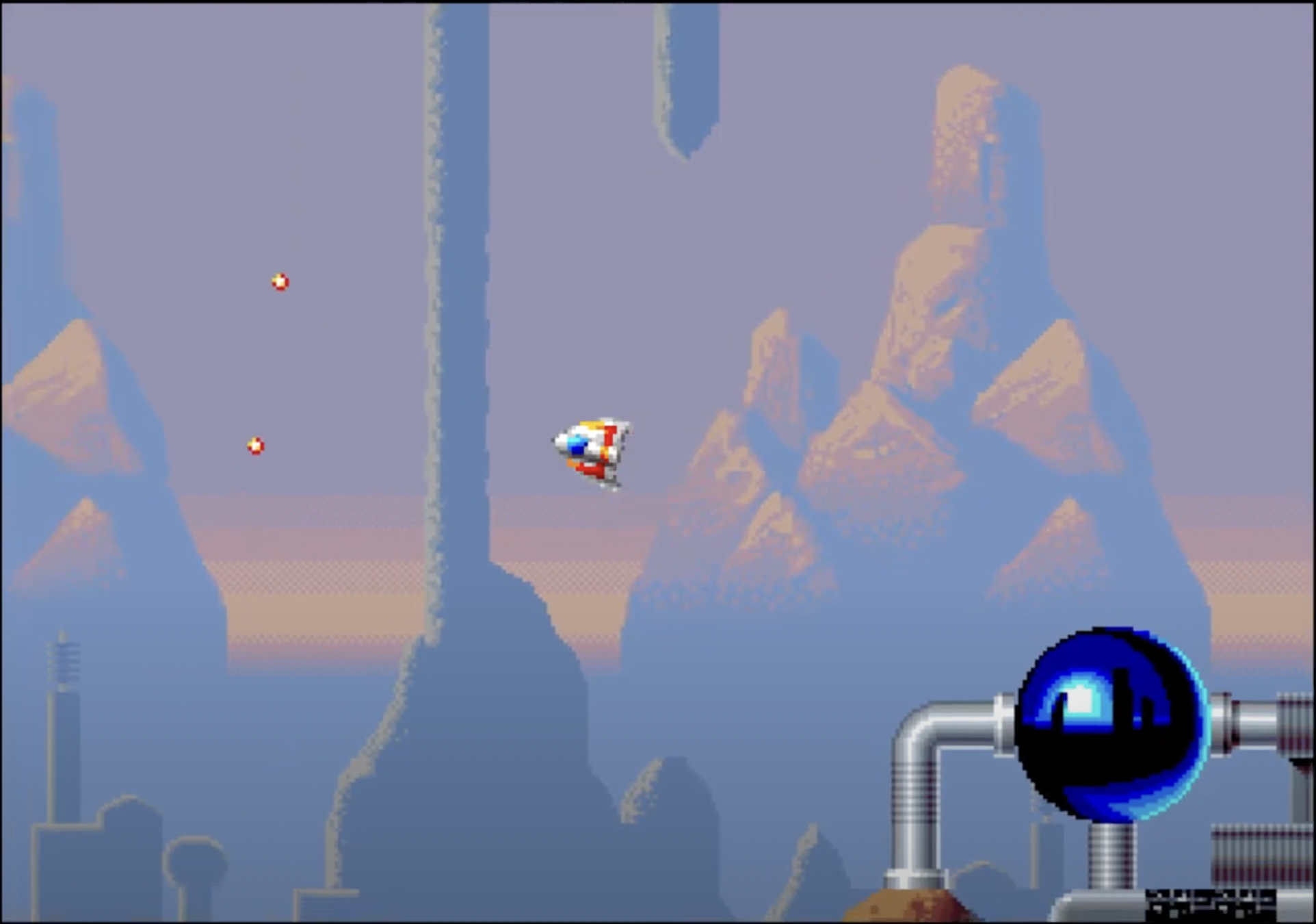
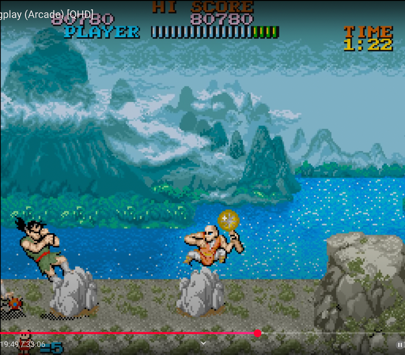
Unfortunately, I don't have time to demonstrate this myself - but here are some screenshots of distant mountains from other games that are more or less going in the direction of what I'm getting at. These examples are a little crude! But they do illustrate the idea of mountains fading far into the background.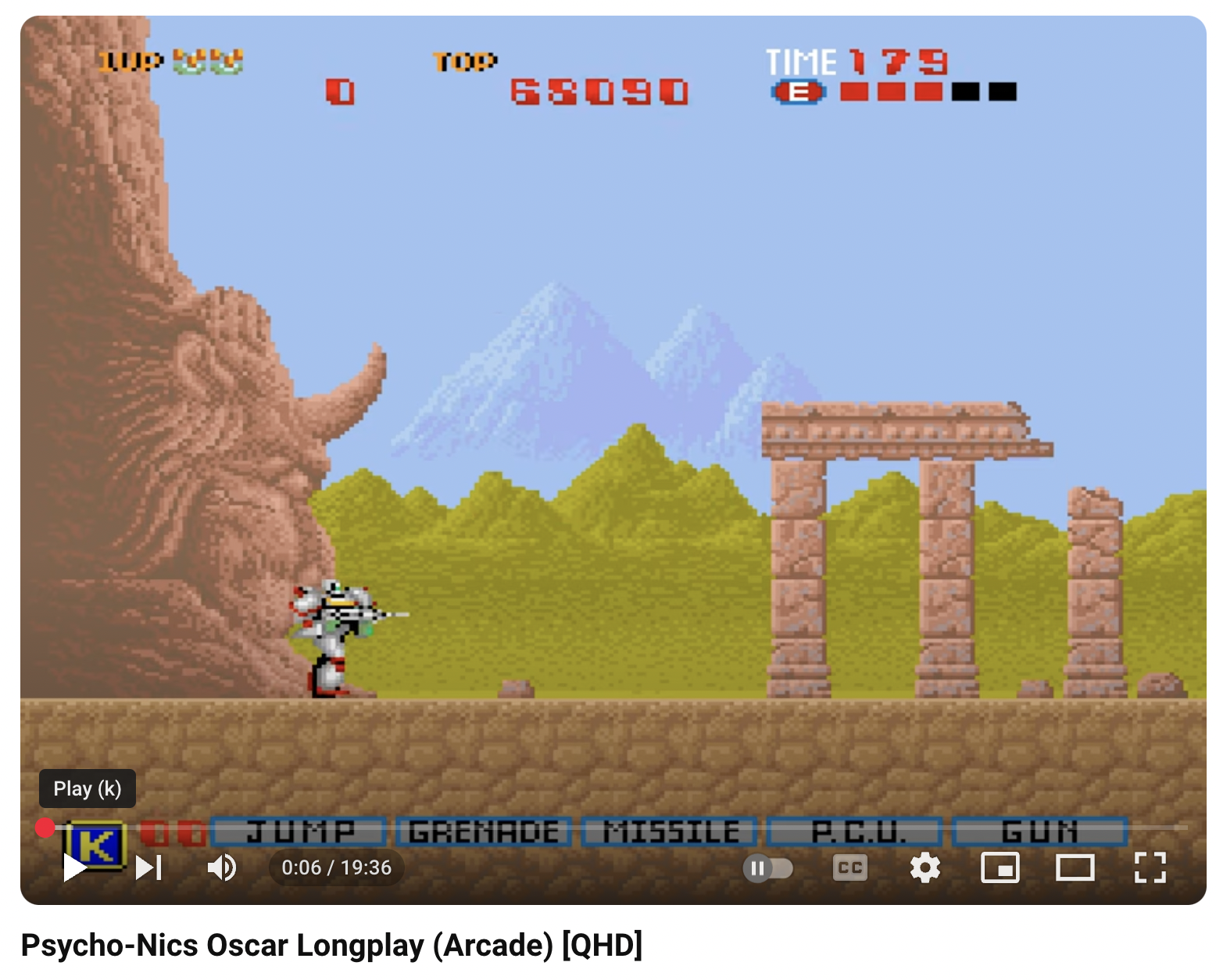
This may not be of any use to you - and again, I understand that your colour palette is limited, and also that the "fading away" effect may not suit your style - or may not be desirable to you at all.
By the way, huge respect to you for being so receptive to feedback! The thing is, you have to take other people's opinions - including mine - with a big pinch of salt.
The most important thing is that you get to express your own style and, as I've said before, you owe us nothing - and it is a privilege to get to see your work.