
Well you asked for fresh opinions - so here goes!
Note: as usual, my position is that the work you have done is magnificent, that you know what you're doing better than anyone else, and that any comments I make are just personal opinions and not necessarily correct.
Case in point: I previously expressed doubt as to the new design for the interior cave walls in the first level. - saying that the former, simpler design worked better.
Well, I notice that your solution was to include BOTH designs for two different caves. That's brilliant - both of them look great and it provides variety to those cave interiors. Now, that is a definite improvement to the game's visuals.
I'll try to keep this short! So some quick bullet points about the things I love in the new build:
- the beautiful smoothness of the scrolling and animation (in Youtube videos)
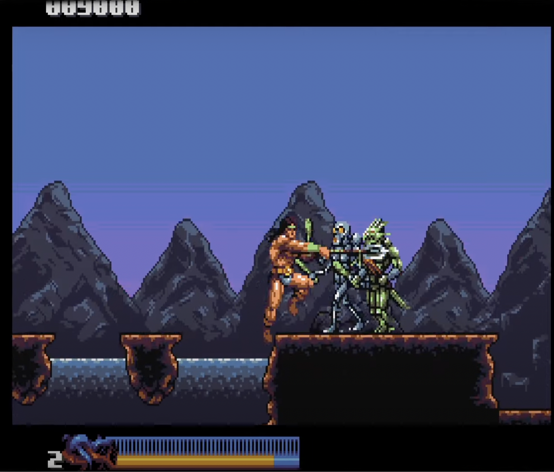
- all the new enemies: the jumping fish, the native American, the Aztec priest, the high priestess - all huge improvements on their equivalents in the arcade version
- the design and colour scheme of the interior of the Aztec temple - masterful!
- the design and colour scheme of the forest level
- the removal of the statues. Sorry, it just looks better now!
Okay, now on to what you asked about: the changes to colour saturation:
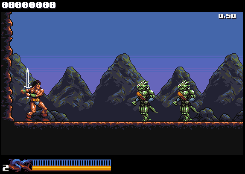
Looking at version 0.51 by itself, I noticed no change, none at all! Sorry!
However, playing version 0.50 and 0.51 side-by-side, I noticed one subtle difference in Rastan's skin colour, namely:
In version 0.51 he now looks like he has a fake tan, compared to how he was previously.
I notice that some of the other characters who show a lot of skin, have that same "fake tan" look - though it is usually far less noticeable as they often have tattoos/armour covering it. So no big deal.
To sum up: in comparing the two side-by-side, I prefer the older, non-tan version of Rastan. I feel it fits better with the mood and tone of the overall colour scheme.
But that is ONLY when I see the old/new versions side-by-side. The difference is quite subtle!
And since we're on colour, I must share with you an issue that has been nagging me since version 0.50 appeared. Here goes:
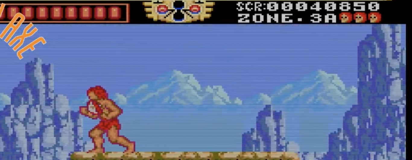
You have reworked the distant mountains in the very first level. I get that - they now look more finished, more detailed, and are beautiful pieces of pixel art.
But - forgive me! - I find there are two issues here:
1. They have foreground-level detail, when they are supposedly miles away. This creates a problem with the sense of space and distance.
2. You have added green to them, and again, please forgive me - that's a big NO for me. That colour is so intense and noticeable (in the context of the palette) that it brings the mountains right into the foreground.
What I mean is that I feel the distant mountains draw more attention to themselves than is warranted.
By contrast, you have also added green to some of the foreground rocks/rock faces - that looks fine. I am referring to the distant mountains only.
My strong instinct is to want the mountains to recede into the distance. There are several ways and degrees of doing this - i.e. simplifying them, using less colours, less contrast, adding blue (if it was in the palette) - or drawing them so that some of the background sky colour is showing through, i.e. the mountains are fading into mist etc. You are an artist - you know how to do all that.
But the most urgent thing I would do is remove the green. It looks very out of place to me. Sorry! With time being an issue, I would just put back the simpler mountains from earlier versions.
So that's it! Again: this is a nitpick and purely my personal opinion. I hope it may be helpful to you. I also hope that if it is NOT helpful to you, that you will forget it right away and continue doing your superb work!
Hey thanks for the feedback! I really appreciate it :)
I never cared much for the statues in the first place so that's a-okay :)
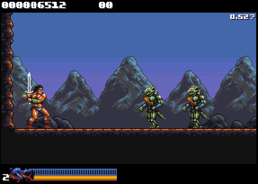
Fake tan... that does not sound great lol :o Check out the comparison gif below. It shows 0.50, 0.51, and the current changes:
Between 0.50 and 0.51 there's not much visible change in this scene, apart from Rastan himself. On 0.52 I made the greens darker and more of a muddy yellow in the mid-range to make the mountain highlights less prominent and a smoother blend with the blues, at the cost of a little pop on the lizard folk.
I totally get ya with the mountain range receding into the background. The goal all along has been to try and get the enemies to pop with saturated, high contrast colors and use more muted ranges for the background to give a sense of distance, separate elements by visual priority and all that. It *is* tricky with only 16 colors that I can use freely ofc :) Change one color and you affect everything since they all do double-duty.
I wanted to give the mountains some more detail because I felt they looked a bit crude the way they were. There's been some grumbling from people about the detail levels on Stage 1-1 too, so yeah :)
How does it look? Can't get around using greens completely, but hopefully the current contrast/saturation on em work better.
Rastan is a full sprite now so I got more leeway with him (separate 16 color palette). I'm keeping the color differences between the sprite palette and main palette subtle tho so he can still revert to blitter drawing when needed.
EDIT: Oh, and don't worry about critiquing my stuff. Constructive criticism is always welcome! :D
Well, thank you for your response! Don't worry too much about my "fake tan" comment. I have a tendency to be over-dramatic. The fact is I didn't notice anything until I placed both versions side-by-side.
I totally get what you're saying about the limited 16-colour palette. I think you're doing an incredible job with it. Really looks like a lot more than 16 colours.
Very interesting that Rastan is now made of hardware sprites. Presume that improves performance? I notice that you seem to be able to get 5-6 walking enemies on screen at once with no apparent slowdown. Very impressive!
Well thanks for posting those comparison screen shots. Here's how they strike me:
I definitely prefer the colouring of Rastan in 0.50. In the others he looks a little too saturated to me.
If I had to choose, I would prefer the muted highlight in the mountains in 0.53. The effect on the lizard folk is barely noticeable and they still look great.
But to be honest, I get that people were grumbling about the original look of the mountains, but I definitely prefer how they were coloured in these two screenshots below - with three shades of grey. The greys allow them to stay in the background and allow the more colourful elements to gain prominence in the foreground. For me, the green, whether it be bright or muted, doesn't quite seem to work in the mountains.
In saying that, I am trying to respect your style , sensibility and decisions - rather than impose my own.
But just to offer an alternative perspective: I would feel like exploring a way to get the mountains to fade further into the distance - for example by allowing the background colour to bleed through at the base - as if the mountains are rising out of a mist etc.
Unfortunately, I don't have time to demonstrate this myself - but here are some screenshots of distant mountains from other games that are more or less going in the direction of what I'm getting at. These examples are a little crude! But they do illustrate the idea of mountains fading far into the background.
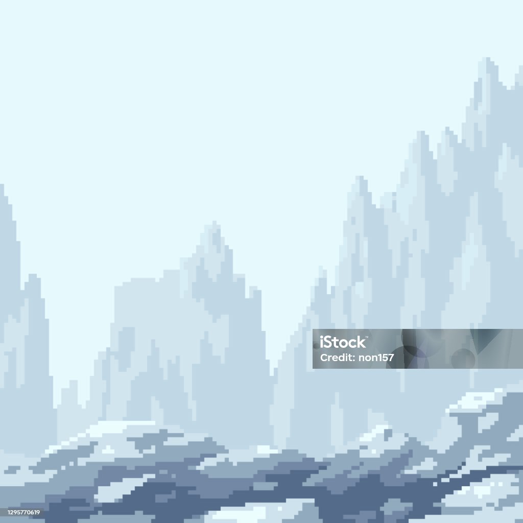
This may not be of any use to you - and again, I understand that your colour palette is limited, and also that the "fading away" effect may not suit your style - or may not be desirable to you at all.
By the way, huge respect to you for being so receptive to feedback! The thing is, you have to take other people's opinions - including mine - with a big pinch of salt.
The most important thing is that you get to express your own style and, as I've said before, you owe us nothing - and it is a privilege to get to see your work.
Hmm. This might work:
Not enough range in the palette to go as low contrast as the bg mountains you posted, but now there's a clear distinction between near and far bg at least
In the end I'll just have to mess around I think. I might decide to revert to a less detailed approach eventually, but in a different way than the old mountains. I'm starting to see why they don't work come to think of it
Yes, totally understand the colour limitations issue.
Okay, well that new screenshot looks really good. My main issue was the green in the mountains. This new iteration, without the green, looks very stylish to me. This is the best version so far.
But again, that is just my opinion. In the end, you are the one who decides what you prefer. And there's only so much tinkering a person can do! In any case, as things stand, those mountains look really impressive to me.