

I am just going to purely describe my player experience as feedback:
I didn’t quite get the game on my first run. It just feels like I am dealing with a lot of pop up ads and trying to close them all. Okay no problem, the game looks nice enough to give it a second try.
Got a better grasp of the game on my second run. But thought to myself: couldn’t the attack and att support node be just one node? Not sure why we need to manually connect them when there’s nothing else for the out(magic) to connect to except for the in(magic), since the other option is the fueler/igniter(Which I feel can also be just one node).
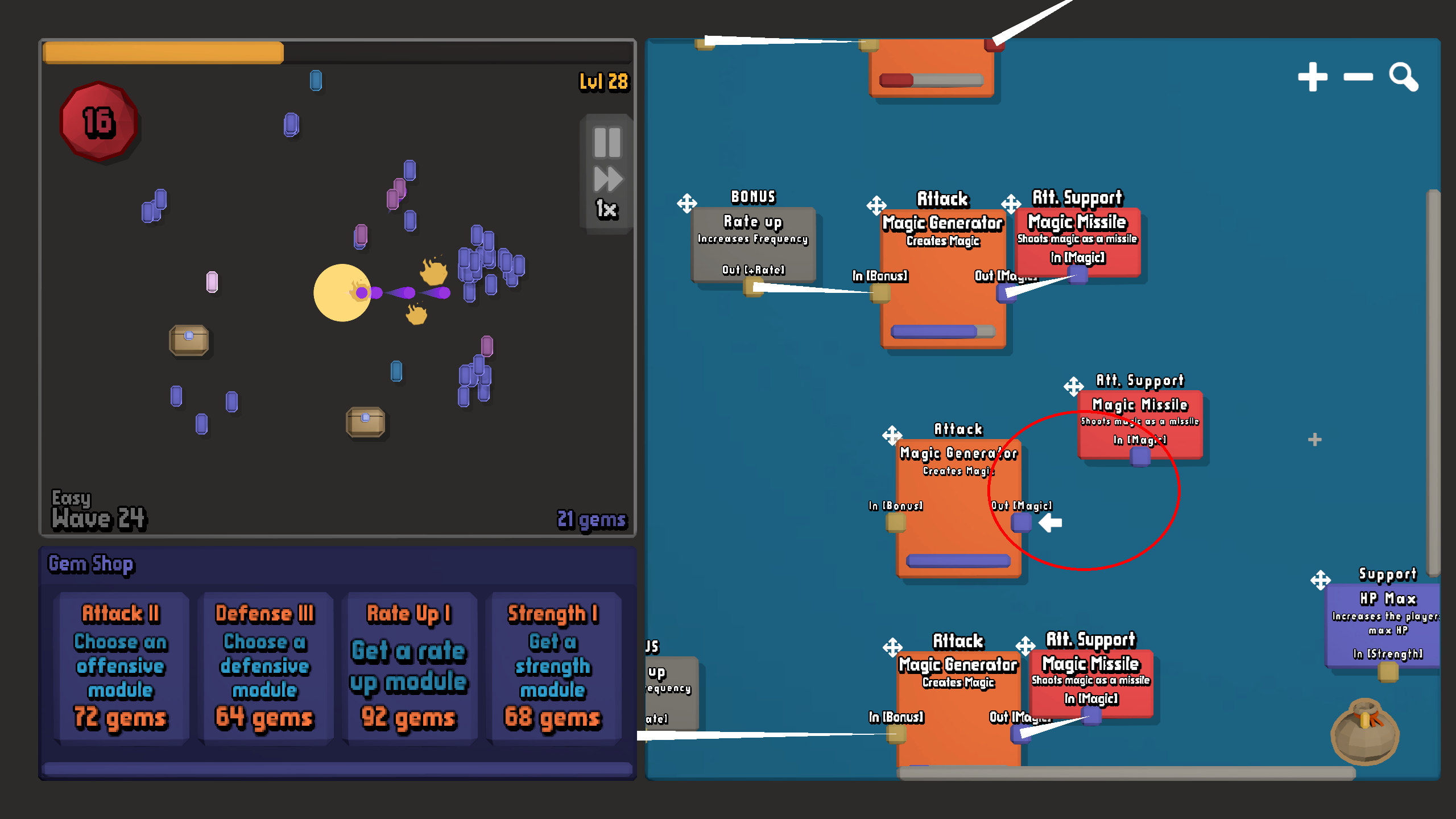
As I spend more time playing it seems every time I buy something from the gem shop it goes right on top of the nodes I already have on screen so I have to move them out of the way. I am spending most of my time rearranging the nodes on the right and dealing with the pop ups when I think should be looking at what’s on the left which is where the action and rewards are. I imagine the space on the right becomes even more cluttered as you progress through the waves, to the point where it feels like managing the interface is the game.