
Update:
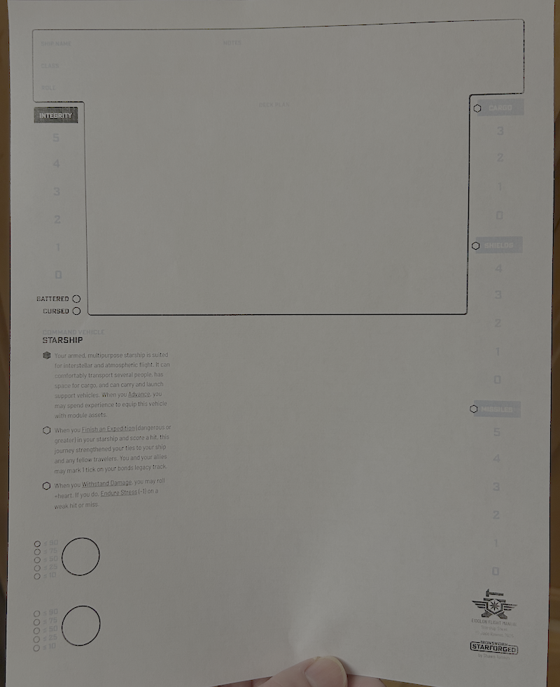
- Blacks show up fine now!
- Dark-grays are barely legible
- Light-grays are almost invisible
If it’s not just a further color-calibration thing, my high-contrast wish-list would look like:
- Cargo/shields/missiles have black headings, like Integrity. (Those empty bubbles really pop)
- Track numbers are black too
- maybe with dark-gray separators instead of the white ones?
- Black numbers next to the clock circles
- I’m noticing a theme here; let’s just say “all text is black instead of any shade of gray”. (Ship name/class/role/notes, Sector/region, Faction rarities, campaign name/date
- (Speaking of Campaign name/date, is it intentional that only the third of the Campaign Oracle pages has a date in the header?)
- (Maybe) dark-gray border around borderless text fields like the Ship page’s heading?
- Black text-underlines, Dark-gray grid lines, light-gray only for accents?
I’m not sure what I’d suggest about the sector & galaxy map, but probably a darker shade of gray?
(Pulling out a color meter app) Basically:
- I can read grays around 0x80, but I wish they were black
- I can barely see grays around 0xD0
- The 0xE grays might as well be white
All that said – take this as you will, I’m not your Mom. :)