
Sorry about that! Still getting used to the new export dialog in Affinity.
Update:
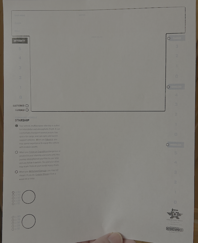
- Blacks show up fine now!
- Dark-grays are barely legible
- Light-grays are almost invisible
If it’s not just a further color-calibration thing, my high-contrast wish-list would look like:
- Cargo/shields/missiles have black headings, like Integrity. (Those empty bubbles really pop)
- Track numbers are black too
- maybe with dark-gray separators instead of the white ones?
- Black numbers next to the clock circles
- I’m noticing a theme here; let’s just say “all text is black instead of any shade of gray”. (Ship name/class/role/notes, Sector/region, Faction rarities, campaign name/date
- (Speaking of Campaign name/date, is it intentional that only the third of the Campaign Oracle pages has a date in the header?)
- (Maybe) dark-gray border around borderless text fields like the Ship page’s heading?
- Black text-underlines, Dark-gray grid lines, light-gray only for accents?
I’m not sure what I’d suggest about the sector & galaxy map, but probably a darker shade of gray?
(Pulling out a color meter app) Basically:
- I can read grays around 0x80, but I wish they were black
- I can barely see grays around 0xD0
- The 0xE grays might as well be white
All that said – take this as you will, I’m not your Mom. :)
Thanks for the detailed feedback, truly. I’ll look into making a high contrast black and white version. The current version is aiming for parity with the official Starforged character sheet, which includes color in the cool gray tones (so I’m not sure how printing in mono affects that). But I can certainly bump up the contrast and look into whether the export settings can be further improved. Stay tuned :)