Thank you for the clarification! That’s how I understood it, but I can see how someone might think it’s a remaster.
Ed Brannin
Creator of
Recent community posts
Thank you! Sorry I hadn’t examined the zip file yet :)
I printed & stapled it yesterday; really looking forward to trying it after so many happy replies on this Reddit comment from r/metroidrainia
If you ever do another edit on this, would it be feasible to make a high-contrast version?
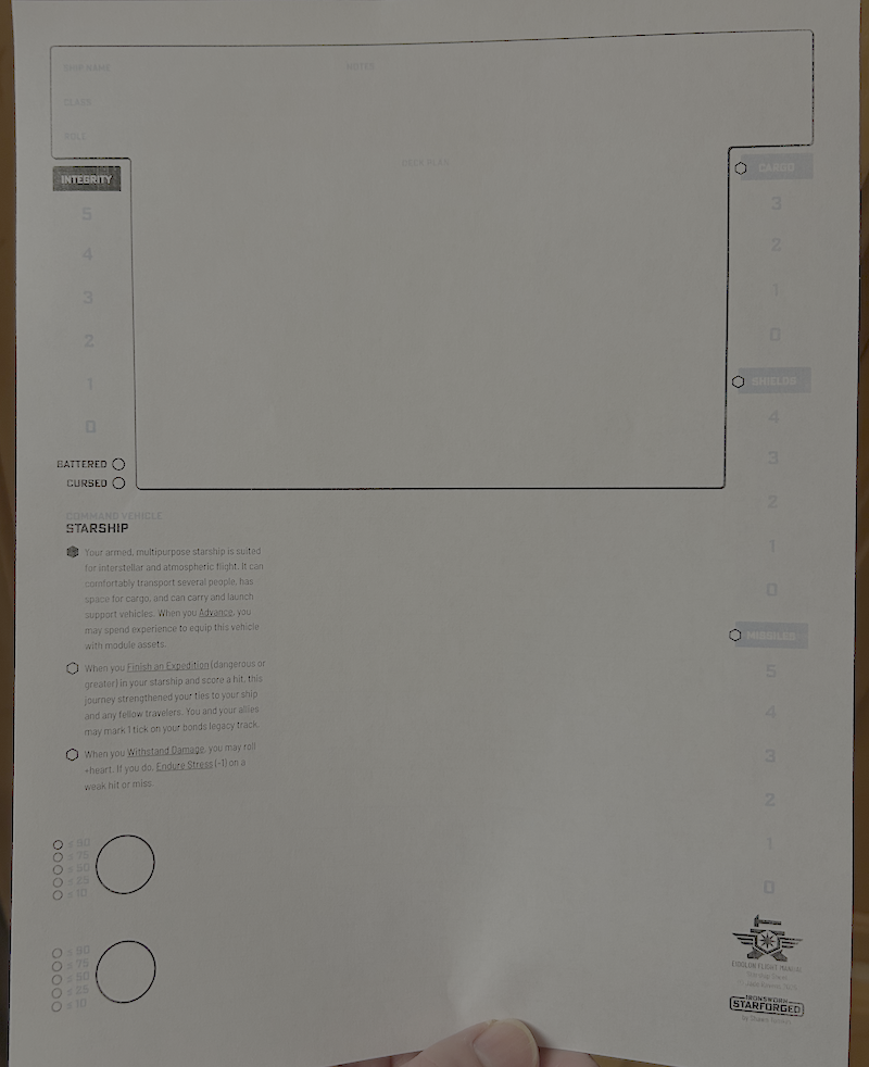
I appreciate the printer-friendly version having a transparent/white background, but the gray-blue text is almost certainly going to be unreadably faint on my printer.
I think it would be better if, when trying to activate a research while activeResearch == maxResearch, it automatically stopped the oldest one. That way, the thing you ask for always happens, but the game adjusts something else (which is visibly also right there) to let it happen.
Being able to “lock” a research to prevent it from switching would be good too, so (for example) if I’m researching random+Meta, I could:
- Click on Agriculture (turn off Random)
- Activate Epiphany (avoid wasting half the charge on Random, which as far as I can tell just does nothing)
- Click on Random (turn off Agriculture)
Edit: Also would be nice if, with an active Random, Epiphany would randomly select a non-random topic to apply to, making the above dance helpful for “Get two things you want”, but not necessary to avoid only getting a bonus to one stat.
It doesn’t look like I can import my Demo save on iOS?
Being able to export would be nice too – not as necessary if it’s backed up to iCloud, but still helpful.
Edit: on the other hand, I quickly surpassed my demo progress.
I spent a minute looking for upgrades that seem to have been removed since the demo build; mainly the auto-coin-cannon and auto-level-advance.
I don’t see a way to copy my current build to another slot.
Update:
- Blacks show up fine now!
- Dark-grays are barely legible
- Light-grays are almost invisible

If it’s not just a further color-calibration thing, my high-contrast wish-list would look like:
- Cargo/shields/missiles have black headings, like Integrity. (Those empty bubbles really pop)
- Track numbers are black too
- maybe with dark-gray separators instead of the white ones?
- Black numbers next to the clock circles
- I’m noticing a theme here; let’s just say “all text is black instead of any shade of gray”. (Ship name/class/role/notes, Sector/region, Faction rarities, campaign name/date
- (Speaking of Campaign name/date, is it intentional that only the third of the Campaign Oracle pages has a date in the header?)
- (Maybe) dark-gray border around borderless text fields like the Ship page’s heading?
- Black text-underlines, Dark-gray grid lines, light-gray only for accents?
I’m not sure what I’d suggest about the sector & galaxy map, but probably a darker shade of gray?
(Pulling out a color meter app) Basically:
- I can read grays around 0x80, but I wish they were black
- I can barely see grays around 0xD0
- The 0xE grays might as well be white
All that said – take this as you will, I’m not your Mom. :)
Fixed color profile issue (may have caused the PDF not to print as dark as it should)
Oh good, I had been waffling about asking you to make a high-contrast version, because the v2 and v3 PDFs both printed unreadably washed-out.
I thought it was my printer, but then my wife printed something else and it was fine
I made an HTML version of the clues that includes the crossword centered on top.
To use, copy and save as index.html (or really anything) in the same folder as Crossword.png
<html>
<head>
<style lang="text/css">
h1, h2, img.puzzle {
text-align: center;
display: block;
margin-left: auto;
margin-right: auto;
}
.clues {
display: flex;
flex-direction: row;
flex: 1fr 1fr;
align-items: baseline;
justify-content: center;
}
.clues div {
padding-left: 1em;
padding-right: 1em;
}
</style>
</head>
<body>
<h1>A Bad Crossword</h1>
<img src="Crossword.png" alt="A bad crossword puzzle" class="puzzle">
<div class="clues">
<div class="across">
<h2>Across</h2>
<pre>
2: a creature
4: heard on rollercoasters
8: golden state
10: swedish pop group
12: a type of car
15: LOK keyword
16: foresee
18: white character
</pre>
</div>
<div class="down">
<h2>Down</h2>
<pre>
1: a muscle
2: a challenge in which you don’t press A
3: barium
5: type of battery
6: banana from the philippines
7: what does a sheep say
9: something to cool you down
11: a type of gun
13: variant of #17
14: help preservation technique
17: cool blue arrow
</pre>
</div>
</div>
</div>
</body>
</html>
Layout idea:
If you moved Channel above Loadbearer, you could mark all the “Requires [Ability]” with lines/arrows between their checkboxes.
Then again, that wouldn’t help with the Feat requirements. I checked if those could be lined up side-to-side with the pamphlet part-folded, but it doesn’t look feasible.
I saw this in the credits…
This game uses mechanics based off the Oracles Gasp, designed by René-Pier Deshaies-Gélinas of Fari RPGs.
…so I looked that up, and I see a Risk Oracle here: https://keeper.farirpgs.com/resources/fari-rpgs/breathless/the-oracles/
Neat idea! A few notes:
- Boat does not get recognized on 4x4 (or not when attached to the lower-left, I’m not sure which)
- I don’t think the points-per-minute estimate should be affected by upgrade purchases: generally buying something should only increase PPM, but often it goes negative for a bit after buying something.