
Indie game storeFree gamesFun gamesHorror games
Game developmentAssetsComics
SalesBundles
Jobs
TagsGame Engines
A jam submission

Fall of DaysView game page

Strategic survival card game—scavenge, battle the undead, and make it to the rescue ship.
Submitted by Humane Tiger (@HumaneTiger1) — 10 hours, 26 minutes before the deadline
Add to collection

Play game

Fall of Days's itch.io page

Results

CriteriaRankScore*Raw Score
Overall#14.5004.500
Fun#14.0004.000
Sound/Audio#14.1674.167
Visuals(Graphics)#34.0004.000
User Interface (UI/UX)#93.5003.500

Ranked from 6 ratings. Score is adjusted from raw score by the median number of ratings per game in the jam.

DevLog Link
https://humane-tiger.itch.io/9-dayz/devlog/1425723/finishing-furbuddy-and-integrate-barricades

Developer Feedback Questions
* Is the tutorial helpful? Does it explain well enough how battles work?
* Have you crafted and cooked at a fireplace? What reciepes you were able to cook?
* Do you like playing with Furbuddy and his doggy friend? Were you able to keep your dog alive?
* If you stream/record, I would really be interested in join or watch the recording :-)

Any other kind of ideas, thoughts, feedback or criticism are highly welcome.

Leave a comment

Log in with itch.io to leave a comment.

Comments

Submitted(+1)

This is a pretty nice survival game. It is tough, but feel reasonable in most ways. There are certainly things a person could use in real life that are not offered in game, such as using wood from buildings and metal of glass from vehicles, but it works well enough for the gameplay to not feel too punishing. The crafting works fairly well, though I wouldn't mind more to craft. I did not replay with any of the other characters, but I like that you have them, and they do add new ways for replays.

I chose to start with the tutorial. There is a lot on the screen, and the cards did not initially grab me as being the tutorial, but looked like part of the general UI I needed to learn about. It would be nice if for the tutorial there was an initial popup based system that pointed to or highlighted the various UI elements to describe what they are. It also starts with the time advancing. It would be nice if the tutorial game started paused until you have a chance to look things over and are ready to start playing. Playing a bit further I got into combat, and that tutorial screen is what I was thinking for the main UI. The combat tutorial is pretty good, though maybe add a button to bring it back up at any time for people who may want to verify things after playing a bit.

I like that the Inventory, Crafting, Map, and cards at the bottom right all still can be interacted with while paused.

I like the hotkeys, and that they are clearly shown in the UI.

When doing things like cutting down a tree, it would be nice if it was more clear what resources will be used. In general, it would be nice if things were more clear on when a resource will be consumed vs just used. In cooking you don't lose your sticks, but that is not clear. Only after doing some cooking with them and noticing the quantity did not go down did I know, but I still did not know what other situations were like that.

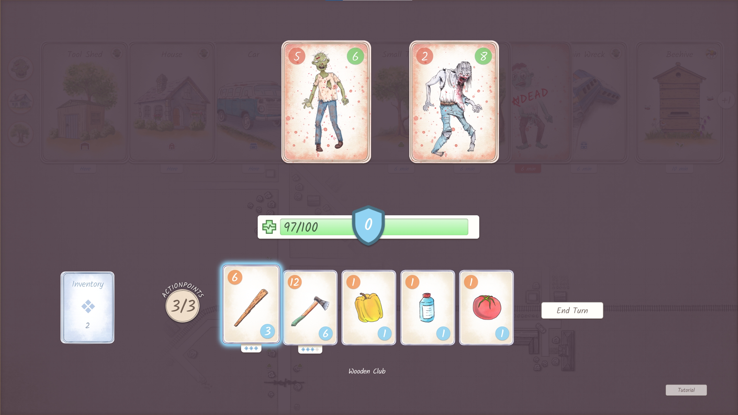
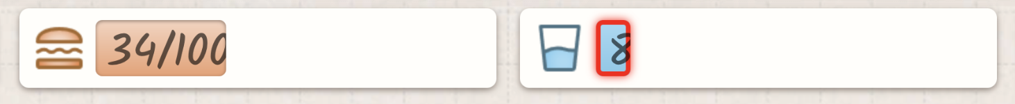
I was at very low water, with it showing only 1. I used items to restore water, and the bar did not move much. It seemed odd, until I acknowledged that the numbers are drawn as part of the bar, so they disappear as the bar shrinks. I think the numbers should always show so you can see an accurate representation. It does seem that it has a minimum size that shows the first digit, which makes it even harder to tell how much you have when it matters the most, but it is not really moving. It did seem like sometimes the bar moved differently than others, though maybe I was just not paying enough attention.

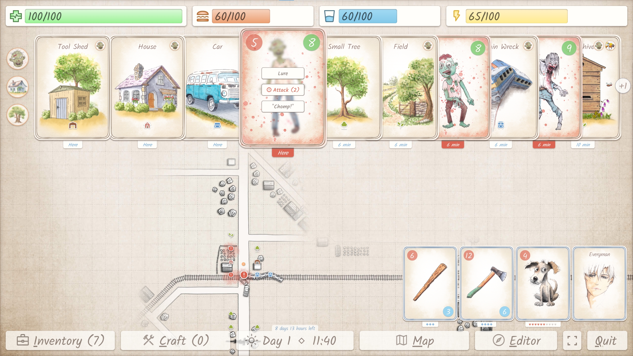
The card UI is neat, but can get very full and cluttered. It would be nice to have a way to shrink some down when you are trying to deal with only certain ones. Perhaps a filter to only show enemies, or exclude all enemies. Don't fully hide them, but shrink them perhaps into a stack at the far right with the number of cards shown on top. I missed searching an area at the Lakeside Camp due to so many cards, even after defeating all the enemies. Just clearing all enemies might not be enough, and more filters might be needed. Maybe one to show all places with non-repeatable actions remaining. I do see the icon for no more items, but with so many cards I had completely missed that location somehow. It could also help if the card you most recently interacted with, or its replacement, was favored for being full size/above others. After killing rats the rat corpse car was often beneath all of the others, but I generally cut them up to regen the dog's "HP" before fighting more.

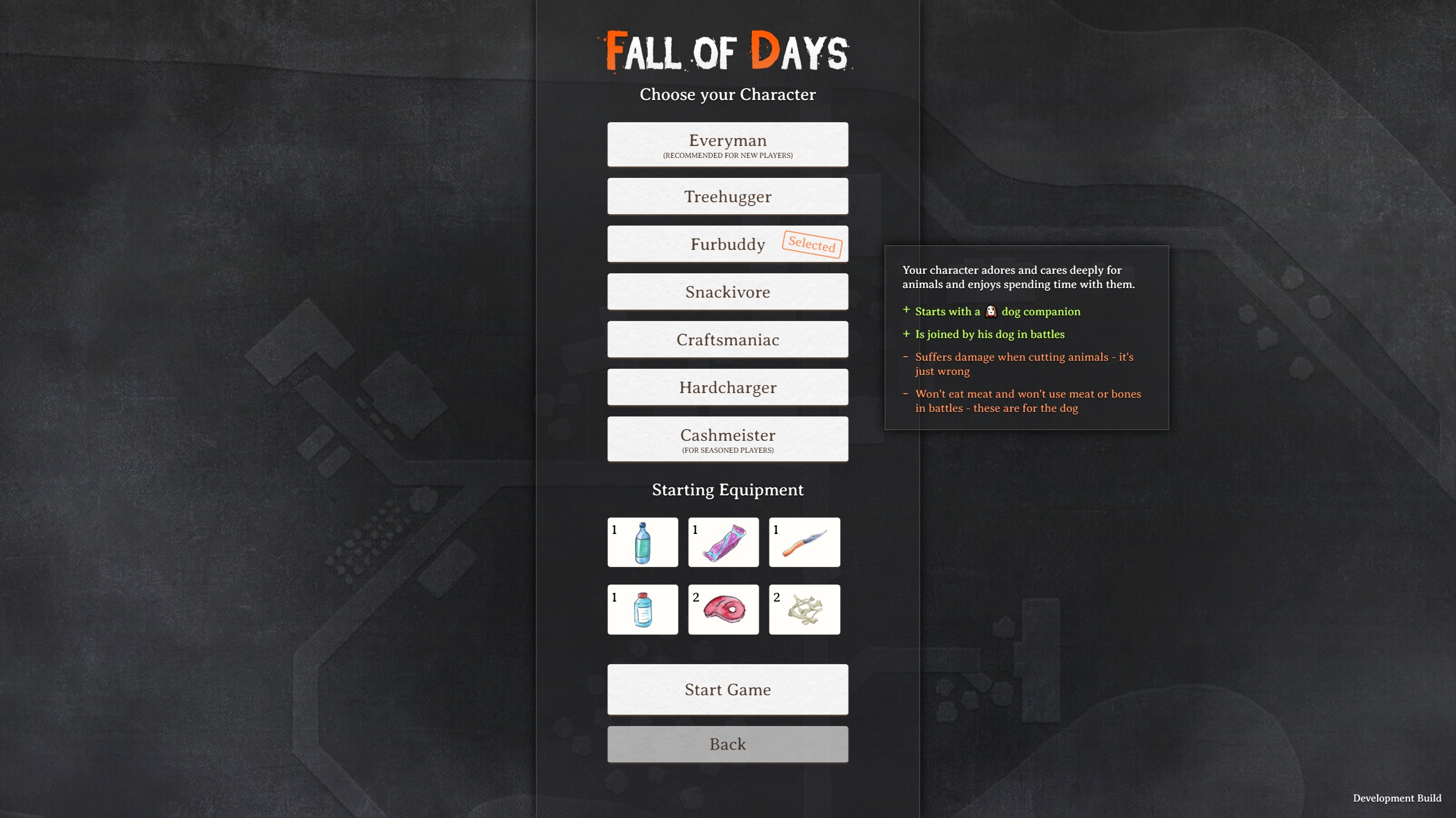
I liked the dog companion. I only used the dog to fight rats, but every rat fight was theirs. Most of the spoils went to them, with some meat being saved for cooking. The Furbuddy sounds interesting. I was wishing the dog would fight with you, instead of alone. Maybe next time I play I will try that character.

I reached the jetty and was able to drink water, which was nice as I was quite low at that point. It would be nice if you could save your water bottles to refill at places like this. In a survival situation I would certainly save containers to refill when the opportunity arose.

It would be nice if the button to go to the next page in crafting was more noticeable. I missed it at first and only saw it when I was realizing there should be more to craft by now and looked for a way to see more. It blends in with the background a bit too much.

While I understand needing to craft an item to get more details on it, it would be nice if crafting that is stationary had an icon noting this, even before you craft it.

I crafted a weapon, only to try to equip it and be told I had no free space. The equipment limit should be mentioned sooner, and possibly a warning provided when crafting.

It would be nice to be able to see the cooking recipes before spending the time cooking, to be sure there is something useful to cook. I cooked several recipes such as roast and stew. I don't recall them all, as I just went through the list and cooked everything I could when I had a fire to do so. It seemed like any of the results were better than not cooking them.

The map is oddly centered. There are points when your equipment covers the area directly in front of you, making it hard to see what is there. The area south of Camp Silverlake is the one that really stood out, though the centering was something I noticed at the start with the bottom UI buttons feeling a bit in the way.

It would be nice if the "You died" screen told you why. I died while resting. I'd recently had food and drink, so I don't think I should have died from those, but I may have misjudged and not paid enough attention to the bars. I was on day 9, and unlikely to make it to the goal, as I was working my way around some of the tougher groups of zombies. Only after did I acknowledge that I might have been able to build a barricade to help and go through the shorter route.

It wasn't too bad, but there were times when the diagonal paths were not clear on what button would move me there and I did have cases where I did not go the way I intended. Being at a fork and having to go straight down, then right when I wanted to take the down-right branch felt odd.

Overall a really good submission.

Developer (1 edit) (+1)

Oha, oha! What a thoughtful and extensive list of feedback! Thank you so much for taking your time, there is so much value in it.

After working quite a while on my game now, I am suffering from some severe developer blindness. Your fresh look is offering a lot of insights and eye openers to me. Will compile all your points and transfer them into a devlog and into my todo board.

I am in a constant struggle with myself to keep the interface as clean as possible on the one hand, while trying to transport as much information as possible. Finding the right balance is a really tough one, but I think there is still room for improvments, and you point at the right places.

Thanks again for expressing your thoughts and impressions in such a helpful way!

Submitted

Glad to help. These jams are great for devs helping each other out and giving different perspectives.

I totally understand the challenge of a good UI that conveys everything needed to new players, while not feeling cluttered or slow to the  experienced ones. We are working on that ourselves right now, and jam feedback has been great for giving us guidance.

Submitted(+1)

Here we go:

* Is the tutorial helpful? Does it explain well enough how battles work?

Yes, it was pretty well explained, it was fun to defeat a zombie by throwing a tomato at it. 


* Have you crafted and cooked at a fireplace? What reciepes you were able to cook?

I craftes items, but did not discover fire and was eating raw rat meat like a savage, was kind of expecting getting a disease 


* Do you like playing with Furbuddy and his doggy friend? Were you able to keep your dog alive?

The dog is great, would die before letting anything happen to him


Everything is very polished and works very well, I have only a suggestion for the UI, it would be clearer with icons for the different stats (sowrd or fangs for damage, heart or cross for  hp, etc)


Overall, fantastic work, well done!

Submitted(+1)

Hey! I played the game for the first time.

  • Gameplay
    • It's good survival game. I am sure that ppl who love survival games would love that game.
    • Game design is good, you can easily extend the game in different directions.
    • Card design with movement is really clever describe what is going on around you. For the firs time it was not that obvious but I god idea pretty quickly. When I thought about it I would probably tried to put cards on the map but then I realized how hard would be to display the whole UI, so I appreciated the design.
    • I would love to have possibly to "run away" when I got into really bad fight. Unfortunately when I got into fight with two zombies I could only just watch how I die :D. This is something that could kill someone run and demotivate to try again (game is slow paced)
    • Item and crafting system is good, make a lot sense for the game
  • Visuals
    • Great, it's exactly what would expect from this kind of turn game. If you did all drawings by yourself I really appreciate your work!
  • Music
    • Good, do not disturbs me. Match well for survival game and fiction of the game
  • UI
    • Good, it's intuitive. I didn't stuck at all. It looks like UI for a finished game.
    • What I would improve it would just adding simple buttons to move your characters. Just like WSAD but visible on screen (move up, move down ..). That would be more integrated with rest of UI logic (using mouse / touch).
  • Bugs
    • I got bug with UI when your stats are not displayed for full width of container so I cannot see all numbers. It's related to progress bar when your stat is low. Probably just need to move into higher layer.
  • Performance
    • Pretty great, works well on web

Anserwing questions:

  • Is the tutorial helpful? Does it explain well enough how battles work?
    • Tutorial is good, I was able to understand how battle works, but it's still pretty clear without tutorial :)
  • Have you crafted and cooked at a fireplace? What reciepes you were able to cook?
    • I didn't find the fireplace but I tried crafting system and I like the implementation
  •  Do you like playing with Furbuddy and his doggy friend? Were you able to keep your dog alive?
    • Yes, it's great idea! Doggy helped me to fight with rats :D
  • If you stream/record, I would really be interested in join or watch the recording :-)
    • I am not content creator but I got the idea because game should be promoted

Congratulations on your submission! The games has great potential I would encourage to "build up" for steam release, current game state is pretty enough for the demo release. I think people would love to play this kind of game! Keep working!

Developer

Wow, what a great feedback :-) Thank you so so much for taking your time!

I will take notes and document them in my ToDo list. The "run away" is something that came up in the past, I will give it another thought. The "Move your character" buttons are shown when you choose the "touch controls" option - you can then touch and click them.

Yeah, visuals are all drawn by me, on paper first, then scanned - me loves drawing pictures :-D

Can't reproduce the bug, though :-( You mean the character stats at the top of the screen? Maybe have a screen shot for me?

Thanks again for your kind and encouraging words!

Submitted(+1)

Yes, it's about character's stats but I think it's common for progress bar component:

Submitted (1 edit) (+1)

Man, this game is amazing! I loved the art style, and the gameplay is extremely creative, it’s something I’ve always wanted to see in a game!

I did get a bit confused during the tutorial, though. It took me a moment to realize my character was already on the map, so while I was testing the WASD keys, I walked straight into a zombie and ended up having to fight it before I could even finish reading the tutorial cards haha

That might just be me being blind haha, but maybe it would make sense to place that first zombie a bit farther from the starting position? That way, players have more breathing room to read everything first and test the controls.