

Well, the game is interesting, let me elaborate.
- Upgrades? Where? You mean the collectibles? Technically, yes. Practically, meh?
- Controls, well, yeah, there's one button.
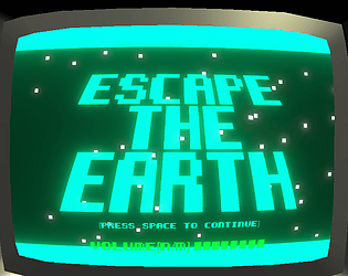
- Visuals? A bunch of squares & rectangles with a TV overlay and a bulge effect.
- Audio? Probably one of the better things here, the audio was actually pretty decent for a game of this type so there's that
- Gameplay is.. not too bad actually.
I'd say, it's something you'd see on Newgrounds or any site with flash games basically.
Play game
Escape the Earth's itch.io pageResults
| Criteria | Rank | Score* | Raw Score |
| Overall | #2 | 3.114 | 3.114 |
| Overall Enjoyment | #2 | 2.857 | 2.857 |
| Controls | #2 | 3.571 | 3.571 |
| Audio (Music and Sound Effects) | #2 | 3.000 | 3.000 |
| Visuals | #3 | 3.571 | 3.571 |
| Usage Of Theme | #4 | 2.571 | 2.571 |
Ranked from 7 ratings. Score is adjusted from raw score by the median number of ratings per game in the jam.
Comments
Sweet, thanks Master Doot, your comments are very fair. I'd struggle to class the upgrades as collectibles since you don't collect them, they just upgrade your character, but to say that they're underwhelming is fair, I originally wanted them to be more spectacular but the gameplay I had committed to somewhat limited me :/. The controls were one button but that's not really what the "controls" category is about, it's how satisfying they are to use and how responsive they are, which I thought was pretty good in my game, but very subjective since it's about gravity so at different moments you'd want it to be slower moving. I'll definitely agree with you on the visuals, it's very technical-focused rather than art focused, but I still put a lot of effort into it. I really want to say thank you for the nice thing you said about the music, I'm not usually too good at that so it's nice to hear somebody liked it after all the effort I put into improving it. I'm glad you think the gameplay is good, I really wanted to focus on replayability, but I think I sacrificed skill somewhere along the way, and a lot of how to win has ended up being luck. Again, thank you so much for taking the time to write such thorough criticism! It's very useful for future projects!
Thanks for playing my game, FuzzyChurro! Yes, I suppose fully saturated rotating colours with ridiculous bloom would make the text a little hard to read! Thank you, it's certainly something to think about in future. I really wanted to ham the garish neon-levels to the max, but as you've pointed out it can sacrifice the clarity :/. I thought maybe that not explaining the upgrades in words would be ok because the icons are clear enough, and obviously the ? was meant to be unknown, but you certainly have a point that it may be hard to tell, especially as they are moving so fast! Thank you so much for the nice things you said about my execution and polish! I worked hard on it!
Leave a comment
Log in with itch.io to leave a comment.