
edit: after writing I noticed the tone was a bit whiny and a bit too overthought, forgive me, long trip and such.
Very well made and engaging RE2-like, the style is impeccable and the setting, while somewhat minimalist, sucked me in.
While the level design was certainly decent and played well to tension building (but not to camera shenanigans), the map held an unintuitive sense of direction, and I found myself stumped when a room I thought I needed to go had its space occupied by a pre-existing room, or found an entirely new segment of the map that I couldn't clearly see.
3D metroidvanias need to maintain a 'guess-able' sense of direction through both set and level design if they're planning to maintain a fog of war; I didn't really know where to go to progress.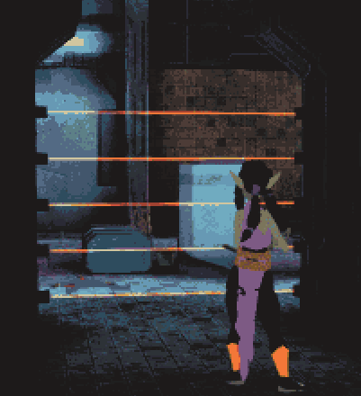
This is despite recognizable, segmented and well color-coded sets that have differentiable styles, this may be down to the game's contrast making everything kind of mush together mentally even when the environments themselves aren't similar.
I actually kind of liked the silence, it breaks in a recently noticeable pattern of games, including horror games, audibly bombarding you in what feels like an effort to numb you into a flow state, maybe non-stagnant and changing low ambience would be a good compromise.
I really hated the direction scheme not changing between levels, even if I understood why it's implemented, maybe a buffer before the directions are changed is best instead of waiting for the player to not make any inputs (or easing), there were multiple times where I was threatened by and aimed at enemies that were off-screen, which usually doesn't feel fair even if intentional.
As for the difficulty, I never really died or dropped below half health, the armor doesn't degrade proportionally to how much we're warned about it, the organization doesn't really matter since there is no limited inventory system and the hotbar fits all the weapons, though 2,3 and 4 are in reverse order(also, the SMG and pistol have overlap in usage), supplies are overaccommodating (at first, they're very early-loaded) and enemies neither deal nor take much damage, though they can stun lock you.
The clothes are...weird? it's the kind of thing I would expect as parody.
Like, they're good, they look great, they're tied into the gameplay and I like finding them, but they pose such a thematic break with the survival horror tension that it feels almost absurdly funny?
It has really solid legs, but it has some deformities that make it a bit unenjoyable to play for a long session.