Indie game storeFree gamesFun gamesHorror games
Game developmentAssetsComics
SalesBundles
Jobs
TagsGame Engines
(+1)

I assume you’re talking about the image with the cello.

Honestly…if we’re grading on the scale of “sexualized depictions of women on the internet” it’s fairly tame. If you want a point of comparison, consider the old ads for Evony and similar slop from that era. Which is not to say it isn’t objectifying–it’s just that the standard set by the internet (and frankly much of the outside world as well) makes anything short of the extremes not really read that way.

On the flip side, if I were visiting the page without the info from your first post, I wouldn’t read it as a joke at all. I would be neither laughing nor offended, just very confused as to why it was there! Sometimes when making a joke, it can wind up too reliant on inside information to make sense to anyone but yourself. I’ve been there before, and I think you’ve landed there in this case.

(1 edit)

Hey thanks for the feedback Huges Ross!

Yes it was the Cello person. Come to think of it, the person blowing a kiss kind of pose is also in that territory in a different way.

Ahh I see. So you’re saying I should draw her with LESS clothes and more revealed attributes. K nice. gotcha. : P K, maybe I’m making that joke that’s too reliant on inside information again there as you say.. Yeah I suppose one would only know after they played the game I suppose. But that brings up an interesting follow up question. Were you so confused as to why it was there that it prompted you to download and find out? I guess not. Has that ever happened to you? where you’ve been like wtf is this I’ve got to dive in more to see…

(+1)

It’s not common, but it has happened. I recall a lot of older games by Cactus having that effect on me back in the day… with a lot of these games, the strangeness and confusion is a part of the game rather than something external though.

Having taken a longer read of the page and watched the gameplay trailer, I do think your game has that kind of energy but the page isn’t doing a good job of presenting it through the game. I think it comes back to the other commenter’s point about there being too much visual noise–the art’s cool, but makes it harder to focus on the content that would tell you more directly what the game is and make you want to try it.

I also think this bit “FREE GAME: An overly ambitious action platformer with a ton of features. Over 50 levels. 50 cutscenes. Around 750MB of oggs. Make of that what you will.” …being red-on-red ironically causes it to stand out much less than the rest of the text on the page, despite being a pretty solid hook.

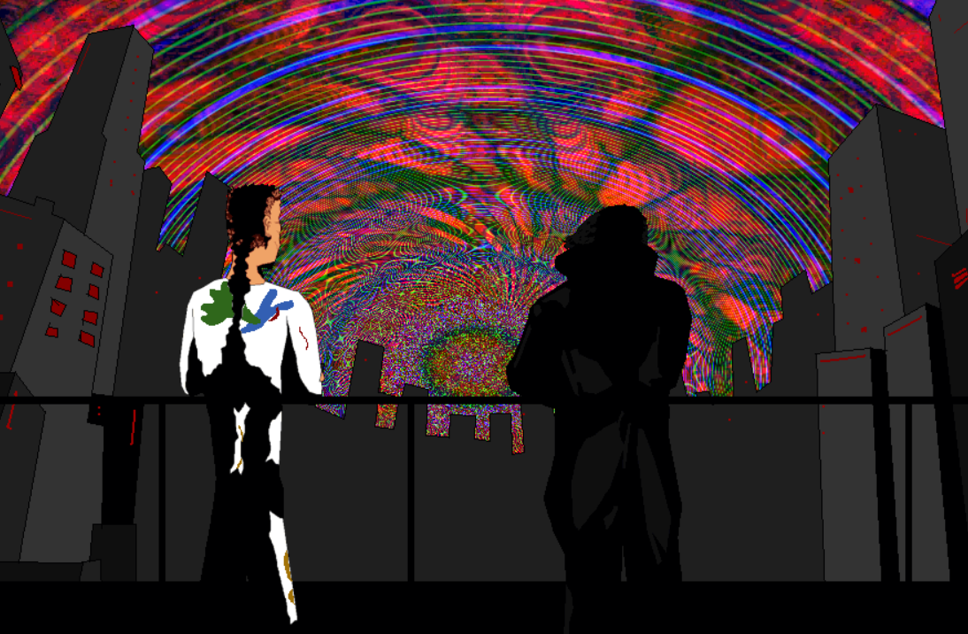
Like honestly the whole problem might just be page design / layout. Like look at this image I snagged off the bottom of the page:

This looks really cool, but I only just noticed it while writing up this comment because, as mentioned, it’s at the very bottom of the page.

(+1)

Having clicked through to the website out of curiosity, I will say that the static-y background there might be something to try on the itch page. I think it’s less distracting and it fits with the overall color scheme you’re using

(+1)

Hey, thank you so much for taking the time to go through all of that. That’s really appreciated.

I think I’ll take your static(from the website) suggestion to heart and if not that, can always revert to the block coloured background from before. Same with the change to title text. I won’t make changes immediately. Plus, I think I need to ensure gifs are working on the page. So far they seem to be inconsistent for me. Will look through that properly when I have some more time.

Selfishly, I still do want to try to get the feature of a labyrinthine story that is told through a huge cast of characters over to the viewer of the page through the imagary on it. And I may give that a quick attempt too. But Through that, I suppose I should choose images specifically from gameplay as you say.

Funny you say about things being hidden at the bottom of the page. Unless it’s a genre that I know that I won’t try, I usually scroll down to the bottom of pages to see comments around that area. Ah we’re all so different XD

There’s another hypothetical way, which I won’t do. We probably wouldn’t be doing much with this game at all anymore if Cruelty Squad hadn’t set precedent that something so traditionally unnappealing in so many areas could have so much traction. I wonder how they got out there from the start. Is part of it because the abrasiveness of their game was unmistakable from the outside? All of that is to say, go completely the other way in terms of subtlety for our page and make it as obnoxiously overloading, abstract and confusing as possible so it’s unmistakable what’s inside. But nah lol. Would probably require a lot of gifs too lol

ey cheers