
It’s not common, but it has happened. I recall a lot of older games by Cactus having that effect on me back in the day… with a lot of these games, the strangeness and confusion is a part of the game rather than something external though.
Having taken a longer read of the page and watched the gameplay trailer, I do think your game has that kind of energy but the page isn’t doing a good job of presenting it through the game. I think it comes back to the other commenter’s point about there being too much visual noise–the art’s cool, but makes it harder to focus on the content that would tell you more directly what the game is and make you want to try it.
I also think this bit “FREE GAME: An overly ambitious action platformer with a ton of features. Over 50 levels. 50 cutscenes. Around 750MB of oggs. Make of that what you will.” …being red-on-red ironically causes it to stand out much less than the rest of the text on the page, despite being a pretty solid hook.
Like honestly the whole problem might just be page design / layout. Like look at this image I snagged off the bottom of the page:
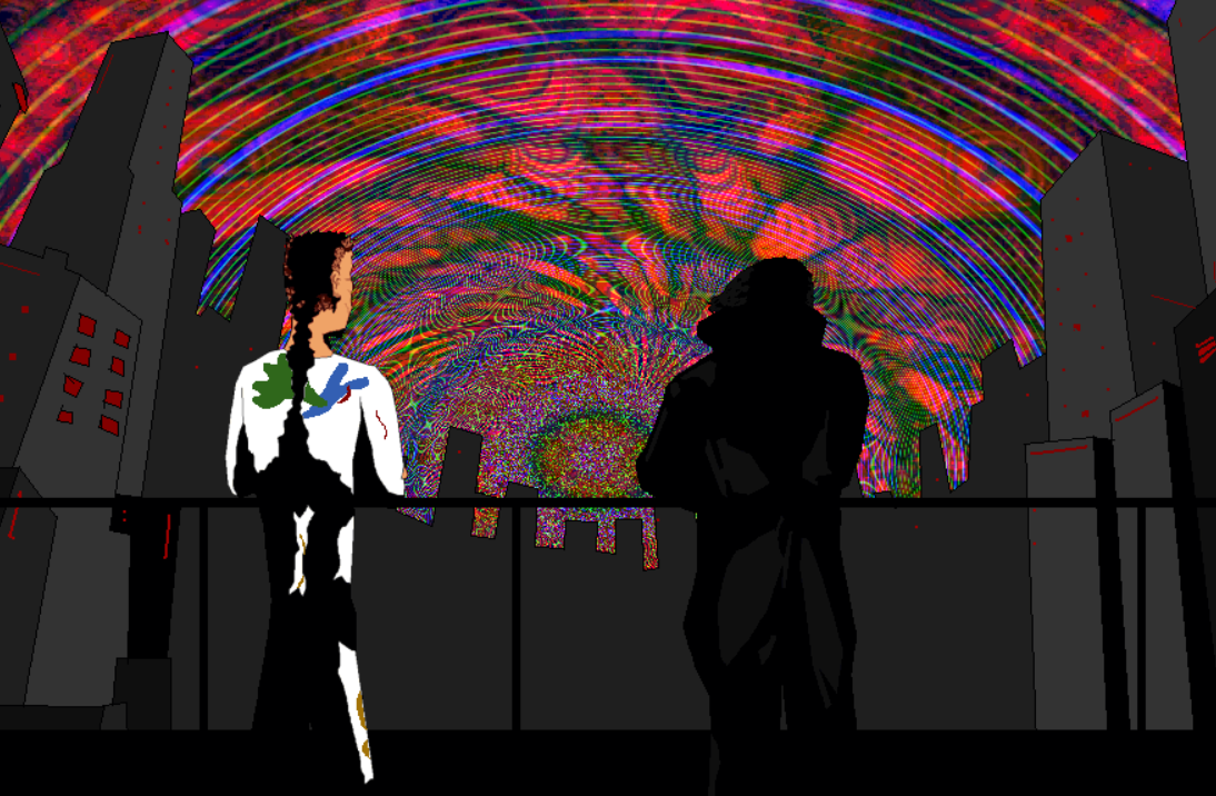
This looks really cool, but I only just noticed it while writing up this comment because, as mentioned, it’s at the very bottom of the page.