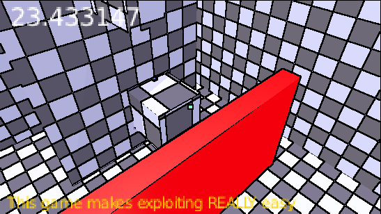
Navigation is meant to be part of the game. I didn't focus on testing the level design specifically because I want players to find their own creative (for lack of a better word) way through. M is meant to be difficult to reach so that using X-ray is reserved for more advance players. If you don't use X-ray your runs will be slower, but you'll have more clarity on the level layout and navigation (besides the red areas turn invisible too). Once you've mastered moving and navigating, then you can use the X-ray to optimise and add challenge at your own pace.
As for colors, I didn't mean for the game to be hard to look at in that way. Do you have any recomendations to improve the color scheme? Preferably something fairly intuitive, such as red for danger. I can also increase or decrease the emission settings.