That's fair enough.
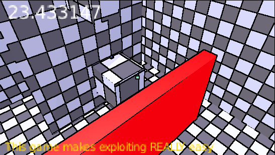
On the colours, I find they're highly saturated. They feel bright and flat. The environment lacks contrast, so I found it difficult to distinguish the different planes. When I first played the game, I thought it was 2D for about a minute until I realised I was navigating a 3D environment.
I would recommend bringing the brightness of the colours down and creating harder edges on the walls and floors. Shadows can help as well, but I don't know if that's within your scope.


