
On Sale: GamesAssetsToolsTabletopComics
Indie game storeFree gamesFun gamesHorror games
Game developmentAssetsComics
SalesBundles
Jobs
TagsGame Engines

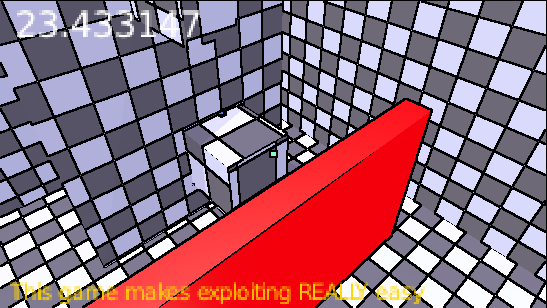
I think the premise is neat. But visually, I found this game really difficult to look it. The colours and sense of space felt quite disorienting. I was confused what I was looking at when I started playing. Once I understood the controls and grappling mechanic, it felt better. But I still found navigating the environment and the gravity confusing.

Also it was a bit hard to push the M key to bring up the X ray when I was moving using WASD and looking with the mouse.

Navigation is meant to be part of the game. I didn't focus on testing the level design specifically because I want players to find their own creative (for lack of a better word) way through. M is meant to be difficult to reach so that using X-ray is reserved for more advance players. If you don't use X-ray your runs will be slower, but you'll have more clarity on the level layout and navigation (besides the red areas turn invisible too). Once you've mastered moving and navigating, then you can use the X-ray to optimise and add challenge at your own pace.

As for colors, I didn't mean for the game to be hard to look at in that way. Do you have any recomendations to improve the color scheme? Preferably something fairly intuitive, such as red for danger. I can also increase or decrease the emission settings.

That's fair enough.

On the colours, I find they're highly saturated. They feel bright and flat. The environment lacks contrast, so I found it difficult to distinguish the different planes. When I first played the game, I thought it was 2D for about a minute until I realised I was navigating a 3D environment.

I would recommend bringing the brightness of the colours down and creating harder edges on the walls and floors. Shadows can help as well, but I don't know if that's within your scope. 

(1 edit) (+1)

Yeah, I kinda agree. I'll look into the saturation values and improving the lighting. Edge highlights are a good idea but I think it's outside of Blender's capabilities. The lighting was a bit rushed, so if I get to it I'll try to improve that.

Thanks so much for the feedback!

Hold that thought...