
Hi, I have tried both 8px and 16px for all the ones where it is tearing and unfortunately it is still the same. This is Arcade filled (16px coz 8px size just make it look a a blocks of white boxes) for reference:
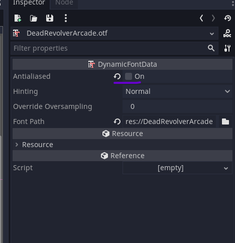
Thanks for the response. Could I ask to confirm, if you have disabled the “Antialiasing” option for the font:
The designed size for the arcade font is 11, sorry, I thought you were referring to the other one.
If you have already disabled anti-aliasing and the issue is still occurring, would it be possible to send a screenshot of what it looks like?
Hey, I tried all three antialiasing options in Godot 4.3 and reimported the fonts, but none of them fixed the tearing issue. Since you mentioned the font size should be 11px, I set it to that and the tearing is now gone for this font.
However, many fonts still show up as solid white boxes (like those filled arcade fonts). I found a workaround for a lot of them: just enable the outline and use a contrasting color. Without that, most still look like white blobs.
By default, all fonts are imported at 16px, but I tried the Arcade font at 11px like you suggested, and that seems to work better. With outlines, I’d say around 80% of the fonts are usable now. The regular versions (even where tearing is gone) still look bad without outlines.
As for me, I almost gave up but after figuring this out I am happy with what I could salvage, thanks though!