Indie game storeFree gamesFun gamesHorror games
Game developmentAssetsComics
SalesBundles
Jobs
Tags

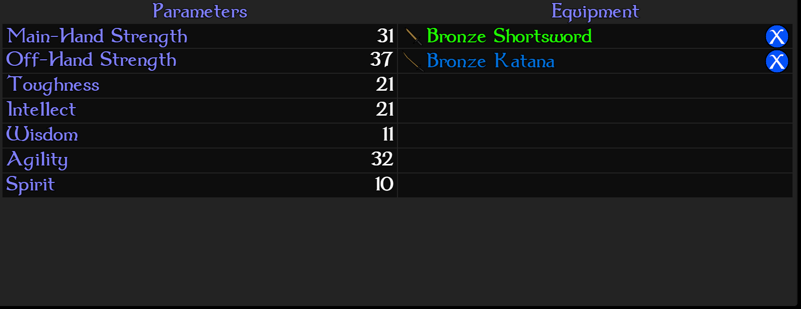
Hey again, it seems a similar occurrence happens in Yanfly's Party System. The second hand draws in overlapping. I was able to edit the dark rectangle's and parameter's Y locations and get everything working out more or less:

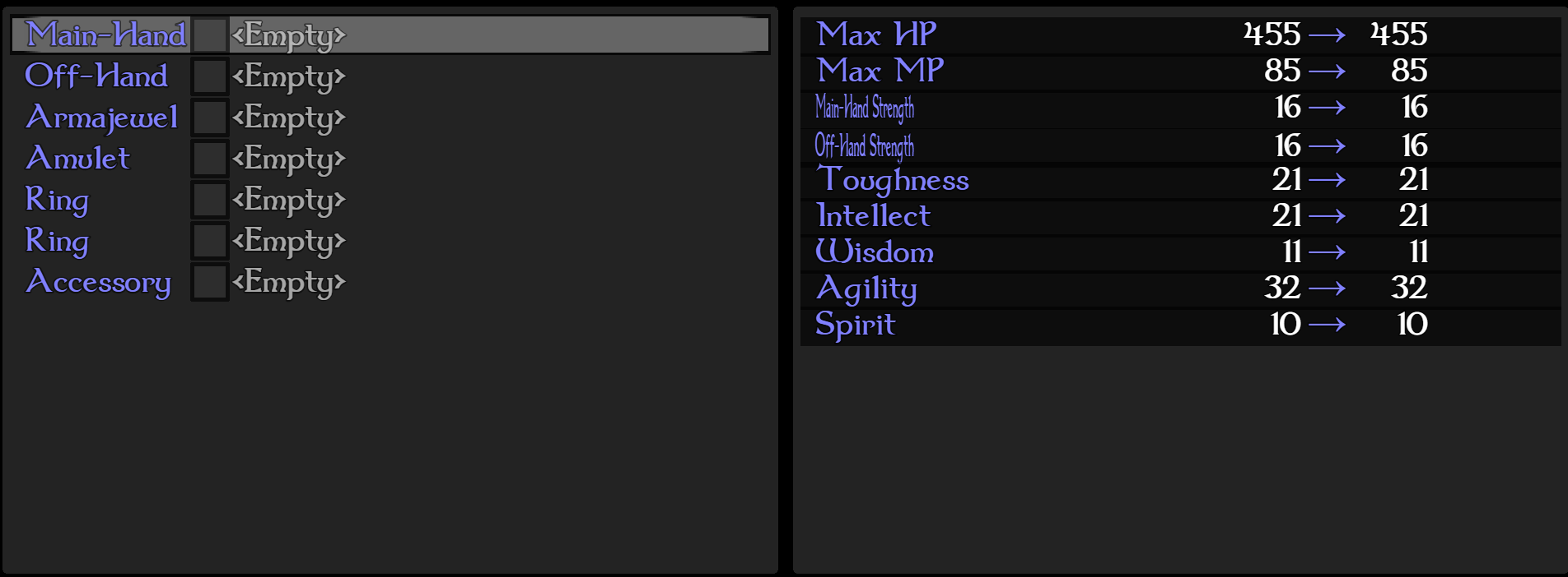
But if I added to the Y value of the line height to get it even with the equipment's side and the rest of the game, I wasn't able to figure out a way to get the gaps right after the first two slots, it seems the other 5 move as one entity, so they forever overlap. I'm also not very proficient in JS, so I'm sure I'm looking right at it. I'm not too concerned, since how I have it currently is quite legible already, just thought I'd drop this by you for future folks having the issue :)

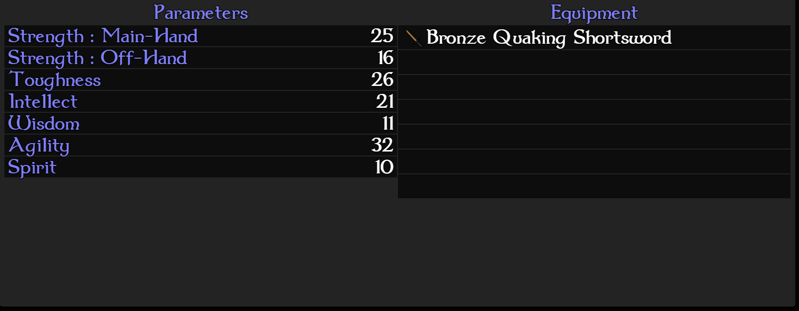
Also, another suggestion: As seen above, I edited the syntax of the Parameter Name and the Slots' Priority Name variables with an adorable little colon thrown in. I find it more "readable" to have the parameters all lined up neatly on the left with the rest, just a preference, because I can certainly see why somebody would want the slot's name first. Maybe you can accommodate a variety of devs by adding a Plugin Parameter similar to one in ItemCore how it handles name formatting with affixes, utilizing escape codes? ie: "%dmg : %mhs"

One last question, any plans to add compatibility with YEP_X_InBattleStatus?

Thank you!!

(+1)

Hey there, sorry for the late reply, I didn't see this message until just now.


Your first issue stems from the fact that I shrunk the default line spacing by a couple of pixels to make the extra line fit on the screen for the default resolution. I'll add a plugin parameter to disable that, for people who have larger resolutions, as it's not needed, and it should make the scene line up correctly in your screenshot. I'll also fix it so that the new parameter I added in the previous update also affects the party scene, as I hadn't released it was having an issue there as well.

Your second suggestion is a good one, more customization is always good for a plugin like this, to help a wider audience get their menus just the way they want them. I'll see what I can do about making that change.

I did not have plans for this to work with the in battle status plugin, as I don't use that one myself, but it shouldn't be too difficult to add that one in. 


I can't give a timeline on these changes, but it shouldn't be too long. I'll keep you posted.

(+1)

No worries! You're the best Ramza!

I have uploaded v1.35 which extends the fix from 1.34 to the party formation scene, and also unhardcodes the forced shrinking of the lines for the dark rectangles. Mess around with the new plugin parameter value a bit, and I'm sure you'll be able to get it to line up.

Very much appreciated :D

I'm sorry to keep doing this, but after messing around with the new parameter I was able to finally get the party menu to align :D

But after going back to the Equip Scene, it appears to have broken that one again as a result:


I think I finally got this squared away for you... hopefully.

Version 1.36 should correct this issue. I also went ahead and fixed the problem in your second screenshot where the parameter name is hardcoded at only 120 pixels wide, causing your main and offhand param names to look squished. 

Awesome! It works great, thanks so much. I'm still not able to get the Party scene's Line Heights to match the right side without breaking the Equip scene, but I'm really not stressing it. Like before, it looks completely fine and readable as is. Thanks for going out of your way to un-hardcode the width, I've been manually changing it to like 400ish after updates, so that was really considerate <3