Play game
Elevator's itch.io pageResults
| Criteria | Rank | Score* | Raw Score |
| Visuals | #12 | 4.051 | 4.750 |
| Audio | #19 | 3.198 | 3.750 |
| Overall | #21 | 3.518 | 4.125 |
| Fun | #23 | 3.305 | 3.875 |
| Innovation | #29 | 3.305 | 3.875 |
| xkcd-ness (how well it matches/interprets the comic) | #57 | 3.091 | 3.625 |
Ranked from 8 ratings. Score is adjusted from raw score by the median number of ratings per game in the jam.
Link to xkcd comic / 'what if' article the game is based on
https://xkcd.com/897/
Please list any pre-made art/music/other assets that you used.
UE4 Starter Content (some materials)
Team size
2
Team's social media links:
http://devsaur.com/
https://twitter.com/allinonemovie
https://lostphases.bandcamp.com/
Leave a comment
Log in with itch.io to leave a comment.



Comments
Overall feels pretty polished.
The radio code isn't well audible.
Too few of the elements are actually necessary, [spoiler] I could very well see someone see the MhZ value on the painting, directly going to the radio and finishing immediately without seeing any more of the game. The clues aren't that useful compared to just trying stuff.
Thank you for your feedback! That's a great point. You could instantly go to the painting and finish the game. I wanted to focus on graphics this jam, so I kept the mechanics to a minimum, but you are right, if I am ever going to extend the game, I am definitly going to pay attention to that! User-Feedback is so valuable sometimes ;)
This was a really polished experience with the dead ends being clever and it still took me a while to find out. As a Ue4 dev my self I can see the amount of 3d modeling and texturing you two did was amazing for only several hours! (I especially love the parody star-bucks logo on the coffee cups XD) The puzzle itself was fine but the atmosphere is what sucked me into it I just feel like it was a bit of a let down when not all the puzzle pieces were used. Still I really enjoyed it and Thank you two for the experience! Anyway one thing I do want to mention is I'm doing a review of design on the games in this jam so here's a shameless plug to my channel if you want to be notified of the vid when released: https://www.youtube.com/channel/UC7Vj46GGL9VMUvd4YTMtjXg
Thank you for your feedback! I added a mechanic, that you know which puzzle-pieces you really need. The parody star-bucks logo seems to be pretty similar to the logo on the left of my name :P You are an Ue4-dev yourself? Would be cool to collaborate once, because I really want to focus only on polishing once. I did everything besides the music and some soundeffects in this game, so there wasn't much time for polishing. It would be really cool to work with someone who focuses only on programming :)
Ohhhh that sounds fun. Now I'm not a crazy programmer but I know more that my fair share of level design and blueprint in Ue4! But I'm trash at 3d modeling and materials something you obviously excel at! I'm interested maybe during the move game jam? Add me on Discord and we can talk! [Rav10(Etra Games)#0860]
just re replying in case you didn't get first notification!
Sorry, I can't find you. Maybe you can add me: allinonemovie#6615
sent a request
My XKCD game jam analysis is out!
Thank you for mentioning my game ;)
This review contains SPOILERS! Please play the game before reading. Thanks!
I really liked this one! It's a simple puzzle, but pretty well-executed. Also love how it's a fully-realized 3d game, which is great to see. It ran beautifully on my computer. But every time I turned, things would blur--I assume motion blur was left on? It didn't really fit this game and only hindered my experience. Or maybe the blur was because of my graphics card or something, I don't know.
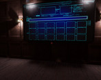
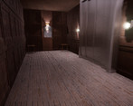
The pieces of the puzzle are well placed. The first things you see when you get off the elevator are the picture and the safe, and the radio gets louder as you get closer, then comes the room--wonderful way to introduce all the pieces of the puzzle that the player will need, even if they don't realize it yet.
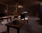
I explored the room by first going right, traveling all the way around, and ending on the left, where the grandpa note was. Which means during my playthrough, I found a lot of things that had absolutely nothing to do with the puzzle itself--which was kind of ok, because the things I found were nice xkcd things and funny, but overall annoying because I was searching for the puzzle's solution, but found things that didn't help me get there. It would be fine if the extra stuff was maybe in a hidden place, like an easter egg, but they're framed and placed in the same areas that objects that helps the puzzle are.
Love how the radio is presented as just a simple object to switch the music (really like the music in this game, btw; all of it is great), but becomes a key piece. I'm half-upset, half-happy with the fact that typing in the radio's textbox to get the code isn't obvious? Upset because you introduce the slider like it's important, and therefore I assumed that you would need to use the slider to get the code (you can't), and happy because you present typing in a textbox with the safe, and the fact that typing in the radio's textbox isn't immediately obvious could be considered good design.
My main problem is with hearing the code for the safe. It was very hard to make out because of the static and distortion, and I got the code wrong a few times before I gave up and looked at the walkthrough. "5" sounds way to similar to "9" and that's not your fault or anything, but the static and distortion made it worse. I know that's what you intended, for the code to be hard to make out, but it was too much.
It's a good game--but it's not to the heart of the original xkcd comic, in my opinion. The point of that comic is that businesses put up the inspection sign for elevators that haven't been inspected at all--they say the certificate is on file to hide the fact that the elevator hasn't been inspected. Not that the inspection certificate is hidden secretly and not hanging in the elevator, which is how this game frames it.
I enjoyed this game. It misses the mark of what the original comic was trying to say, but I still had a good time with it. The puzzle is well designed, the 3d space is easy to navigate and well done, and the music is great. Well done.
Thank you for your helpful feedback! For the records: This guy didn't just help me to improve my game with this comment, but on Discord too ;) I think I improved everything you pointed out :) The update is uploading ;)
Totally welcome! I'm glad I could help. :) I'll give the updated version a look after I've left a comment on the other games.
I added a spoiler to the description. Could you remove the spoiler from your comment, so that nobody reads it by accident?
Ok I just didn't properly hear the code