Play game
Loki's itch.io pageResults
Criteria | Rank | Score* | Raw Score |
Graphics/Animation | #143 | 3.227 | 3.857 |
Music/Sound | #194 | 2.630 | 3.143 |
Overall | #268 | 2.271 | 2.714 |
Technical Implementation | #302 | 1.912 | 2.286 |
Theme/Limitation | #321 | 1.912 | 2.286 |
Fun/Design | #353 | 1.673 | 2.000 |
Ranked from 7 ratings. Score is adjusted from raw score by the median number of ratings per game in the jam.
How does your game apply the limitation (and optionally, the theme)?
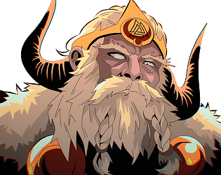
we have a final boss at the end(Odin) and we applied the theme by making ledges that people can fall from making a feeling of "On the edge"
Team Size
Quartet (4)
What main engine/tool/language did you use to construct the game?
Unity, c#
Leave a comment
Log in with itch.io to leave a comment.
Comments
i liked the idea of having to attack the enemies directionally. the effects animations and sounds were excellent. the intro art was also top notch. i didn't go off the top or left for a long time and just kept dodging the energy beams and was confused. eventually, started walking off the bottom edge and then would kill the 2 enemies that spawned over over and. and each time i walked off, my health would also regenerate. i'm not sure if something was bugged or not. i never met a boss or anything.
one other note: the main menu font was not very readable, while the in-game menu font was good. also a mish mash of different art styles, palettes, and UI was funny, but not great. but it's a jam game, so i get it.
First of all, the intro graphics and music are gorgeous. And this brings us some expectation for the rest of the game. Then we play with tiny characters in pixelart. There are cute, but it contrasts too much with the promises(in my opinion). You have talented artists: make big sprites. Your game was meant for. You could have done something looking like "street of rage" view, for example.
I understood how to beat guards, but not immediately that I must continue to the right.
Otherwise combat system is good, and could be even better with some combo chaining that make us feel strong. Keep it up.
The visuals, especially in the beginning, are extremly stunning and just awesome. Unfortunately, the gameplay doesnt hold up the that. The targeting with your attacks is confusing, the pattern of Odins attacks very repetative and it took me 3 minutes until I figured out how to change to the next screen (ATTACK the edge of the screen)
So while it is visually overwhelming, I didnt enjoy the gameplay much. Although trying, I couldnt figure out how to attack properly - sometimes I hit, sometimes I didnt, and I couldnt figure out what I did wrong. More clear instructions regarding the controls would help a lot.
the way to kill enemies is by attack dashing(x, l) in the direction of the sort of bubble around the enemies so if the arrow came from the bottom left u would need to input a directional attack dash diagnoal up right (keys: up, right).
you are right though, we didn't have enough time to make a proper tutorial, but the killing does work as intended, it's just a little unclear.
Hope you try it again with this info and play it to the end ^-^