Play game
What Am I's itch.io pageResults
| Criteria | Rank | Score* | Raw Score |
| Creativity | #34 | 2.500 | 2.500 |
| Presentation | #34 | 2.750 | 2.750 |
| Theme | #36 | 2.250 | 2.250 |
| Overall | #37 | 2.167 | 2.167 |
| Story | #40 | 2.000 | 2.000 |
| Horror | #41 | 1.750 | 1.750 |
| Gameplay | #41 | 1.750 | 1.750 |
Ranked from 4 ratings. Score is adjusted from raw score by the median number of ratings per game in the jam.
How did you choose to implement the Theme: Eldritch Abomination in your game?
the player and final boss are eldritch abominations
Did you implement any of the optional Bonus Challenges, and if so, which ones?
1: your father and most people in the village are in a cult and 2: you don't know how or why you are in this body and why you are in the middle of nowhere
Leave a comment
Log in with itch.io to leave a comment.


Comments
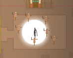
I liked the character forms and animations. Perhaps you should make the scene darker. It would enhance the horror atmosphere. I liked the quirky dialogue.
I couldn't see any UI for my health or power recharge, so had to guess when it was charged. The game is pretty tough, during my first fight, enemies kept spawning directly next to me as I tried to make space while recharging. There were so many of them. I tried manually setting the difficulty to normal, but it was the same.
I played the windows version.
hello, thank you for your feedback and the compliment :) . And i am terribly sorry for the inconveniences. The game was only tested on my computer so i now realise is hould have put a resolution changer in the menu. And with the enemies i totally know what you mean, when i come back those two things will be the very first things i look at. so thank you very much for the compliment and feedback ( oh o I totally forgot, I will also change the lighting, so also thank you for that :) )
I absolutely understand the issues of getting games finished by such tough deadlines, believe me.
I look forward to playing your fixed version.
OMGi just realised you made swipe stream, i can't express how much i love your game!
Thank you so much. It means a lot.
Nice entry!
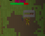
Really liked the designs for the player character and the enemies.
I think the collision areas on the world objects like trees could use some tweaking as I was getting caught in them quite often. Also the player would only ever face left while idle, which made attacking feel tricky while lots of enemies were on screen.
Fun game and would love to see more with some improvements!
thank you very much and I totally agree with you, the way i handeled collision can be defenitly better, I also encountered numerous issues with things like that. After the voting i am sure to use your feedback, so thank you for the compliment and the feedback!
I liked the feel of your character movement and there animations. And I could clearly see what the idea for the game is however I found myself a little confused as to what to do and wasn't able to fall into the gameplay loop to deep.
If I was to offer some suggestions that I feel would of kept me playing for longer It would of been to let me walk down a shorter more linear path while I learnt the moves and then switch scenes to a more open plan level.
Implement a auditory or visual cue as to when the right click move is available as well as my health and zoom out the camera just a little. I would be walking and the enemies would appear before me and do damage before I had time to evade them or attack first.
Solid entry though and I really like the character animations and the polish of the death screen.
thank you very much, and thank you even more for the awesome feedback! I myself did not notice them because i made the game so i was used to all the shenanigans the game pulls on you but hearing this from players will help me improve this and other games i am working on. once again thank you and thank you for the feedback ! :)