
Play game
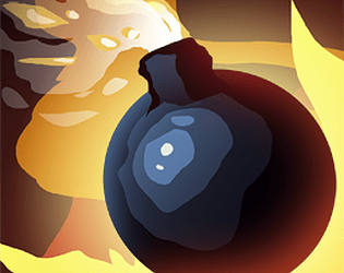
Bomb Around's itch.io pageResults
| Criteria | Rank | Score* | Raw Score |
| How well it adheres to the Theme | #1 | 5.000 | 5.000 |
| Originality | #3 | 3.500 | 3.500 |
| Overall | #3 | 3.300 | 3.300 |
| Fun to Play | #4 | 2.750 | 2.750 |
| Presentation (Audio and Visual) | #4 | 3.000 | 3.000 |
| Accessibility | #5 | 2.250 | 2.250 |
Ranked from 4 ratings. Score is adjusted from raw score by the median number of ratings per game in the jam.
Judge feedback
Judge feedback is anonymous and shown in a random order.
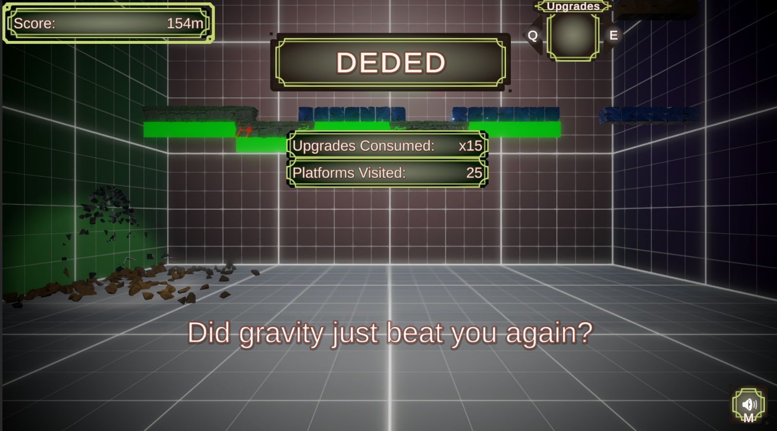
- Explosions literally make it go. An excellent use of the theme. The game induces rage, but is satisfying to see yourself climb the leaderboard. Planning your next jump and trying to get certain powerups adds to the strategy and fun of the game. There is a lack of accessibility. Key binding and other control options would have gone far here. This is a unique way to do an infinite climber. I don't believe I have seen anything quite like this. The mechanics set it apart from other infinite climbers in a fun way. The music coupled with the explosions works really well. A larger variety of explosive sounds would have been great. Visually the game is appealing, but the UI doesn't seem to fit well.
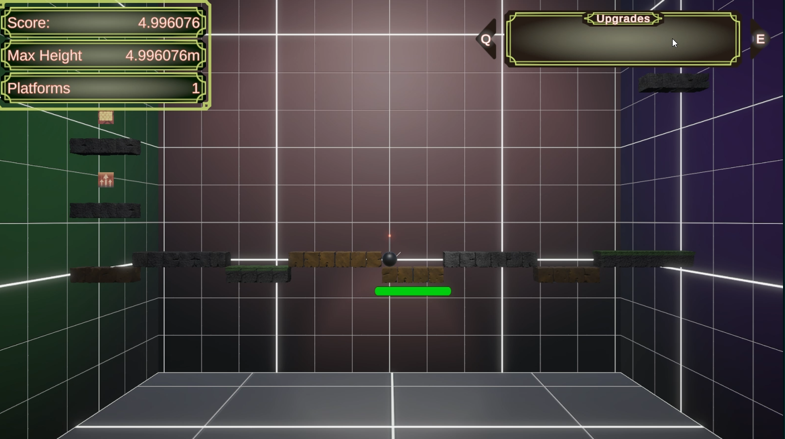
- For a self-described "Rage Game", I didn't find it that rage-inducing (not that I'm complaining!) - the frustration of losing the run was quickly overridden by my competitiveness to beat my previous scores (and my friends' scores). I liked the Test Chamber / Training Mode aesthetics and the use of the fuse as the power meter, though the in-game UI was a little small, and other accessibility features like controller support and resizable window would've been appreciated. The textures of the platforms could've been less similar to better differentiate the different types.
- Theme: The explosions literally make it go! Using explosions to mimic the mechanics of games like Jump King is pretty cool Fun to Play: Using the powerups while moving was pretty difficult and the default keybinds didn't help. Being able to rebind keys could have made that process smoother. I couldn't actually tell if the length of the fuse told me anything about how much force I was putting into the jump because each item (rocket, grenade, etc) seemed to have a different length fuse, and each time you lost you were given a random new jump item so it was impossible to get a feel for consistency and planning on how long to press for any jump. Everything felt like a red herring. Accessibility: Having sliders for audio, screen shake, and screen distortion were great and the music before being able to get to that setting was calm and not loud. The red/green contrast for the health of the platforms is distinguishable through most forms of color blindness but the platforms themselves would be incredibly difficult to differentiate for anyone with a variant of that disability. The colors of the text border and the background in the Instructions menu under the Upgrades section is incredibly hard to read for various kinds of color blindness. Originality: While the jump-style games aren't exactly original anymore, the idea of the platforms breaking as you "jump" off of them is a really new take and teaches you to learn quickly or get punished. I was amazed at how high up people were on the leaderboards based on how hard the game was. It was a great addition! Audio and Visual: Having a button that I can press anytime to mute the game was *chef's kiss*, loved it. However, every UI element had different margins from the text and background it was on. Some had padding on the top/bottom and sides, some only had padding on the sides, and some only had padding on the top/bottom. That inconsistency is easily noticeable and detracts from the polish in the UI. The text for Screen Distortion in the settings menu is a smaller font than all of the other settings in that menu. The color palatte for the UI really starts to hurt in the Instructions menu where you start getting really clashing colors and different font sizes for the same information being presented. The text for the Upgrades Info in that menu is a smaller size than the other headers that say Input and Upgrades.
- Easy to grasp the goal, even if the gameplay itself was difficult. The power up variety was nice, but not sure how well some of them worked. I struggled to find the right situation to use the reinforce power up, and I thought the extra platform was just spawning randomly for the first few games I played. Some of the puns were good, but a lot of them did feel like they crossed into a little too much snark for someone who had lost. The fuse power felt a bit inconsistent - having a bar or something to help determine the power level could help with that. The mouse angles also felt limited - multiple times when I wished for just a bit more left or right direction. At first, the music struck me as a little too incongruous to the game, but after a couple of rounds I appreciated it. The pleasant, calming music definitely helped counter some of the rage. The textures for the different platforms were nice and definitely helped convey what to expect from a tactile perspective. There was almost a dream-like quality to the visuals that, like the music, felt out of place at first but then seemed like a good way to balance the other rage elements. I thought the icons and and layout were well done, but increasing the size or adding more contrast would probably be appreciated for visual accessibility.
Team Members
Clayman_dev - Juice, code
**MatisseTec** - Ideas, code, models
itsOiK - nearly everything else, code, audio, implementation, project manager
Leave a comment
Log in with itch.io to leave a comment.
Comments
10/10 frustration, this game taught me I suck at these kinda games. It's a lot of fun but I wish I could get higher. Alot of the bugs in the beginning have also been fixed. Thanks Matisse/Oik <3
itsoik and clayman did like 99%, but thanks for playing <3
ah well... thanks Clayman also too as well!
One of my favorite entries to the jam by far! Definitely the most original concept, and a blast to play. Clearly fits the theme as well, but in a way that I don't think others would have considered. I have rage quit and come back to replay this a few times at this point, and will probably keep coming back periodically in the future
Cant wait to show you some of the new features itsoik has been working hard this last week to make this game even more fun!
We are aiming to push this to steam.
Its a nice rage game that suffers from some unfairness towards the player
if you want to watch my playthrough in the future heres the link to the vod
Enjoyability 3/5
The main game mechanics are nice to play around with to get top scores but theres certain parts of the game that feel very unfair towards the player and kill my want to do high score runs. The subtitles then insulting the player after they get affected by something they couldnt react to and was not their fault doesnt help enjoyability as well
- Somehow have a way for the player to see above so that upper obstacles don't just suddenly appear and kill momentum with no time to react (this being a thing makes the safest strategy very boring)
- Adjust powerups to be more beneficial towards the player and what the player expects them to do (especially since timing them in the air has to be done currently in a small window). This is things like let people use the pass through powerup when theyre on a platform and then it takes effect next time theyre in the air.
Accessibility 3/5
Theres some main accessibility features people get in for jam games including the volume slider but you can't adjust the window size and the sliders are not scaled properly
Possible post jam additions:
- Rebindable controls
- Adjust the sliders so that the entire slider affects the volume instead of the volume cutting out around 0.7 due to everything below that being unhearable
- Let the game be fullscreened and the size adjusted for smaller screens
Originality 4/5
This concept as a rage I haven't really seen done before and it works well and feels unique (even if its composed of other parts that are done alot like doodle jump gameplay and rage games)
Visuals 4/5
Visuals work well. Animations on things and the bomb being a random sprite add variety and life to things. It overall can feel a bit unpolished with things like the UI not fully feeling like its a part of the game (and has portions that are just a single color in a basic shape)
Audio 4/5
Audio works well with the game with the background music and things like explosion sounds working well. However the sounds aren't very memorable and don't feel as cohesive as they could be
thank you for the full stats here, also watching you play there gives us a few ideas for fixes for the next version we have setup for Steam.
For Accessibility we are using the unity game input system so we can fix this for sure
For visibility itsoik setup a lot of things for screen size and aspect ratio.
For your points on audio, we have a few plans in mind!!!
Thank you for the review, if you wanted to add more on later versions we might have a few internal builds available!
I really like this game, as someone who beat bennet foddy I enjoy these overly cruel type rage games. fits the theme, and has a lot of really nice touches.
The drive of this game just felt so right for rage hahah, explosions rage, mallot, I dont know, but thank you for playing!
we have a lot of next steps setup, and a lot of updates coming!
If you have any ideas for fall disses please let us know, we are adding them all the time
Awesome work team, congrats on the entry!
Please either heavily moderate the leaderboard or disable it entirely. It is already being misused!
Not quite my type of game but very much appreciated the originality of the power up system and how they can be chained together for some cool combos.
While the visual effects looked great, I think the overall visuals could use some more cohesion.
Genius idea to use the fuse to show jump strength.
Theme on point.
<3
I'm raging! <3 it.