Indie game storeFree gamesFun gamesHorror games
Game developmentAssetsComics
SalesBundles
Jobs
TagsGame Engines
A jam submission

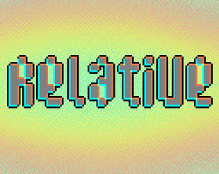
RelativeView game page

Seeing things is hard
Submitted by Yuki (@yuki_is_bored) — 8 hours, 52 minutes before the deadline
Add to collection

Play game

Relative's itch.io page

Results

CriteriaRankScore*Raw Score
Presentation#1183.4173.417
Enjoyment#1623.0833.083
Concept#1783.1673.167
Overall#1832.9792.979
Use of the Limitation#2422.2502.250

Ranked from 12 ratings. Score is adjusted from raw score by the median number of ratings per game in the jam.

Team members
Yuki, https://yukiisbo.red

Software used
Godot, Aseprite, SFXR

Use of the limitation
Color blending steganography trickery is used for obfuscation. Consult the Manual.

Cookies eaten
7 cookies. (legit)

Leave a comment

Log in with itch.io to leave a comment.

Comments

Submitted

Very nice platformer/puzzle game! I love the visuals and the super adorable main character! The sound effects really stood out to me, I feel they went so well with the aesthetics~ And because of this, I actually really like that there is no BGM! Since we're jumping and dying a lot (well, at least I was dying a lot LOL), and those actions have sound effects, I feel that they create the mood perfectly as is!

The only small thing I must point out is that some of the jumps we have to make are quite frustrating because I see where I must go, but I just... can't..! (Maybe I'm just bad tho, no cookies for me ;;) But all in all, great game, well done! ^^

Submitted

Extremely cool and well thought out, the way you hint at the true ending early on by getting the player to bump their head on something seemingly invisible is very cool, though the little puzzle sections were slightly repetitive, i still found it very neat to encourage scanning around the screen looking for secrets.

Submitted

Really enjoyed it. The variety of things you can do with the few simple mechanics is quite cool. But no, I won't read the manual.

Submitted

Hey, I played your game on the stream


difficulty jumping

Please give my game a try if you have some time!

Submitted

I'm a big fan of the presentation! Bootup screen was very well done, manual was well-written, all really done well on that front. I laughed when I got RTFM'd too the first playthrough.

--Spoilers Ahead!--

My primary wish is that the steganography mechanic was used in a more engaging fashion. When I discovered that almost all of the rooms had secret platforms, it kinda ruined the "a-ha"! moment I got from doing it the first time, not to mention my fear that I had missed a cookie and would have to do the whole thing again. I feel that more mechanics would have been a huge boon to the game.

I agree with everyone else -- hitbox is too big, and that makes it frustrating to get to the secret level entrances. The controls are very slide-y and feel a bit mismatched to the environment, and I felt more frustrated than accomplished upon finishing the game.

Submitted

Hello! The game is cool.

I liked the art and the jump physics.

Be careful, the hitboxes should be smaller than the renderer. On your game, hitboxes are bigger and not fitting the shape. Even sometimes there is invisible colliders.

Anyway, it's a pretty game.

Developer

Thanks for the comment!

The hit boxes being larger than the actual sprites is intentional. Both to allow room for error and bits of fun jank! :D

Personally, I always like abusing jankiness in games so I ensure to leave some intentionally.

Submitted

Loved the aesthetic of your game! Thought it played really well too. Only thing that (like Randy) almost made me break my keyboard was trying to jump through some of those gaps above the player. Maybe a collision box being a bit too big, but likely just me lacking the proper SKILLS. Anyway, really enjoyed jumping around trying to navigate your very clean levels. Only suggestion would be maybe adding some music. I'm a big proponent of setting a tone with music, and often games without any just seem to feel flat (Although, your color usage really did well to make your game not flat!). Really great job!

Developer (2 edits) (+1)

Thanks for the comment! I really don't play platformers on keyboard so I pretty much do my playtests with a controller. Having experienced this jam, I really should get someone to evaluate future games on mouse and keyboard!

For music, I'd love to add some music but I didn't have enough time to find anything that fits the game and I'm not good at making music myself. Personally, I thought it was better to leave it "music less" than adding some tacky music that might harm the experience.

Submitted

I'm not a platformer person so I almost broke my keyboard several times getting to the end. I would up the friction on surfaces just a bit so you don't slide as far but I might just be getting old. I tried finding the hidden platforms with the app and with the in-game filter (one of those rare gamers that read the manual first) but I really still couldn't make out the platforms. Maybe I have also discovered that I'm partially colorblind? Great concept though - had a fun time regardless!

Developer(+1)

Thanks for the feedback. I actually just updated the game to make the movement system more forgiving along with miscellaneous settings to make it more enjoyable for people.

I actually don't play a lot of platformers! I assumed that my skill level is lower than average and seeing that I can finish the game in 4 minutes, I'm surprised that people find it hard. I should have people test the game regularly, lesson learned!

Submitted

This is my first game so I had my wife (a total non-gamer) test it out and watched her play. Definitely eye-opening and she found a few bugs for me as well!

Noice game.

Submitted (2 edits)

Wow, that was really cool. 

The movement is a bit rough, especially for how precise some of the platforming is. I'm pretty sure that the collision boxes had their corners cut off so you could easily move about them, which is good, but I don't think its necessary on the tops, since it only made me fall off a lot. Although, I could see the argument that the movement being rough is kind of a part of the experience with the theming of the game.

Honestly, I would consider the next part of this comment spoilers, so play the game first before reading! :)

I like the fake out of the doors, when I saw the other one I was wondering how I would open it. But having the first one tell me to read the manual (which I bet no-one will do right away) Then finding out about the invisible blocks only seen with the red filter was just super cool! 

Maybe the blocks were easier to see with a physical red filter over the app, but they were very difficult to see with the app. I ended up just memorizing where things were on some screens.

Sadly, the phone website would sometimes just stop working, in which I would need to rescan the code since refreshing the page wouldn't work. 

I couldn't get the seeing cyan code to work, but I think it was for the better since using a physical object is a cooler experience.

I don't exact see how it fits the limitation, unless its meant to be that you are your own enemy by not reading the manual at the start...

I would love to see a continuation of this, with having a very long manual with a ton of obscure controls and ways to doing things on it. Feels like playing an ARG.

Really, really cool game! :)

Developer

Hey, thanks for the comment! Spoilers ahead!

Happy to see someone read the manual :D

When it comes to the limitation, "You're your own enemy" because your human eyes are limiting you from seeing the hidden platforms due to the distracting background obscuring it. Without seeing them and exploring them, you wouldn't be able to reach the "end" of the game.

Along with people not reading manuals these days!

I *really* wanna write a manual with long winding paragraphs which includes a primer on video games, platformers, and puzzle games to hide the information in plain sight but sadly, I wasn't in a writing mood. Even then, I realized if I obscure the information too much people would just see it as a really difficult platformer.

I should push out an update with tighter movement and a save system since a lot of my friends are also finding it hard.

Submitted

Pretty fun, I liked the tight controls. Although I couldn't really figure out the hidden stuff, I played through each screen looking for invisible platforms with the red filter thingy but still couldn't find anything. Oh well, still nice job!