Play game
Magnus: Inter Eos's itch.io pageResults
| Criteria | Rank | Score* | Raw Score |
| Audio | #194 | 2.900 | 3.091 |
| Graphics | #223 | 2.985 | 3.182 |
| Gameplay | #232 | 2.644 | 2.818 |
| Overall | #257 | 2.793 | 2.977 |
| Authenticity (use of resolution) | #331 | 2.644 | 2.818 |
Ranked from 11 ratings. Score is adjusted from raw score by the median number of ratings per game in the jam.
Did you work in a team?
Yes, 3 of us. One worked on tile maps and level design, another worked on the player and ai and their sprites, then the last worked on UI and persistent data.
Was the resolution a challenge?
Besides making sure the aspect ratio was set, there was no real challenge. Working at lower resolutions can be challenging in its own way but we didn't think it was an issue.
What did you learn?
We joined mainly to get better at game development under time constraints. Helps motivate us to be under a clock. But we also wanted to try a couple more behind the scenes things like using coroutines. Overall just the practice of making a game and gaining experience is a great boon for us and will help a ton.
Leave a comment
Log in with itch.io to leave a comment.


Comments
Nice game, plays quite well and the mechanics are well implemented. Interesting choice of palette, I would have gone colorfull though, and good SFX. Spritework, maybe sprites are a bit too big for the resolution leaving a small playing area. You also went over the restrictions with the text boxes not complying to 64x64. Got killed but I had no idea about my health level or being hit at any point, so a bit more feedback to the player would be quite necessary.
I always appreciate a minimal hud ^^ if you was going to add HP or Fuel indicators maybe something diegetic dead space style would be a good challenge to get working. I love the turning flamethrower, and alternate sprites for going up/down or left/right, great attention to detail.
The furthest I got was the giant amogii, they were burning but I died before they did ;-; Also I died once while reading the dialogue, maybe freeze everything in place would be good haha Great game I enjoyed playing :)
oh also, I LOVE the grey palette. though I did spot some Unity default blue here and there ;) I always set that default colour to black just in case it shows haha
Incredible use of gray palette! The music and the sfx are good too. Maybe the collisions with the walls are too bigger.
Good job!
I absolutely love this creepy amogus swarm!
Danke sehr, we thought what could possibly be the worst thing you could encounter in space, and that was Amogus
Congratulations on making this game !
I've played your game during a live that you can watch here :
The live is timestamped so you can go directly to your game.
I hope the feedback and live reactions will be useful to you. Keep it up !
Ah, this is pretty wicked. We never actually did have someone test the game as an outsider so we weren't sure entirely how people handle the game. We kept thinking it was too easy but I guess we had an unfair advantage XD. Like a lot of the suggestions make sense now in hindsight, because we wanted to give the player a minimalist ui since there already was soo little to see. We tried using the outside of the screen as like a natural fog of war. But yeh, after watching this I think we prob could've kept the minimalist ui while still addressing health, fuel, and navigation. Also yeah, some things were just bugs we didn't have time to work on like the ambushing amogus when dialogue appears. All in all, thanks a ton, we probably needed something like this
My pleasure ! Happy to help.
Found collisions quite confusing.
Also missed a health bar of some sort.
Grayscale ambiance was cool though.
Oh yeah, we realized towards the end that we messed up in our planning and didn't account for the colliders on some of the objects correctly but didn't have time to fix it. Big oof on our part. We initially planned to not have a health bar because we wanted to keep the screen as clear as possible, but with hindsight (and seeing how others handled it) we probably really should've added something for the health XD
Found collisions quite confusing.
Also missed a health bar of some sort.
Grayscale ambiance was cool though.
Not quite 64x64 but I like the style! Player animations look really good despite being the main offender of the jam constraint. Moving around and using the flamethrower feel good too. Congrats on your progress and for not being late!
Thanks for playing, glad ya got to enjoy it! But could you elaborate what you mean about the jam constraint? We understood the rules as wanting everything within a 64x64 resolution so we thought we achieved it by keeping all the sprites in that scale.
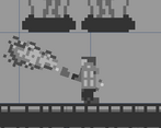
The game itself should render at 64x64. Look at how the flamethrower remains smooth when rotated, that's not possible at 64x64 without distorting the sprite. I mean how big is the flamethrower, like 16x5? Here's how it woul look like rotated by circa 45 degrees. I've made the images in paint.net so results might vary but to give you an idea it should be fine.
upscaled to 256x256
In other words your game has an anti-aliasing like effect that can't be achieved at 64x64
Ok, yeah that makes a lot of sense now. We didn't really think much of it at the time, just thought if it looked like it was in a 1:1 aspect ratio then it's basically 64x64. Big oof on our part
nice black and white style! click and drag for flamethrower!!!
Danke sehr, and yeah at first we were considering coloring it but we just liked the style too much too
bitte sehr! BW works well with the pixelstyle.