Play smash-em-up
Rogue Sun's itch.io pageResults
| Criteria | Rank | Score* | Raw Score |
| Audio | #126 | 3.429 | 3.429 |
| Authenticity (use of resolution) | #181 | 4.286 | 4.286 |
| Overall | #184 | 3.375 | 3.375 |
| Graphics | #215 | 3.000 | 3.000 |
| Gameplay | #216 | 2.786 | 2.786 |
Ranked from 14 ratings. Score is adjusted from raw score by the median number of ratings per game in the jam.
Did you work in a team?
It's the annual lowrezjam with my brother, we keep making these xD
Was the resolution a challenge?
We had lofty ideas of maing a bunch of cut scenes but we're just not very good artists and may have ahem, borrowed some content.
What did you learn?
We tried to do story telling a bit this time, though much of what we planned didn't make the cut. I think if we make cut scenes again that we should build it into the game itself and use sprites etc.
Leave a comment
Log in with itch.io to leave a comment.


Comments
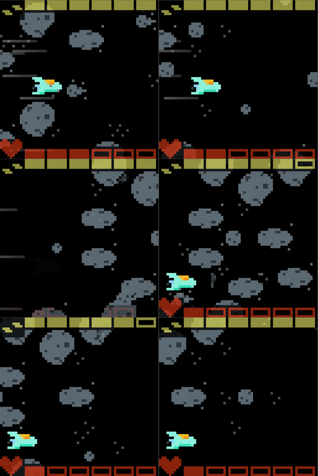
nice job, but I think the asteroids should be more distinguishable from the background, because it took me a while to realize that I should shoot them (I was waiting for the opponents).
I just got a black screen at the end, No CONGRATULATIONS! \o/? haha :) neat set of unique levels using the same base mechanics. Where did you take the fmv from? haha ^^ neat game!
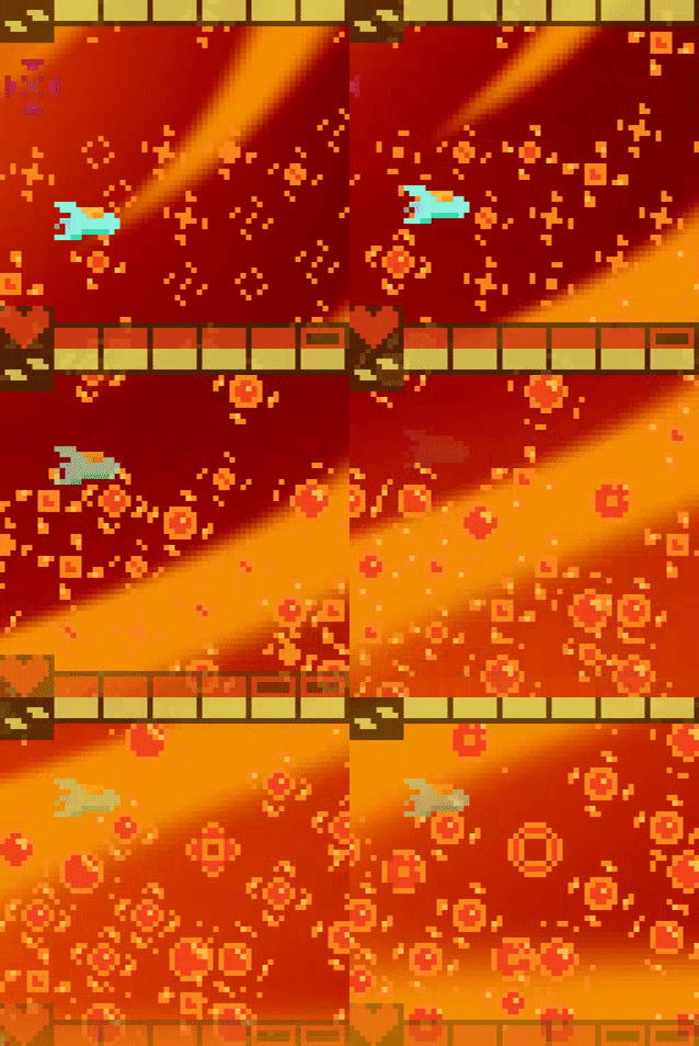
Very cool game, but the second level background kinda mixed up with the obstacles and made it hard to avoid. I also failed that level cuz I didn't know you had to shoot all the target so a description there would have helped.
Otherwise the visuals, cutscneses and sounds are very good, so good job!
The cutscenes are very interesting (I just read that you borrowed them, which is ok as long as you have the right to use the assets). The game itself could be more fast-paced, maybe with some additional enemies and weapons. The fact that the shooting has a "long" cooldown makes the action a bit slower than it should be (in my opinion, of course)
That being said, I really like the effects on the second and third levels.
Okay interesting entry. Like a bombing run in the a stars photosphere followed by a frantic escape like a mix between lifeforce on the NES and the attack on the death star haha, that last level was really tense, it seemed I moved faster when I was closer to the right of the screen so I was frantically managing my shots and dodging, that was a cool sequence.
The cutscenes were a big standout for me actually, well specifically that first cutscene between the first asteroid level and the stars photosphere, the undulating solar flares and music was really emotive. I did wonder how you did the ones after that and it sounds like you maybe down res'd some stock footage or something?
In terms of feedback, the movement and shooting was pretty slow for me, I wonder if that's a web version or browser thing rather than what its like at full speed, I also didn't quite understand what I needed to do in the 2nd level until I failed so maybe some sort of context, instructions, objectives displayed to the player would be helpful.
Good effort!
Nice! I especially liked the orange gradient background on the second level. It gave the game a 'wow' feeling. Everything felt good: fast and fluid and the music/sfx complemented the game very well. It was sometimes hard to tell what could be destroyed and what could not - maybe everything could and I missed something :D. Good work and congrats!
really interesting concept with the movement, shooting with g feels kind of weird, but it was a hard but fun expirience (maybe a little to hard for my noobness)