Play game
Shades Of Self's itch.io pageResults
| Criteria | Rank | Score* | Raw Score |
| Controls | #89 | 2.818 | 2.818 |
| Theme | #91 | 3.273 | 3.273 |
| Originality | #96 | 3.182 | 3.182 |
| Graphics | #106 | 2.818 | 2.818 |
| Overall | #113 | 2.662 | 2.662 |
| Fun | #115 | 2.455 | 2.455 |
| Audio | #121 | 2.091 | 2.091 |
| Accessibilty | #131 | 2.000 | 2.000 |
Ranked from 11 ratings. Score is adjusted from raw score by the median number of ratings per game in the jam.
Godot Version
4.2
Wildcards Used
Dynamic Perspective, Curses, Ducks
Game Description
Switch between light and shadow as you explore 3 realms
How does your game tie into the theme?
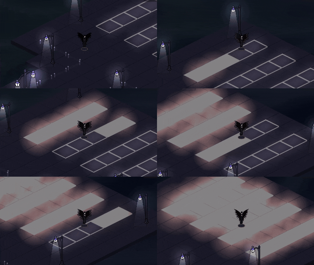
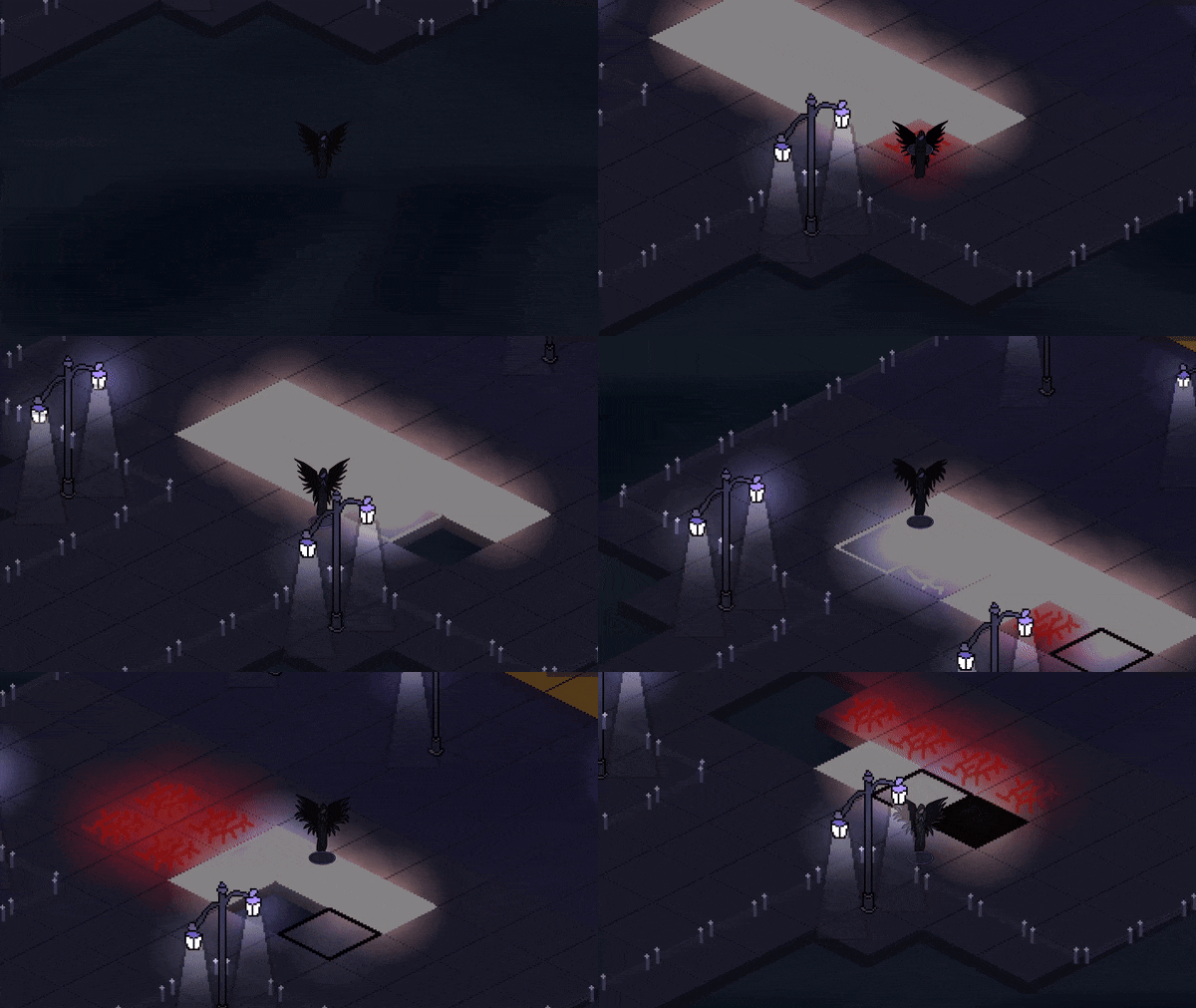
The player has access to Light and Dark mode used to light their paths to completion of levels. All tiles must be either light or dark to continue.
Source(s)
N/A
Discord Username(s)
Sevadusk
Participation Level (GWJ Only)
9
Leave a comment
Log in with itch.io to leave a comment.



Comments
Great Entry! Like an aRPG meets Flappy Bird - Interesting Concept! A great puzzle game that I would definitely Wishlist on Steam or similar
Pros:
Critiques:
Thank you for the great feedback. I'm glad you liked the concept, and hearing that you would wishlist on steam means a lot. I may fix a few elements and update post jam, but I have to catch up on some other things for the time being haha.
I noticed the text was a bit dark as well, and that's something I plan to fix for future games.
Nice art in this. The ambient sounds also set a dark atmosphere. I thought the mechanics of switching modes/perspectives was neat, too.
I played after watching Vikfro's stream, and I did manage to beat it. I often enjoy complexity in game mechanics, but I still don't think I learned how my actions had consequences. From reading the comments, it seems you were on a time crunch and already aware of this. If you can get even one playtest in before jam submission, I think it will help a lot.
I really appreciate you giving this game a try and completing it. It's nice to hear that the art is good because that was one of my main priorities this jam.
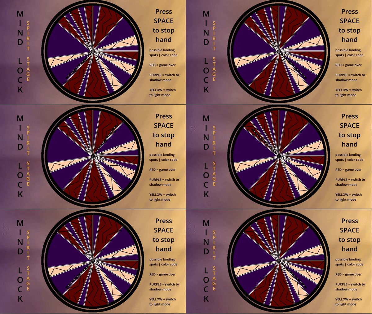
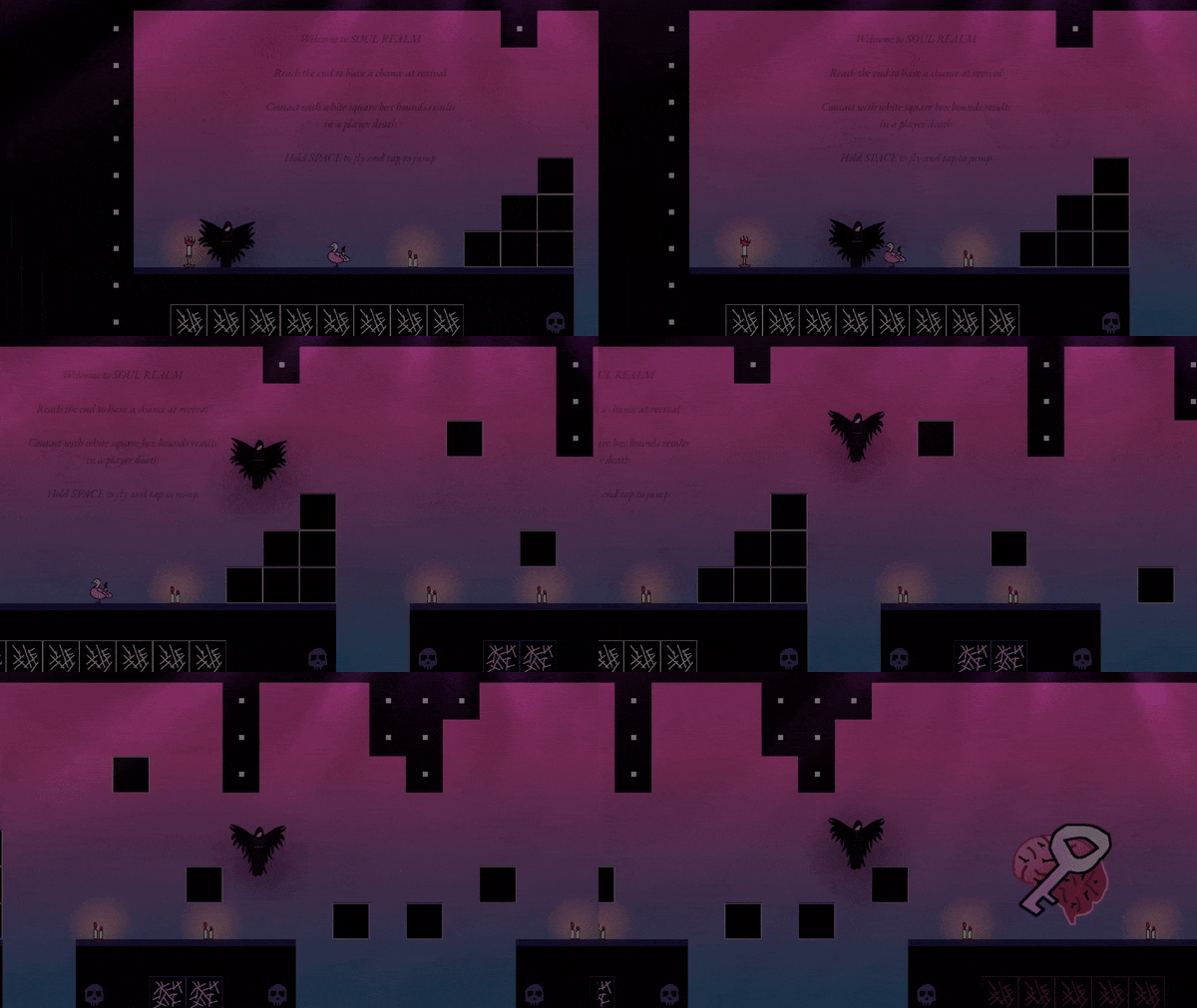
Basically, the main consequence is the death counter. The wheel of mind that you run into in the soul realm will scale based on number of deaths, and it becomes harder to reselect your active mode. So, if I'm in light mode with 10-15 deaths, the chances of getting light mode again are very slim and vice versa. I did not explain mechanics like this at all, so it seems like random rates are applied in places. I also completed the level design for body realm in 10-15 minutes of the last hour, so I was really in a crunch. I didn't get to explain any of the mechanics, and it seems most confused many. I always say I want to leave 1-2 days for playtesting and polish, but I never do. I'll be taking a new approach next jam and see to it that clarity is a priority. Thank you for the feedback.
A little confusing, but cool :)
The goals / mechanics were unclear to me. I didn't understand the point of being in light / shadow mode in the overworld ?
originally I intended light/dark mode to have different weapons and have the player fight enemies. It was too overscoped, so I switched to tile conversion. If you are in light mode, yellow character, you turn tiles into light. If you are in shadow mode, purple, you turn tiles into shadow. You need to light all the tiles in order to win the level. I'll admit the mechanic was very confusing and unexplained, but I was already pulling all nighters trying to pull this off. I completely understand why you think it's confusing, and although it hurts, I'll focus more on clean design next time. Thank you for playing.
Oh ok I see ! And some tiles you can only turn on in some of the colors, right ?
Now I see the concept.
I will say that no matter what, repeating the same level several times will unfortunately risk being frustrating. What happened to me was I died, and then I respawned on a tile of the wrong color so I died immediately again.
With that said, good job on the game. Both platforming part feel good to play, which is impressive considering the ambitious scale of the project for a solo gamejam. I think you're taking the right lesson from this about clean design.
Tougher part imo about work in a gamejam is having a clear well defined project from the start. Because it's never like that, second tougher part is being able to kill your children and relocate your effort when it's necessary. So congrats for that and delivering on a complete game !
This feedback is much appreciated, thank you. I've seen a few people have that issue with the instant death, and what happened for you is definitely frustrating.
I made the mistake of thinking that, since I understood it, it would be fine. I keep making the same mistake, and I have fix this bad habit haha.
Cool idea that was very well executed. I really liked the change up in play style / perspectives. The subtle sounds really added some depth to the overall atmosphere!
I liked the aesthetic on this one quite a lot
Fun idea, I liked how the camera moved out a little when you are going faster