Play game
INFINITE UNIVERSE (beta)'s itch.io pageResults
| Criteria | Rank | Score* | Raw Score |
| AUDIO | Did the game have great music or sound design | #54 | 3.250 | 3.250 |
| FUN | Was the game satisfying to play or did it bring you joy | #104 | 2.500 | 2.500 |
| MOOD | Did the game have atmosphere or make you feel something | #106 | 2.500 | 2.500 |
| Overall | #109 | 2.550 | 2.550 |
| VISUAL | Did the game have nice graphics or art direction | #110 | 2.750 | 2.750 |
| IDEA | Was this game super interesting or innovative | #137 | 1.750 | 1.750 |
Ranked from 4 ratings. Score is adjusted from raw score by the median number of ratings per game in the jam.
Let people know how long you've been working on the game
October 7th, 2023
Leave a comment
Log in with itch.io to leave a comment.


Comments
Nice job on your entry. I liked the title screen and the music was nice.
Feedback:
The screen was kind of big in web build.
You could move faster than your bullets when walking and shooting.
I liked the controls on the screen, but felt they took up too much space.
For play through I opted into using WASD
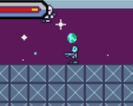
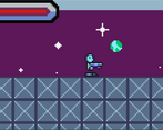
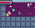
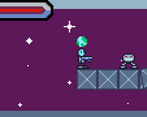
Art was alright for gameplay.
The double jump needs to be clearer with some form of animation or indicator because it just looks like a high jump.
For the shoot it might be a better option to left mouse click.
The first level should have been a tutorial that teaches you how to play the game
After you collect the key, I was confused that you had to press W to the person at the end in the booth.
Movement needs adjustments because it was floaty.
I liked the wall jump, but this definitely needs an explanation before performing it and an animation as well.
Sometimes when you jump and you land on the side of a block, it pushes you back with great knock back.
I couldn’t tell what the item for the key was and feel that should be made clearer.
There needs to be an animation for climbing up ladders.
The death animation/screen was real nice.
Overall, good work so far!
thank you for the feed back! I was just about to add credits and another story cutscene, also the guy in the booth was supposed to be a door and the guy was supposed to indicate you have to use the key which was an ID. I only worked on the mobile controls once and that’s why they’re so big. I’m glad you liked it :D
A cute space station romp! The visuals were great, but it felt very claustrophobic! If that’s what you were going for then great (considering the whole infected marines setting). Good job!