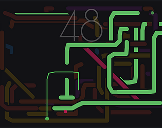
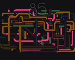
All the turned-off colors should have similar value
Pink, purple, and yellow can easily be mistaken for active walls when they are turned off
Play game
Paul Klee, Rich Harbour's itch.io pageComments
Kino concept, nice player-made aesthetics. There are some minor nitpicks like getting killed by seemingly nothing while it was probably a single pixel sticking out. Sometimes it's not fully clear which line is the active one as the value difference isn't big enough or they could be marked better in another way. The game probably have some neat ways of decision making but it feels like it would take a very long time before having to actually resort to those.
I wish the game spiralled out of control or simply progressed faster, which is smaller room size and having to constantly move. Getting time to stop and think doesn't help hit the flow zone.
The worst part of the game is the title.
It's simple fun!
Adding textures/patterns to the colors could make it accessible if that's something worth considering.
Nothing to critique. It works and is fun.
No commentary video.


Leave a comment
Log in with itch.io to leave a comment.