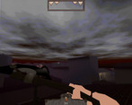
This game pissed me off, but only because I want it to succeed. Right now it needs a few things to really feel good in its unfinished state, and that's an options menu, because fucking with my mouse sensitivity to play a game sucks, and I'd like to be able to turn down the volume. Furthermore movement feels kind of bad, because you slip around so much and it makes it too easy to fall off a platform. I realize holding shift slows you down but it would be nice if it gave you some traction as well.
Play game
Vinyl Hunger's itch.io pageComments
I really wanted to shoot some mimics but I only ever got the axe :( It's clearly got empty space everywhere but I like the look of the levels so far, just needs more really. Good to see you still working on this, I remember it from years ago.
For the love of God, please have an option to turn off that strafe sway. Playing Quake with that on is just awful. It totally throws me off and looks super unnatural, especially with how far you lean over.
I would complain that it doesn't seem to warrant being 1.5 GiB installed, but that's just what engines do.
I like the Visuals of the Level, so far movement feels rather nice, and Sounds are nice aswell. Could use some Character voice on jumping/etc tho I think. HUD feels a bit off and not very fitting compared to the Looks of the Level.
I don't think I should slide down the small Slopes between the Crypts(?) Maybe adjust their Angle a bit.
Some Plants, Lanterns and Props are floating/not attached properly. But your Level design so far is pretty bad either Way I think, its too linear and straight. The Button Sound is too loud compared to the Rest, and the Axe Model doesn't look very nice. Also placed pretty nonsensically.
Boxes should explode with more Force when destroyed I think, and it seems I have to time blocking pretty quickly to actually block, more like a parry. If I hold it down, I still get hit apparently.
Floor button Noise was alright volume-wise. Do you play these Sounds based on Button Location? If so, the face pressed one will be super Loud because its basically inside the Camera.
You can solve the Riddle in the 2 Mimic Room in Reverse quite easily. There are some Seams over the Town where you can see through into unintended Parts, but it clearly looks like a blockout at the Moment anyway. It also feels way too big and empty, I mostly walk around doing nothing until I come to a small section with an Enemy or a Puzzle, or something.
Reached the End of the Demo and since I couldn't load from the Safepoint or anything had to restart to try out the other Way.
Why is the Mine Area so small. Its the only Place with new Enemies, and a nice change of Environment from the City, yet its only a single Room basically. And isn't this a shooter Game? Why is there no Gun yet?
- You really need an options menu.
- Movement feels off. There needs to be a bit more friction, and you should be able to stand on those tiny slopes at the start without sliding down.
- C is for toggle crouch. Hold crouch should be on Ctrl.
- Blocking feels unresponsive with the delay before you can block again after letting go of RMB.
- Why do the hints use Japanese quotation marks?
- Have a recoil animation when blocking an attack instead of just a progress bar to show when you can block another attack.
- The world feels needlessly big.
- Needs bunnyhopping/strafejumping.
- There better be something behind that waterfall in the future.
- Why have the Half-Life-style "Loading..." popups? Did anyone actually miss those? I doubt you actually need them.
- You can bunnyhop and airstrafe but you need to get to the right spot.
- Things like options, text, keyboard keys and animations are really rough right now but there are improvements planned in the future.
- The wold will have more details, secrets and things to do, it’s gonna be justified.
- The Loading prompt is just a little touch for changing maps and nod to Half-Life. I’m not fond of having a background with a loading bar.


Leave a comment
Log in with itch.io to leave a comment.